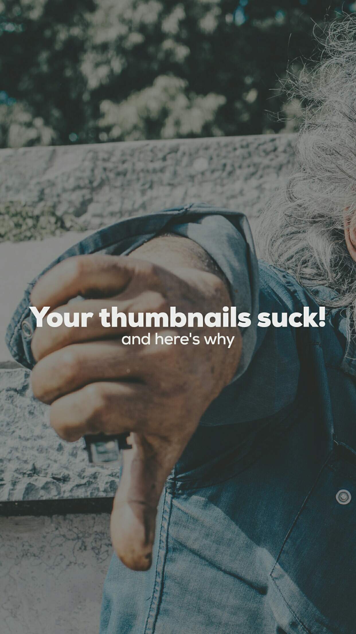
Your thumbnails suck!
I've been making a weekly post on Wednesdays where I'd select what I consider to be the week's six best thumbnails of Steem.
At the same time I'd explain why the thumbnails were selected. These reasons would help the avid learner to shape a good thumbnail design.
I've also given away my hard earned Steem to the best three thumbnails of each week. And I also had some generous sponsors (thanks @preparedwombat) and indirect sponsors (thanks @whatsup) who made the prize pool bigger.
In three weeks we have given away a grand total of 78 STEEM.
Below you can find said posts:
If you are wondering why I haven't made this week's post, it's because I havent found six great thumbnails yet!.
Can you believe that?.
I hope I can get the remaining two or three I need in order to make this week's post before Sunday.
So let's cut to the chase.
Here's why your thumbnails suck!
You are adding text over your face: your face is your brand, and unless putting text over your face is helping you get some kind of message across, you should always avoid this practice.
You are stretching down the fonts in order to fit in as much text as possible into the thumbnail, or stretching the font up to make the text bigger: this should be illegal. It is a common practice between those who have no idea about design to skew the fonts. Please don't do it anymore. In general, text on thumbnails should be short and concise. But if you need to fit in more text, try using a condensed font. If you need your text to be larger, then use a font that is wide. Please do not mess with the font's original aspect ratio. That's ghetto!.
Your background image is too busy and your font is not readable: to avoid this you can either lower the contrast on your background image, or just put a flat colour background between your font and the background image. This way the text will be more readable. As last resort you can use a "drop shadow" effect on your font, or outline the text in a different colour than the text, this will create contrast and will make the text readable against busy backgrounds.
You didn't leave any bleed: leaving "white" (not literally white) space around text blocks and between text and the edge o of the image/sheet is a rule you learn since you are in primary school and you're taught to write letters in a typing machine, or at least that's how it used to be in the late 80's. When you see any design, you always see there's no text that is right on the image's border. Unless the designer was trying to achieve a certain effect, that is. It is a good practice to always leave a space between text and the image's border.
You are using icons without transparent backgrounds: a common mistake I always see is people using icons or logos with solid backgrounds on their thumbnails. This leaves a potpourri of different logos with different background colours, often at different sizes, and very likely not aligned and scattered all around the thumbnail. Be sure to always use icons and logos with transparent backgrounds, put them all in a section of the thumbnail, preferably all at same height if set horizontally and same width if arranged on a vertical line. Although I strongly advise to not use any icon or logo at all, unless it's your own logo.
You are using a crappy font: this one is a tough one since if you have no design notions you will probably be using the font that you think looks nice to you, but you will probably ignore that it is difficult to read, or it is just plain ugly. Please refrain from using Comic Sans or Times New Roman. I'd always advise using a sans serif font (if you don't know what a sans serif is, go read a book, or google it) that is thick in weight. This way it's easier to read on small applications.
Well, hopefully these tips will help you avoid creating thumbnails that aren't pleasing to see, unless you purposely want to make them ugly for some strange reason.
Happy thumbnailing
@greencross
Posted using Partiko Android
To listen to the audio version of this article click on the play image.

Brought to you by @tts. If you find it useful please consider upvoting this reply.
Thank you so much for being an awesome Partiko user! We have just given you a free upvote!
The more Partiko Points you have, the more likely you will get a free upvote from us! You can earn 30 Partiko Points for each post made using Partiko, and you can make 10 Points per comment.
One easy way to earn Partiko Point fast is to look at posts under the #introduceyourself tag and welcome new Steem users by commenting under their posts using Partiko!
If you have questions, don't feel hesitant to reach out to us by sending us a Partiko Message, or leaving a comment under our post!
I like this initiative and don't want to see you get frustrated, so here are some I noticed:
Dealing With Opposition as Home Educators by @crosheille
The Morning Bowl by @davedickeyyall
Hivemind Deep Dive by @imwatsi
Witness Update by @quochuy
Hopefully I found something to add to your list this week!
Thanks so much for the help!!!. I will be nominating one of these for sure :D
Thanks to @bobaphet for resteeming this. I learned something here and already applied that in my thumbnail. I've found a tool to outline the text there and it looks really better. Thanks for such tips.
Awesome! Glad to help :)
Did mine suck too this week? Mortally wounded. Good advice. Better title. Come on peepz, up your thumbnail game! Love it. Sending you 10 steem to add to kitty for next week as tempter.
Posted using Partiko Android
Wohoo! Thank you for the donation for the next prize pool!
Yours didn’t suck at all, but I wanted to refrain from picking thumbnails of those who had already been picked before :)
thanks so much again!!! :D
Ha I know, just kidding. Dont expect to be selected two weeks in a row lol.
Posted using Partiko Android
Well I'm going to be frank, I had one of yours selected for this week, but you bribed, I mean, added 10 steem to the prize pool, and now I am in a difficult position, hahahhaa
Posted using Partiko Android
yes i can believe that but keep the vibe!!!
Que quieres decir?
i haded this contest of self improvement and happened me something similar
oh yes, thanks for clarifying.
I respect very much those people who can keep consistency. I am definitively not able.
Thanks for the reminder, let's see if I can squeeze in the post today.
Cheers!
Posted using Partiko Android
I set my contest for later, when we can reach a good self-reliant comunity, consistency is key, but passion is a more important key
Thanks for the posts. I will have to keep all this advice in mind next time I create some thumbnails.