DIFFERENT LOGO DESIGN (part 1)
logo is something that is a description or characteristic of a product or company, of course the demand for logo design itself is very much, ranging from companies, organizations, universities, governments and even all businesses that have their own logo that is characteristic and representative from themselves. most designers need more time to work on logo design, because logo design is a job that requires high concentration and imagination, unfounded work on the procedure adds to the difficulty in designing the logo. if you want to design a logo, you have to explore the operation of the design program, it will really help you to get maximum results, the more you understand the design, the easier you get the good results.
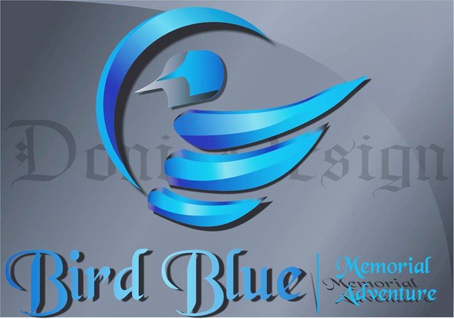
multiply logo design references is also a good step in the logo making process, so don't ever get bored in seeing and dissecting designs that have been made by others, and therefore this time I want to dissect the logo that I once designed. this is the logo.
I created the logo using the Corel Draw x7 application, by drawing the manual at first and I scanned it using an Epson L2001 scanner, after that I designed the pain tool following the line I had made, why I didn't use the pain tool directly without having to draw it, isn't it more time-efficient ??, if you think like that I would say that drawing sketches before entering the design stage is necessary for every design work, and if I don't use sketches it will take more time and the results will be very different . so if you want to design something especially logos, I suggest using your sketch first, because that will really help you.
the use of the color of the logo is the gradation of bright blue and dark blue, intended to give the design a dark light on the design so that the logo looks more alive, to make the logo look awake, I give additional objects on the bottom and top of the wing, then I give a little color gradation darker to give a different emphasis. the use of shadows on logo objects also gives effect so that the image looks more vivid and real. assisted by different color backgroun gradations add a distinctive impression to the logo so that the logo looks more real.
each logo has its own philosophy as well as this logo. the main object which is an illustration of a bird symbolizes broad freedom and reach, a shimmering texture like a diamond symbolizes great glory and the crescent in front of a bird is a great thing even if it requires something that protects itself, that is an all-powerful God.
okay maybe just this for this article, see you in my next article. peace