Creating a Brand Strategy Using Graphics Made From Food

The Process of Branding a Catering Company
In my last post I detailed our process of branding a top New York City catering company where we made their logo out of food. The photo below should give you a little taste of that post. You can see the images and read the description of that process here - Making a Logo Out of Food

The Application of Our Branding Strategy
Below are a series of images consolidating a lot of hard work and creative strategy. We created a style guide for the client, Great Performances, to use when creating new graphics and coming up with big ideas. The guide helps them align the branding we've created to any public facing marketing materials or concepts. In our branding strategy project we made a connection between the creation of quality dishes and catering to fine art and the creation of art. Naturally, we decided to make the logo and branded assets out of food.


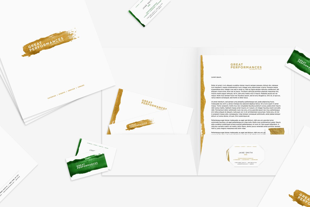


There is a lot more time that goes into the thinking and strategic process than the actual production process here. But, I think the hours paid off. We're continuing to work with this client to develop more materials including a year long ad campaign and potentially redesigning and rebuilding their website. Hope you enjoyed our designs.
Explore more projects on our website here
Ciao for now, Steemians.
- Weston (aka @design-guy)

Looks sick man!
Nice images @design-guy, but I wonder how frequently food businesses need to change logos (and menus). 'Cause there's a strong likelihood that what people respond to (food-wise) in 2017 will not be what they want to taste (or see) in 2019. Just guessing...
Yeah, great question and good point. This particular company, Great Performances, has changed their logo once since 1980. I think, after many discussions with this client, the logo and branding needed to change for their own identity more so than for the customer base or food trends. The founder of this company started the farm to table movement in NYC and is likely one of the pioneers of that movement in the US, so sometimes the company plays the role of leading the look and feel and branding rather than the company looking to the audience to decide how to fit in. In our case, we knew it was time for our client to make a step forward and bring a new look to the industry because of how they've grown, but not because of how the industry or competitors have changed. It's a fascinating concept overall.
Good to hear about that deep background. I'm no designer (there are witnesses to back that up) but I'd want to stick with raw, unprocessed food which cannot go out of style (unless it's kale). But then you don't get to work with those expressive, edible swooshes.
Very impressive work!!!
:-) @roused
Congratulations @design-guy, this post is the ninth most rewarded post (based on pending payouts) in the last 12 hours written by a User account holder (accounts that hold between 0.1 and 1.0 Mega Vests). The total number of posts by User account holders during this period was 1187 and the total pending payments to posts in this category was $2241.69. To see the full list of highest paid posts across all accounts categories, click here.
If you do not wish to receive these messages in future, please reply stop to this comment.
Nice work man! Love the compositions.