Making a Logo Out of Food

Creating a logo out of food
We actually had a really good reason for doing this other than just to have fun.. Great Performances is New York City’s premier catering and events company, enhancing celebrations with delicious and seasonal food, creative design, and professional service. They came to us with a desire to refresh the brand look and feel as the company has developed and changed over time.
The intention of rebranding was to not only represent the company, but to also address the hand-made, human touch aspects of food preparation and presentation that are so integral to the company. The tagline “celebrate food” became the inspiration behind the process of thinking about the brand and creating the logo.

The Art is in the Dish
There is great care, craftsmanship and quality found in the work at Great Performances and these are the qualities that we looked to achieve in the logo. Their many dishes appear intricately composed, appearing almost as edible art pieces. We wanted to create a logo that embodied the elegance, texture and quality of the Great Performances’ dishes; something that is delicate, colorful, and versatile - and naturally, we began creating art made of food ourselves.


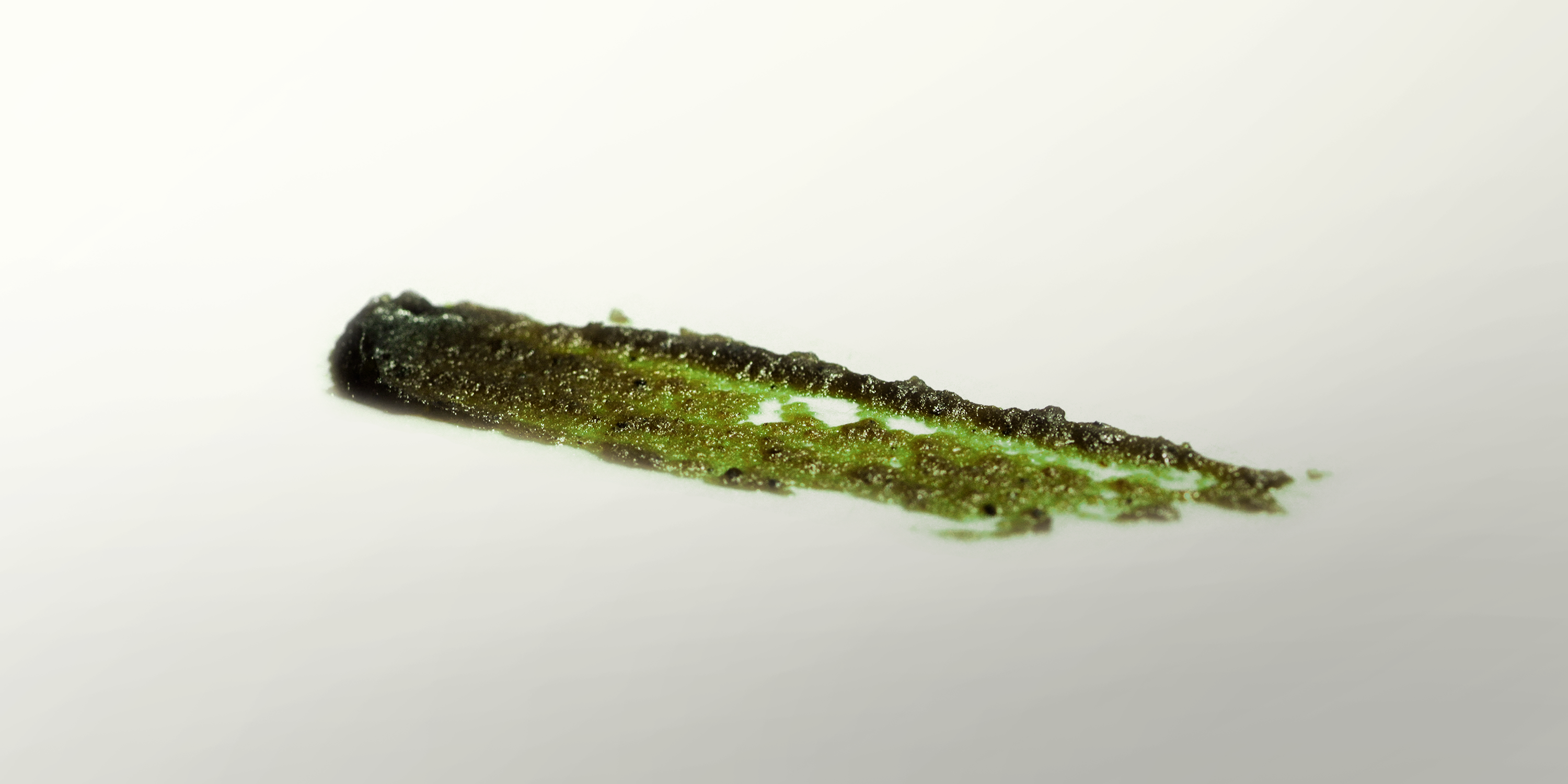
Time to Get Dirty
We explored the various ways we could paint and draw using food. The approach for the logo was to paint swatches of a Demi-Glace as if on the edge of a perfectly composed plate. The logo, like any dish, is custom, handmade and not always exactly the same. We created a series of logo options using different Demi-Glace strokes and color variations, which parallels the creation of these dishes. If the logo we created doesn’t exemplify “Celebrate food”, we don’t know what does.

You can see that there is a great deal of detail, depth, texture, transparency and color differences within the logo, which is not typical of a logo, but Great Performances is not a typical company. The logo needed to contain the beautiful detail and fine texture, which contrasts with the very modern and bold font.


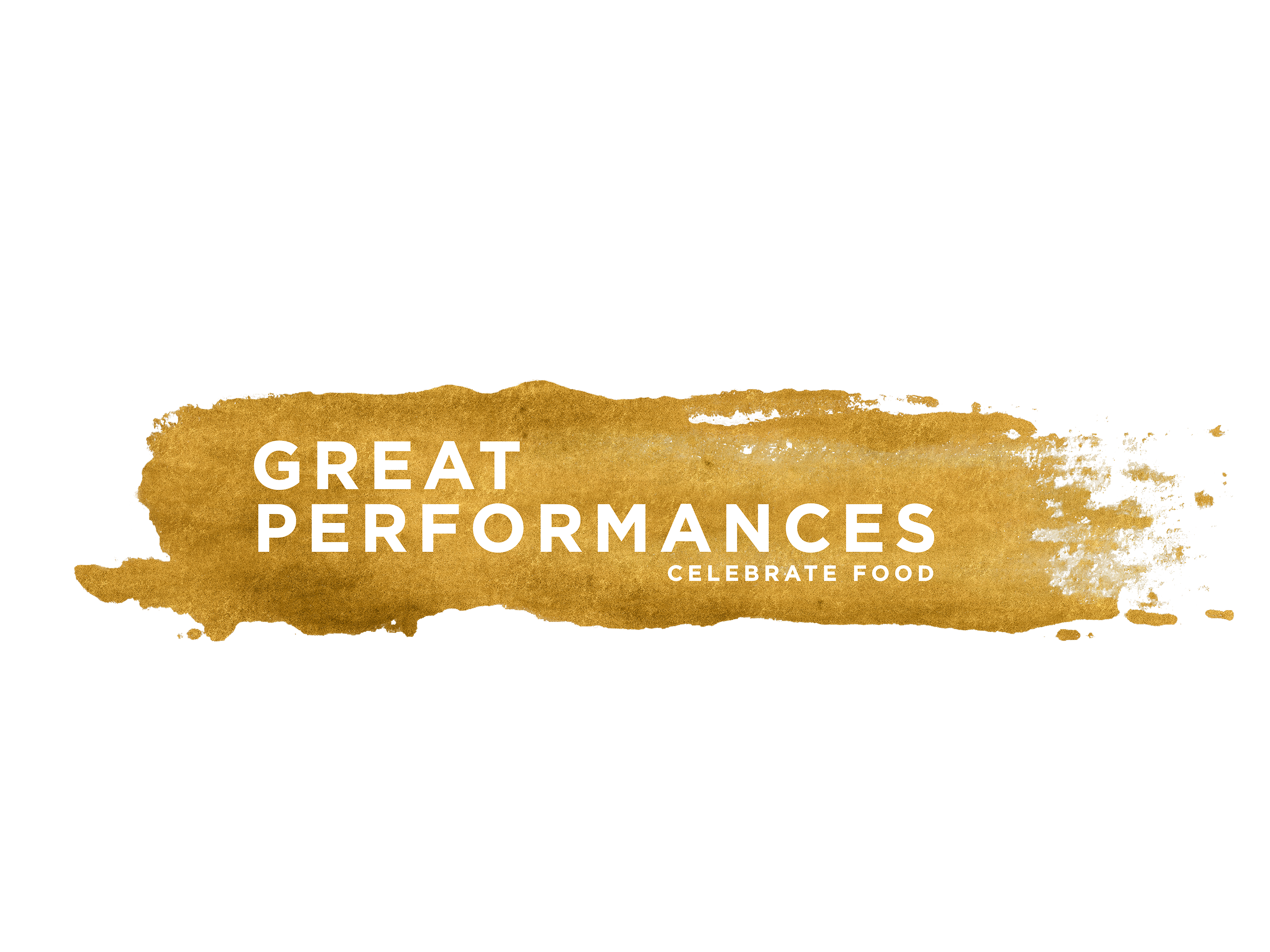
The logo itself comes in a few different strokes to continue the idea of no dish being the same. Gold is the primary color, but there is also a green and purple theme. In the image above you can see the transparency of the files, which allows them to be put on any background and work seamlessly with any color.

I'm excited to show you the result of what we've created with this new company branding. It's pretty exciting to see these images come to life and represent a major industry-leading company. Hope you enjoyed!
Ciao for now, Steemians.
- Weston (aka @design-guy)

Creating a logo out of food is as good as a fat in burger meat
Wow what a cool idea. I'll have to try something like this one day. Seems to make some really cool designs on the ones you posted and never would have thought of trying that.
Thanks @gniksivart its pretty fun too
Upvoted and RESTEEMED :]
thanks!
Kandinsky from food!
Haha yes! @rogvalentin We actually did create a series of ads for the client that displays their plated dishes over famous artists styles like Miro and de Kooning.
This could also be really nice to combine it into irregularly regular patterns :).
Did you consider something like that?
I'm not quire sure what you mean, but it sounds interesting. Any link or reference to help me understand more?
In a way I'm talking about something along the lines of the last image (which I see only now as before it didn't load).
Though to describe it better or outline other possibilities :
Then with this pattern you can use it in other parts of the brand.
Eg. in the Menu
Here are some examples.
http://www.6rs.co.uk/the-power-of-pattern-why-your-brand-should-have-a-pattern/
Congratulations @design-guy, this post is the seventh most rewarded post (based on pending payouts) in the last 12 hours written by a User account holder (accounts that hold between 0.1 and 1.0 Mega Vests). The total number of posts by User account holders during this period was 1307 and the total pending payments to posts in this category was $2353.81. To see the full list of highest paid posts across all accounts categories, click here.
If you do not wish to receive these messages in future, please reply stop to this comment.
You are indeed the design-guy, that is so clever, and brilliantly executed.
:-) @roused
and you are definitely @roused. Thanks! Appreciate it
Congratulations @design-guy! You have completed some achievement on Steemit and have been rewarded with new badge(s) :
Click on any badge to view your own Board of Honor on SteemitBoard.
For more information about SteemitBoard, click here
If you no longer want to receive notifications, reply to this comment with the word
STOPYou have an awesome work done
check my new post
https://steemit.com/education/@abkktk/aerobiz-professional-business-powerpoint-template