The ABC of classical typefaces (I part)
Typographies are an essential part of any graphic design, as it provides, in addition to the necessary readability that requires any text, character, emotion and feelings that make design an attractive piece and according to what you want to say.
Since the invention of the printing press, tens or hundreds of thousands of typographic styles have been designed, motivated by different needs. Many were falling into disuse, others are still preserved today and every day new typographical sources are being created, many of which we will never see and others that seem to be everywhere, given their wide diffusion in digital and printed media.
That is why I have prepared for this Steemian friends this ABC typeface in which you will find classical sources, some of which are hundreds of years old and have been created and are still used in all types of designs.
A
Akzidenz Grotesk
This simple but sophisticated letter was created near 1880 and 1896. The modern version of the font is attributed to the designer Günter Gerhard Lange, type designer and artistic director of Berthold Foundry. Despite the passage of time, Akzidens continues to have a contemporary look for the elegance of its lines, and the great influence it had on many other types of dry stick or sans-serif like Helvetica, Arial, Erbar, among others.
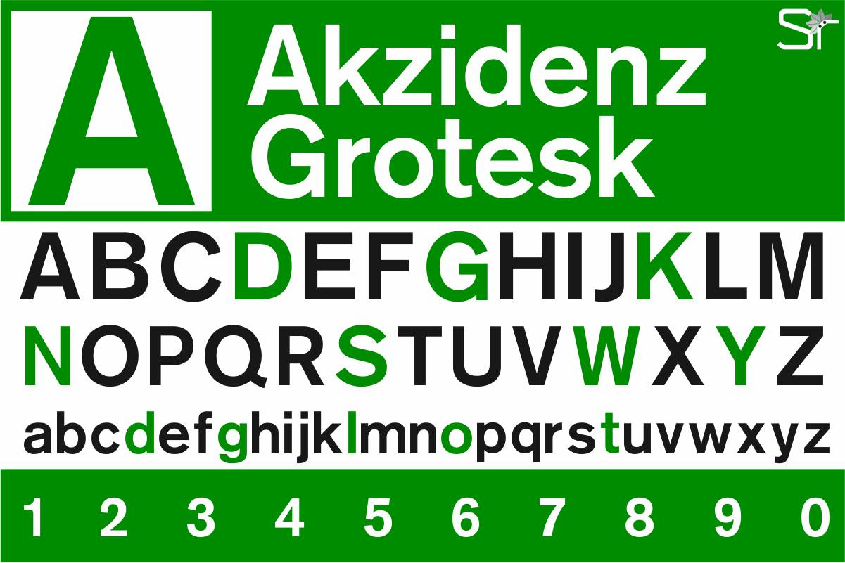
Design created by the author
B
Bembo
Created around 1495, it is possibly the oldest source used today in book diagramming. It was originally molded by the Venetian printer Francesco Griffo for use in Pietro Bembo's famous book of poetry. Inspired by the ancient Roman Empire types found sculpted in the ruins of the Italic peninsula, it has been the inspiration for the creation of many other typefaces that attempt to reflect the stable, solid and consistent style of the ancient Roman letters.
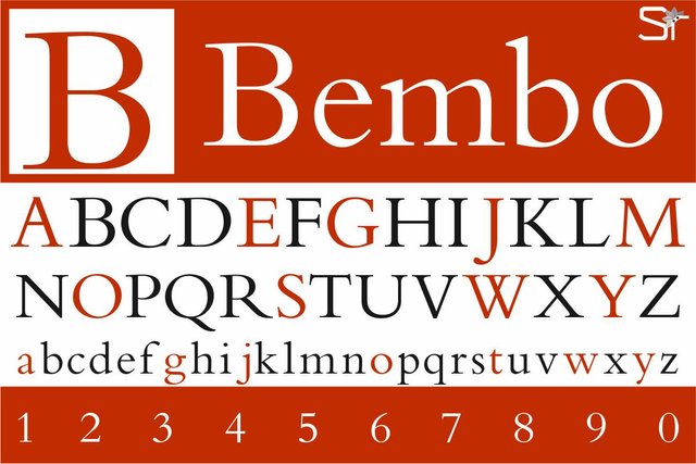
Design created by the author
B
Bodoni
In the letter B we wanted to add this typography that in spite of its antiquity, is always fashionable and we always see it in publications devoted to divulging elegance, fashion and life in big cities. It is about Bodoni, a series of typographies invented by the Italian Gianbattista Bodoni in 1798. In his time he had the innovation of moving away from the classical Greco-Latin types, making a greater differentiation between thin and thick strokes. Designed in and for the epoch of changes lived by the West during the French Revolution and the Napoleonic Wars, it was quickly spread among printers throughout Europe. Currently expresses ideas of fashion, luxury and charm.
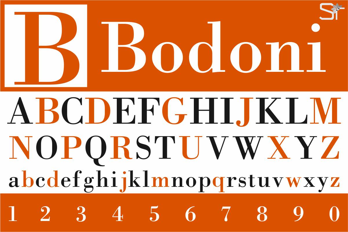
Design created by the author
C
Century
It is a typeface specially created for long texts, it was designed in the United States by Linn Boyd Benton in 1894 for its magazine, called Century. From there, it has created many variants of this type in a large number of publications around the world.
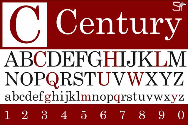
Design created by the author
D
Della Robbia
Designed by Thomas Maitland Cleland in 1902 for American Type Founders (ATF). It is a careful and academic creation of a typeface of fifteenth-century Florentine capitals. Named in honor of Luca Della Robbia, Florentine sculptor.
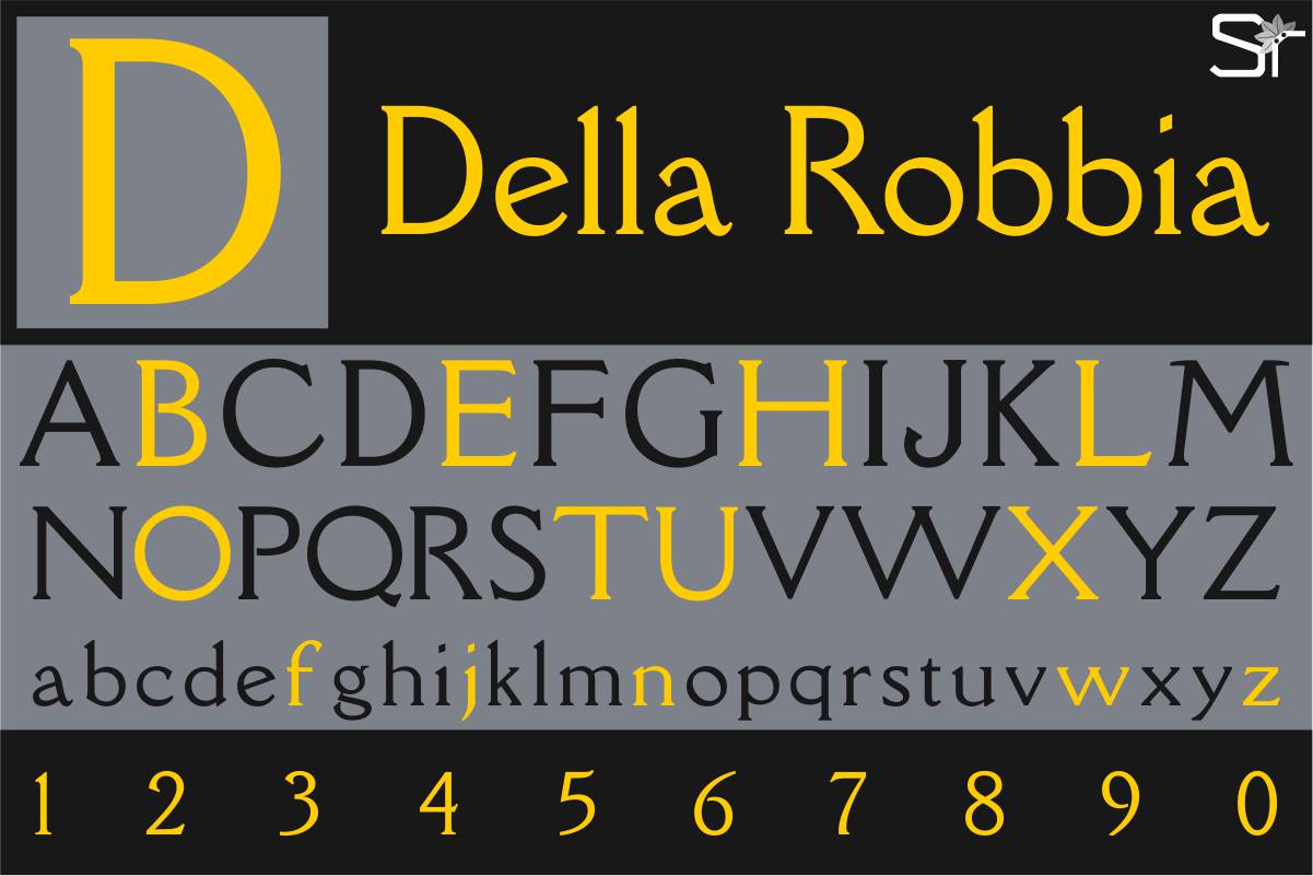
Design created by the author
E
Erbar
It is a geometric typography designed in 1922 by Jakob Erbar, it is a modern and easily readable font. He had a great influence on the creation of other sans serifs such as Futura, Vogue, Metro, among others, which over time became very popular.
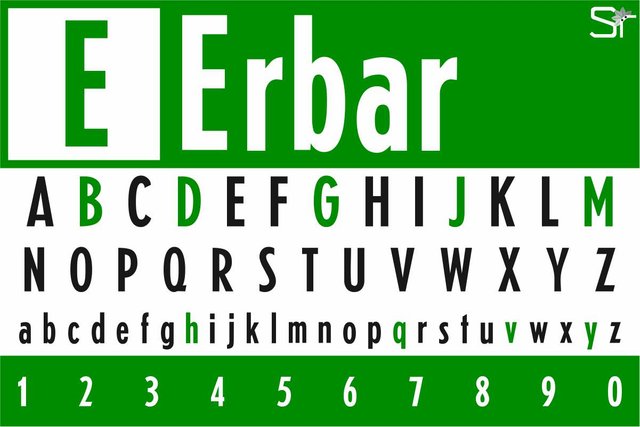
Design created by the author
F
Futura
It is a geometric sans-serif typography designed by Paul Renner and launched in 1927. It is based on geometric shapes, especially the circle, which is in keeping with the Bauhaus style, influential school of design and art created in Germany in the 20s.
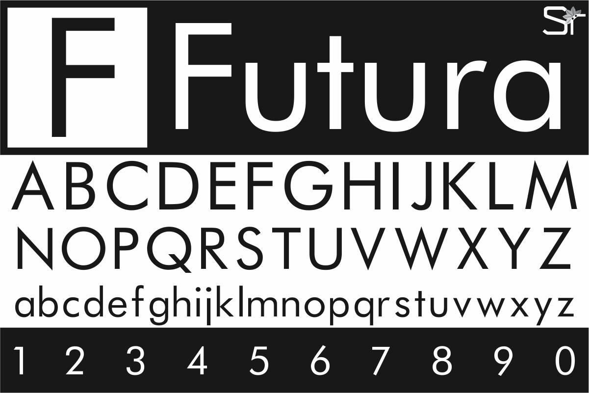
Design created by the author
G
Garamond
To Claude Garamond, typographer of the court of King Francis I of France, we owe the invention of this fountain in 1540. It is one of the most famous and well-known sources of all time, used initially in the official documents of the French king and then throughout Western Europe.
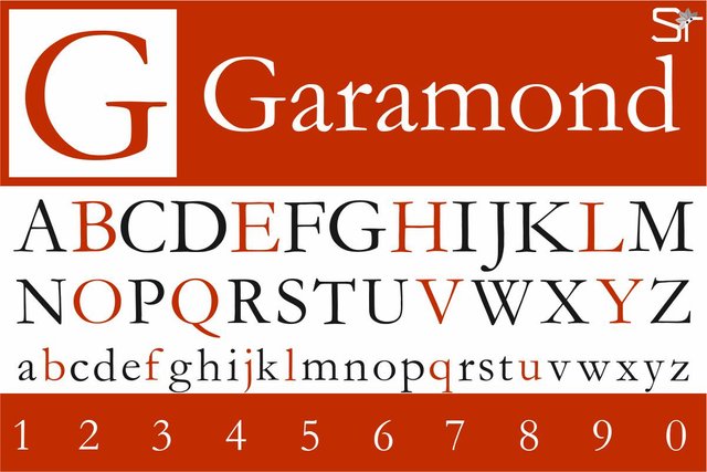
Design created by the author
H
Helvetica
Undoubtedly, it is the most used source since its creation in 1957 by the designers Max Miedinger, Eduard Hoffmann. Brands as diverse as BASF, Behance, BMW, General Motors, Jeep, Kawasaki, Knoll, Lufthansa, Motorola, Nestlé, Panasonic, Parmalat, Sears, Skype, Texaco, Tupperware, as well as many of the government agencies of several countries regularly use Helvetica either in their logos or in their corporate texts, signage, etc. Given its popularity and some legal loopholes with copyright, there is a wide variety of similar and almost identical sources, such as Arial, Open Sans, Shape, Unica, Bitstream vera, MS Sans Serif, among others.
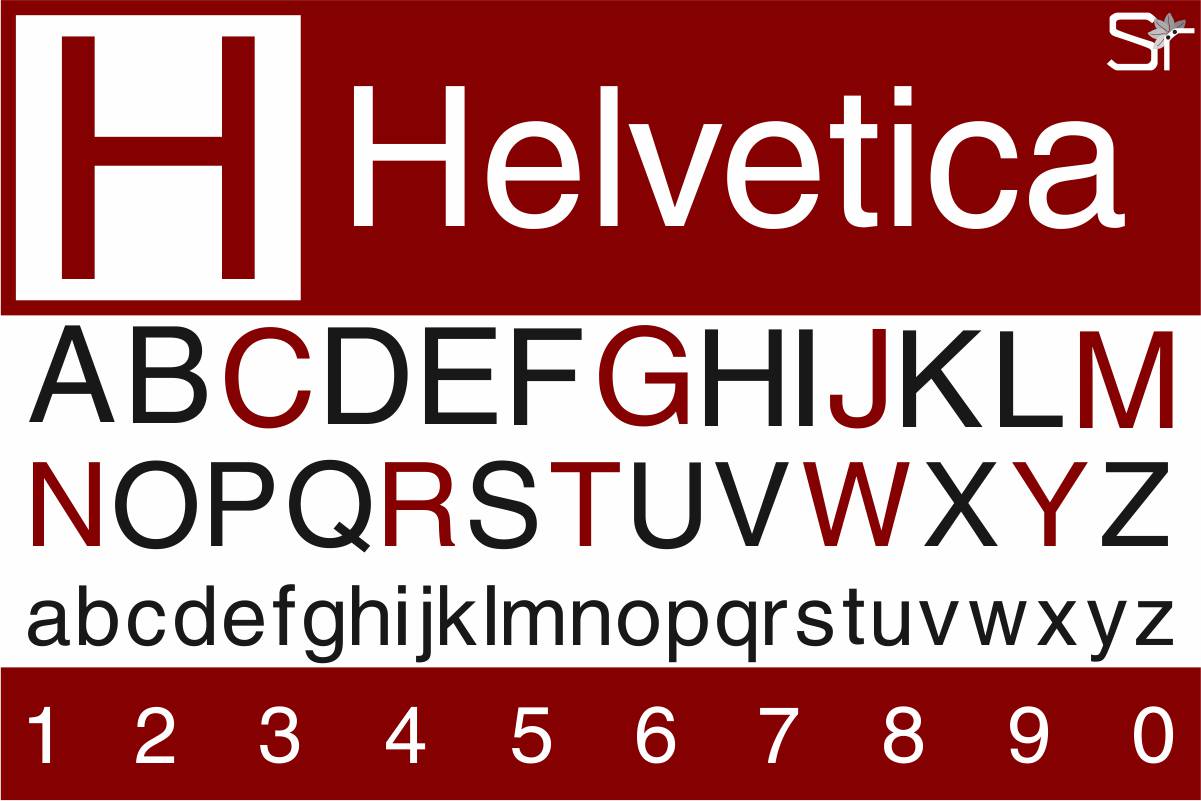
Design created by the author
Hasta aquí nuestra primera parte del ABC tipográfico, con un poco de historia de las fuentes que vemos a diario pero que de las que a menudo sabemos muy poco. Espero que les haya gustado y puedan sacar provecho de este artículo. Si desean agregar alguna tipografía que les parezca que haga falta, no duden en avisar.
Gelasio Suárez
SRComunicaciones