Fundamentals of UI design... as told by a non-designer
In my last post I mentioned that I will be working on a sort of web resume app built in Angular. But before I can actually do any coding, I have to decide what the gosh darn thing is gonna look like. So I thought I'd share some of the principles I try to use - emphasis on try - when working out the design of a new project.
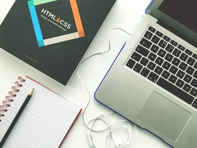
Image courtesy of Pixabay
First a caveat
I am not a designer by any definition of the term. Nor do plan to ever become one. I believe that I am able to put together interfaces that at least look descent, not great, won't win any awards, but good enough to at least make you think "This app could have been made by a professional". And to be honest that's good enough for me at this stage. To illustrate I'll add screenshots of two of my previous apps:
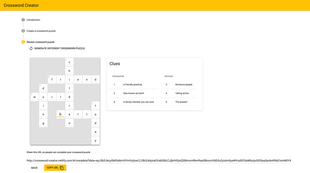
A crossword generating app: Crossword Creator
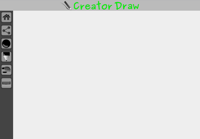
A drawing app: github page, sorry it's not hosted.
Now that that's out of the way, let's begin shall we.
1. Plan ahead...
...or at least try to think ahead. You have to try to imagine how a user is going to use your app and what information is going to be displayed. Split it up into different sections or pages to make it a little easier to digest. Once you at least have some idea what it should do, deciding what it should look like becomes a little bit easier.
And even if you have a vague image in your head, it's still a good idea to plan at some level beforehand - because tomorrow you're going to forget that grandiose picture.
2. Keep it consistent
Nothing screams amateur like a site with different fonts and colors on every single page. Or worse still... on the same page! Decide on a style and stick to it - unless you have a really, really good reason not to - if this happens to be the case for you, you're probably not going to learn much of anything from this post.
3. Not too much, not too little
Another instant ipecac like trigger for an app is when there are just so many things going on... Of course it may not always be obvious that your app has become a candidate to star on Hoarders
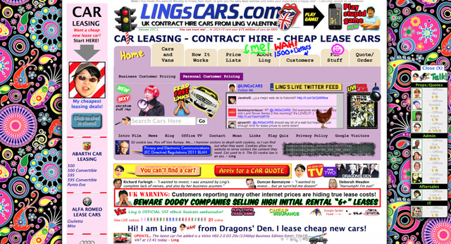
Image source
On the other hand, if your users are just going to stare at a giant white block most of the time, they're not going to stay users for very long. Looking at an almost blank page is boring. Too be honest, I think I tend to make my projects a little too sparse too.
The best way I can think of to try get a gauge of how balanced your content is, ask a friend to give you their first impressions and adjust as needed. Which brings me to my final point for this post...
4. Take all the help you can get
This can take many forms:
- Asking for someone's opinion on your initial draft - if that person is a designer even better.
- Reading up on good practices - as a side note, while researching for this article I came across a pretty well thought out slideshare you can find here that you can use as a starting point.
- Use a design library or framework - except Bootstrap because every developer and their grandma uses it and frankly it's getting annoying. A good library will very likely have people that do design for a living working on it. The most popular route to go these days is Material Design - although that will probably become the next Bootstrap.
I think that about covers the extent of what I think I know about design. If you happen to be an actual designer that made it this far, hats off to you firstly and secondly I'd love to hear what you thought/know I got wrong. Leave a comment below.
From a software dev who went to school for graphic design, this is pretty spot on. I'd tack onto that plan ahead, that making paper prototypes, even lo-fi ones, help that step quite a bit. You get a better understanding and even at that point, you could have people test it out by asking them what they would do to try to do X Y or Z on your app or site even though it's on paper. It's helped me a lot with past projects. This is if you have the time to do this anyway *
It's seems as though the low-tech solutions always give the best results.
Thanks for the pro-tip.
This is really good post and I love the photography in the start of the post
Thank you
Material design is the framework developed by Google, right? What's the difference between between that and bootstrap?
Yes, Material Design was developed and is used by Google.
Material Design isn't really a framework as much as it is a set of very strict design guidelines which in turn is used by independent developers to create libraries for you to use in your own projects. You can look at Material UI which was developed by Call-em-all to be a Material Design library for React. Then there's Angular Material which was developed by Google's Angular team. There's also many other pure css implementations you can use - see Material Design Lite and Materialize. If you're brave you can even develop your own library that use the Material Design guidelines.
Bootstrap was developed by Twitter many years ago and is a full blown UI framework. Many people have made their own customised versions of Bootstrap as well. There's even a few Bootstrap based libraries that use Material Design - see Material Design for Bootstrap 4.
I should have probably been a bit clearer when I suggested you don't use Bootstrap. I should have probably said don't use Bootstrap as-is. Either use a customised version or customise it yourself so that at least your app doesn't look like all the other apps out there - and essentially gets lost in the masses. If you do that then Bootstrap can still be a very good choice.
Thanks for the info.
Heh, say what you want about Ling's Cars but their design is very intentional and it seems to be working quite well :)
http://www.independent.co.uk/life-style/gadgets-and-tech/ling-s-cars-has-one-of-the-best-websites-on-the-internet-a7492386.html
There's this thing that is always mentioned whenever you read about design guidelines. That is that every rule can be broken, if you have a good reason to do so. I think that might be why modern art is a thing by the way.
In the case of Ling's Cars I think the intention was to be so bad that everyone that ever wants an example of what not to do when designing a website can just use it as a reference. For that it works very well.