Rise and shine with better design!
As a freelancer, one of the biggest sources of your income comes from doing logos. Even if you aren't looking for that kind of work, if people see that you're a talented artist, inevitably you'll be approached to do a logo. Right off the bat, I'd like to say that in no way do I think of myself as an authority on the topic of logo design. As with most things, trial and error is the best teacher and lemme tell ya... I've gone through some trials and errors when designing logos! Learning by doing has been the name of the game for me and I'd like to take what I've learned and hopefully help you skip bits of the trial and error phase.
A lot of times I would be so focused on making something look "cool" that I didn't pay much attention to what the design was communicating. What do I mean by "communicating"? To help explain, check out this A/B test I did with the folks I work with:
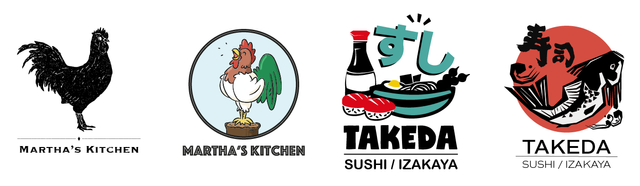
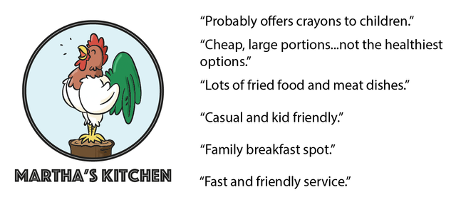
Above are some logos I did for two imaginary restaurants. Each restaurant got two different logo designs that incorporated similar elements but had some differences when it came to typeface and color choice. Even though the name of the restaurant stayed the same, people made some very different assumptions about the restaurant based on the changes in design. For example:
compared to...
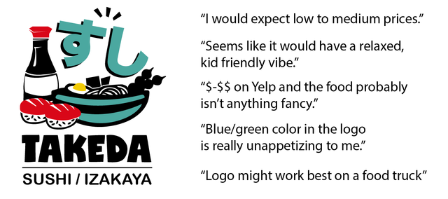
Pretty interesting, right? Here's what they said when I gave them the next batch...
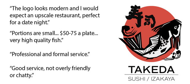
compare that with...
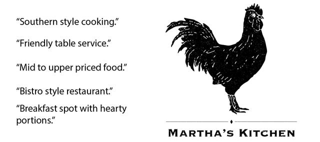
Even though the answers are short, they say so much about the power a logo has on people's perception. People made assumptions about the quality, price, portions, atmosphere and service they would expect ALL based on the logo! But how'd they jump to those conclusions? The answer is in the patterns that popped up in this test.
The two logos with the cartoony elements, brighter colors, and "playful" font were perceived as lower quality, kid friendly and unhealthy. The two logos with fewer colors, modern typefaces, and "classier" illustrations were seen as being up-scale, and having better quality food.
In both cases people were thinking about price, which would influence how much money they brought with them. They thought about atmosphere which would influence how they dressed or how they would be expected to act while dining. Including a chicken in the logo made people think of breakfast which means they were thinking about what time of day they'd go to this restaurant. The blue/green color in one of the logos affected one participants appetite. Again, these aren't even real restaurants and one person brought Yelp into the mix. Basically, they were making assumptions about these restaurants based on years of prior experiences they've had at restaurants with similar logos. People draw on experience to interpret a logo's communication. (How's that for market research?!)
So, whats the point? Well, objectively speaking, there isn't anything wrong with any of the four logos. But, once you give them some context, thats when potential problems could arise. Based on our experiment, even though the cartoon chicken is drawn well, a high-end restaurant wouldn't benefit at all from having that as their logo because of what it "communicates". So, as a designer, knowing as much as you can about your client and their business should inform all of your choices when designing their logo. Making something look really "cool" before doing your research is essentially putting the horse before the cart.
Knowing this will help improve your relationships with your clients, save you a TON of time (and money) by helping you avoid the dreaded "redo", and build confidence in your design choices. Put this into practice and you'll rise above the competition and shine as a designer! (See what I did there?)
Did you know that you can create a logo for your restaurant yourself? Try it yourself https://turbologo.com/articles/restaurants-logo-design/