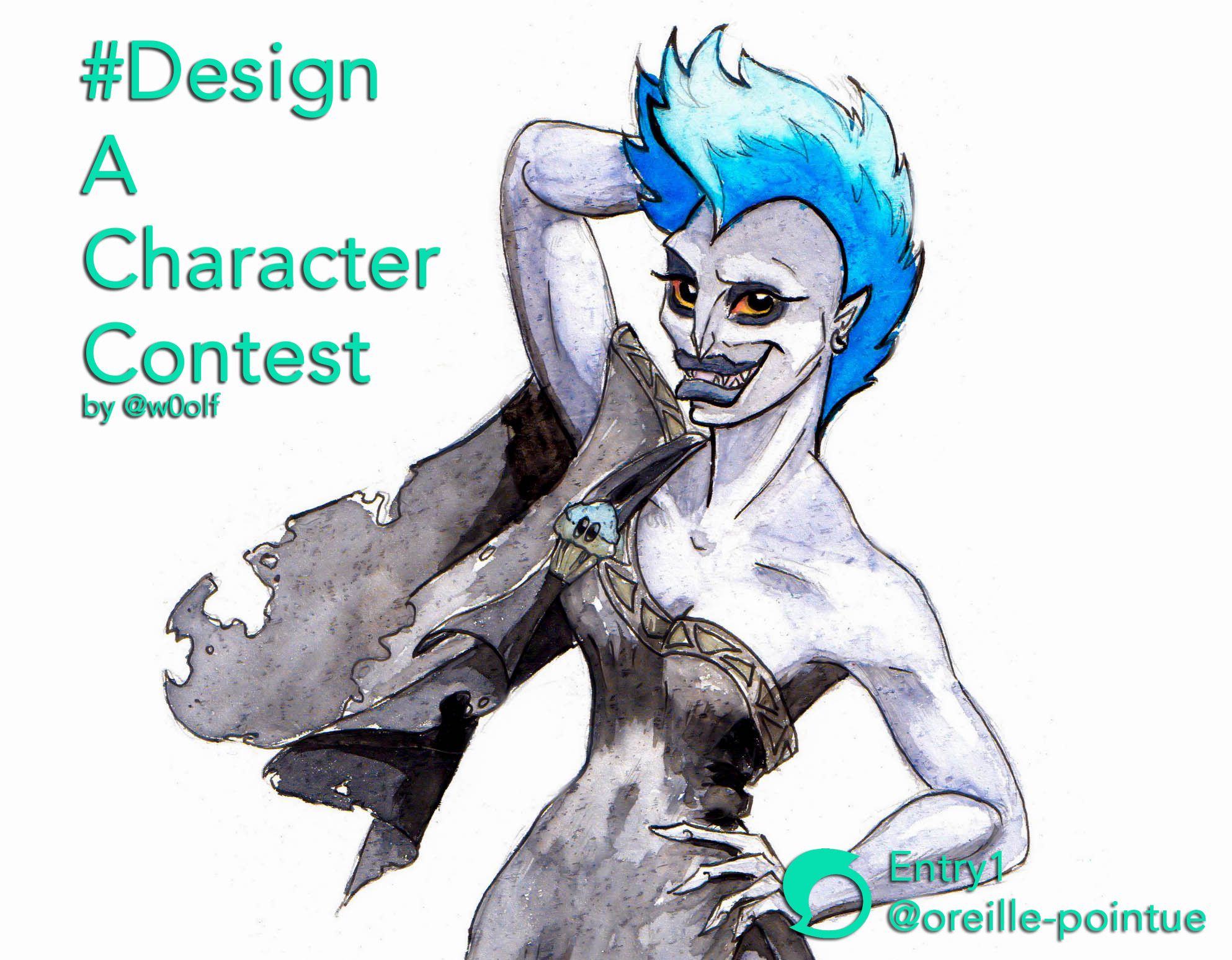
[Watercolor] - #designacharacter Contest / Sexy Hadès [FR/EN]
Bonjour à tous !
Hi everyone!
Premier dessin sur mon nouvel espace de travail : une entrée pour le Concours Design A Character de @w0olf avec un de mes personnages de Disney favori, ce cher tonton Hadès :D
Thème du concours : trois personnages nous sont proposés, à nous de les redessiner mais en changeant un ou plusieurs détails (sexe, style, époque, âge, espèce, lieu...).
Les trois personnnages proposés sont : Hadès (Disney), Katara (Avatar) et Gaz (Invader Zim).
Je réfléchis à me lancer dans une interprétation shamanique / épouvante de Katara, mais rien n'est sûr.
First drawing on my new workspace: an entry for the Design A Character Contest by @w0olf with one of my favorite Disney characters, this dear uncle Hades :D
Theme of the contest: three characters are proposed to us, it is up to us to redesign them but by changing one or more details (sex, style, period, age, species, place...).The three proposed characters are: Hades (Disney), Katara (Avatar) and Gaz (Invader Zim).
I'm thinking about entering a shamanic/scary interpretation of Katara, but nothing is certain.
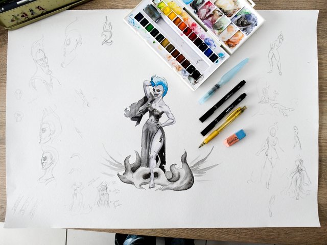
Matériel utilisé / Tools used
Papier chelou (trouvé en recyclerie, je pense que c'est du sous-papier-peint)
Crayon de papier et Stylo
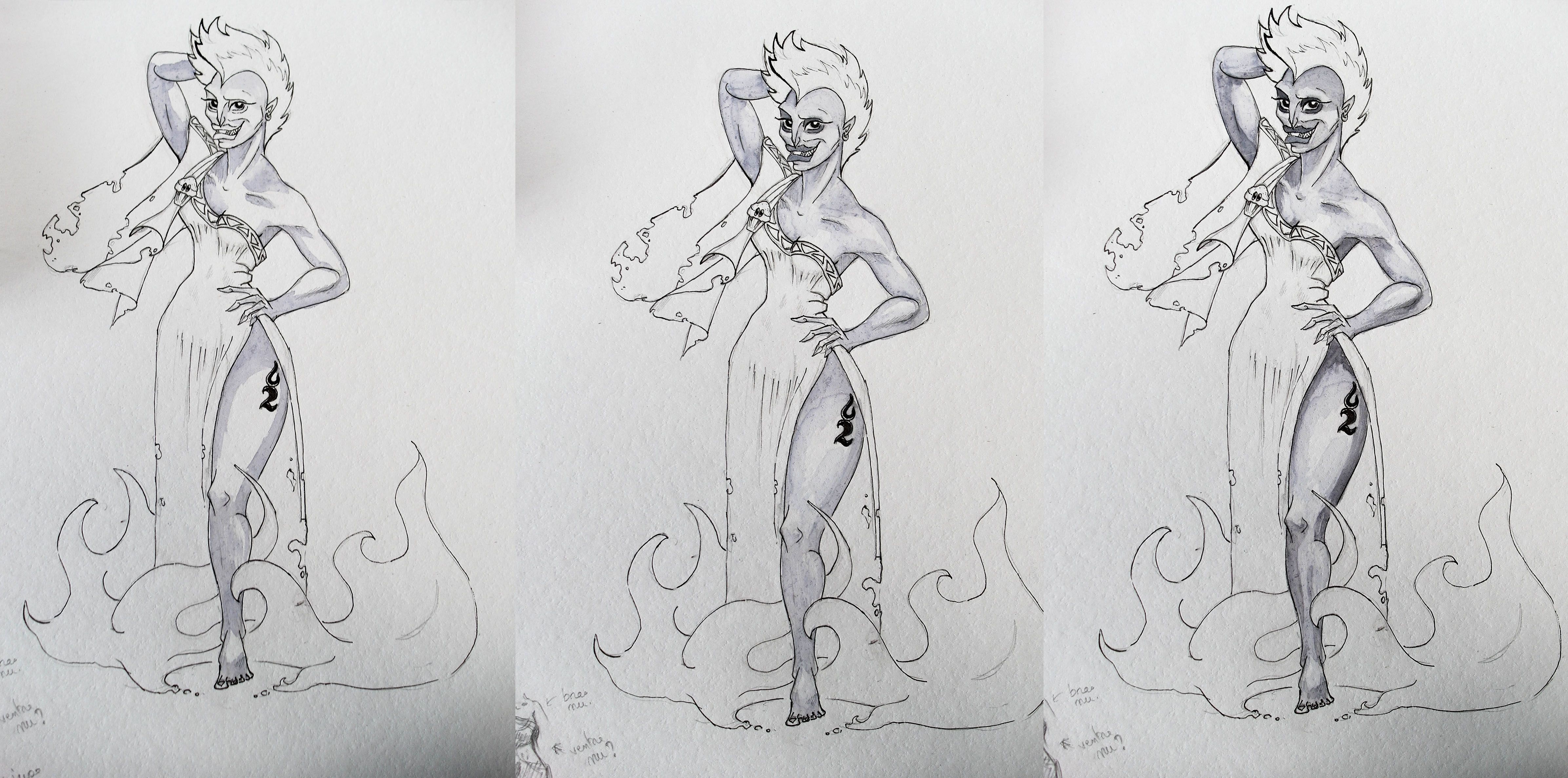
Aquarelles : Blanc de titane, Jaune Sennelier, Rouge primaire, Bleu primaire, Gris de Payne, Noir d'Ivoire.
Strange paper (absolutely no idea of what is it, I find it in a recyclery store)
Pencil and pen
Watercolor : Titanium white, Sennelier Yellow, Primary Red, Primary Blue, Payne's Grey, Ivory Black.
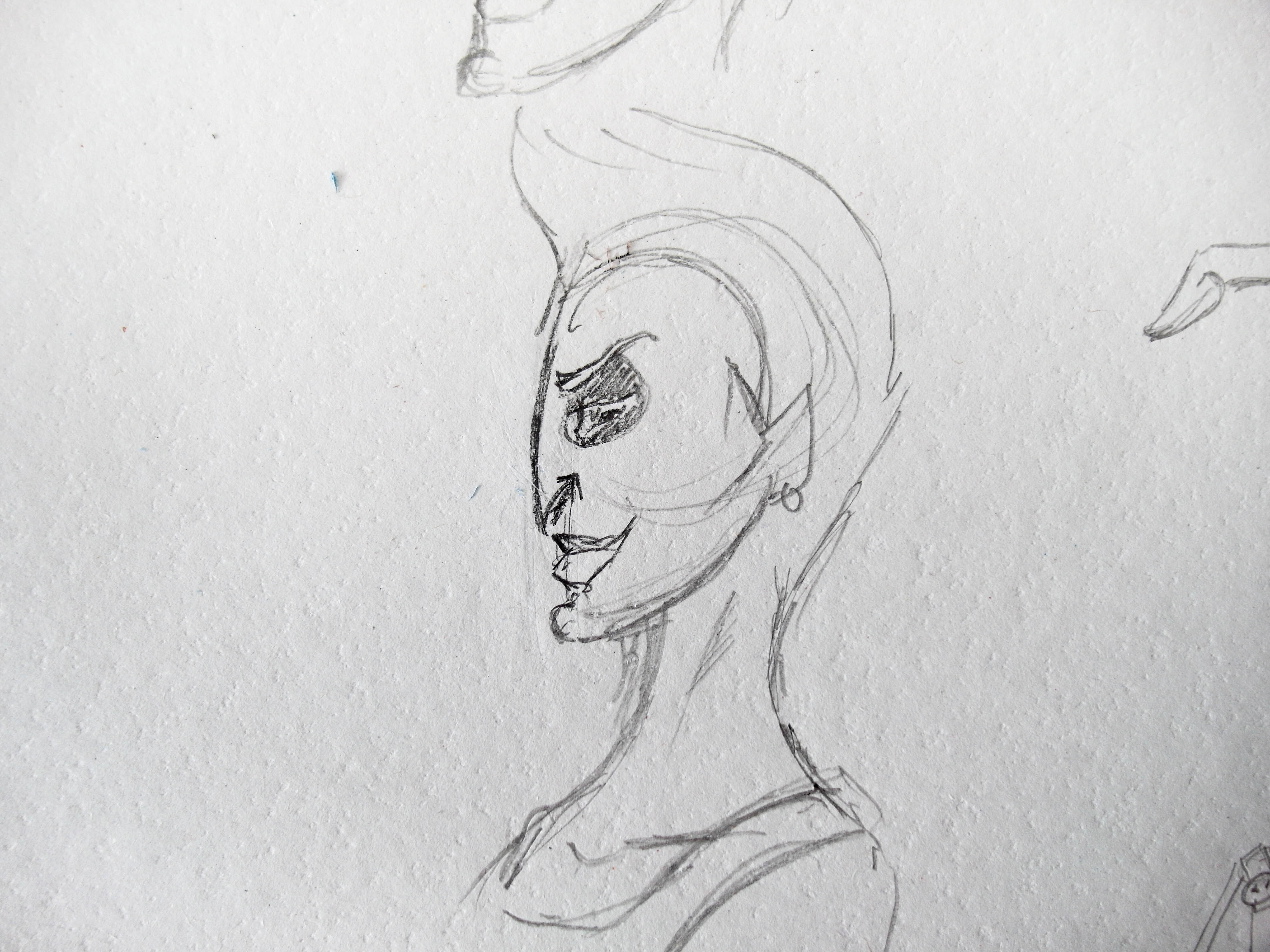
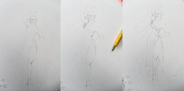
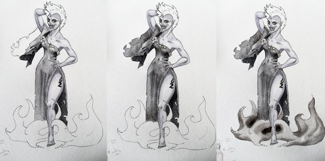
Recherches préliminaires / First Sketch
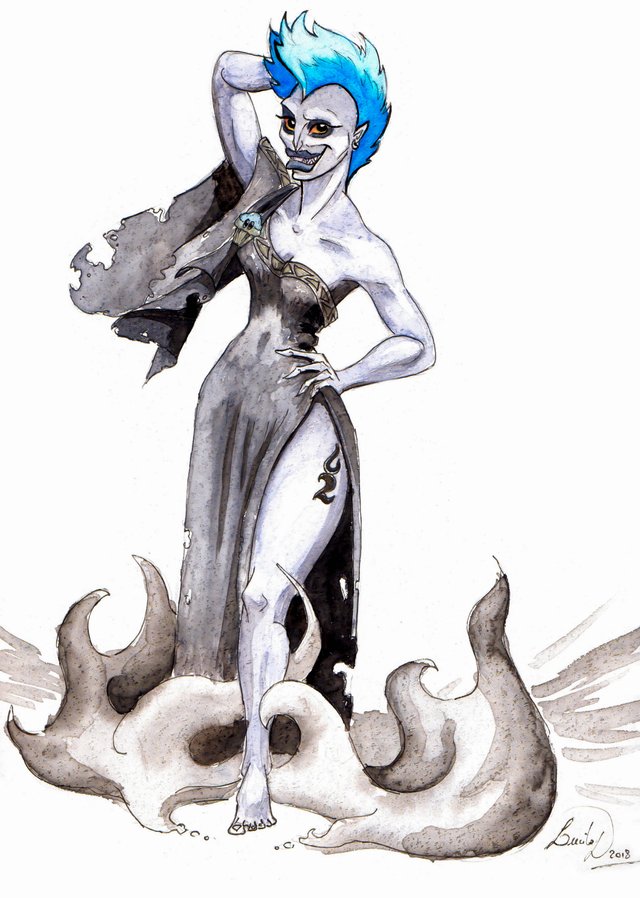
Dessin du visage originel afin de me familiariser avec les tracés du personnage. Puis je le dévie en plus féminin : menton raccourci, yeux étirés en amande, visage plus rond.
Drawing of the original face to familiarize me with the lines of the character. Then I turn it more feminine: shortened chin, stretched almond eyes, round face.
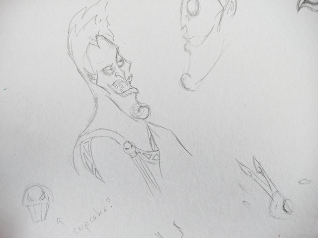
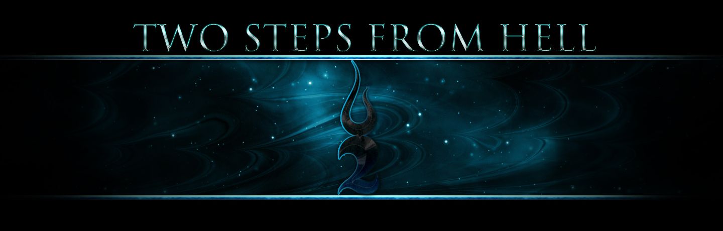
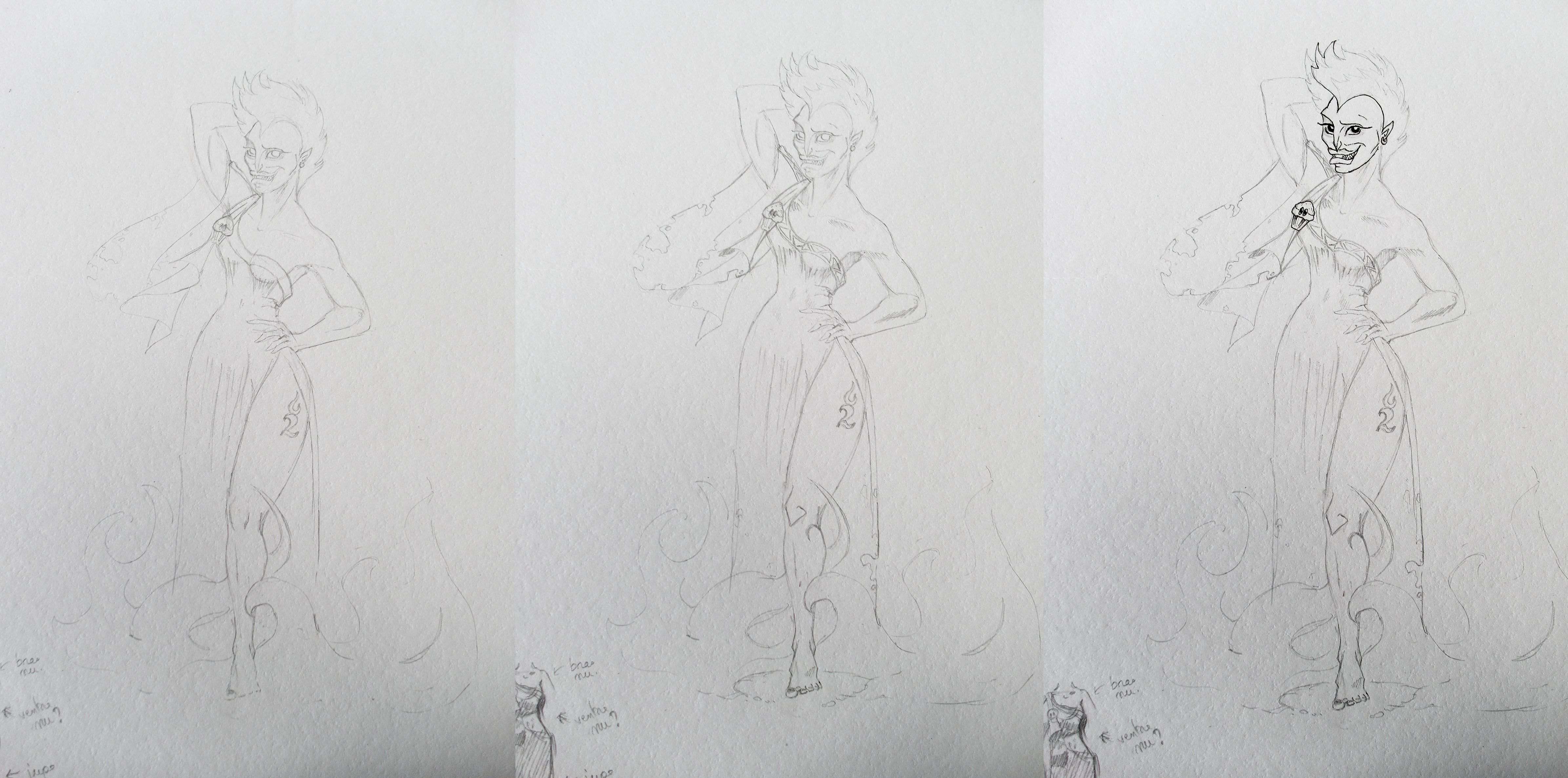
Je voulais faire un tatouage sur la cuisse de mon personnage, et j'ai tout de suite pensé à un de mes groupes favoris : Two Steps From Hell
I wanted to get a tattoo on my character's thigh, and I immediately thought of one of my favorite bands: Two Steps From Hell
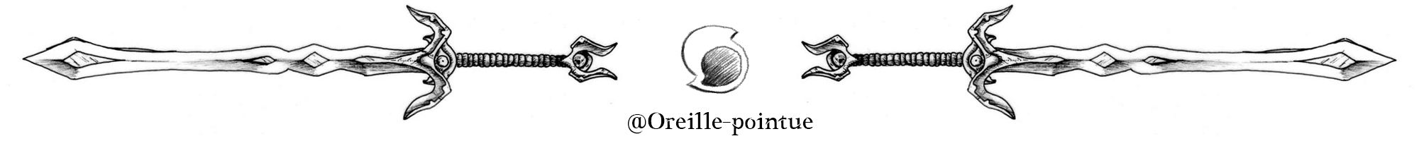
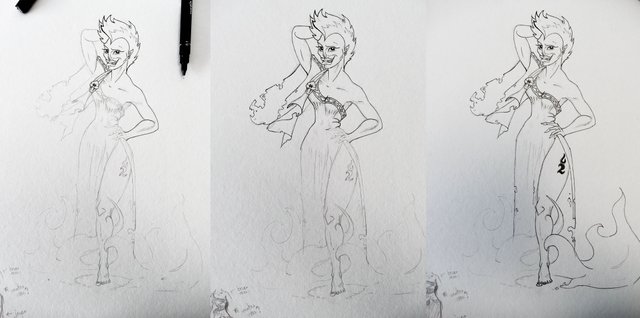
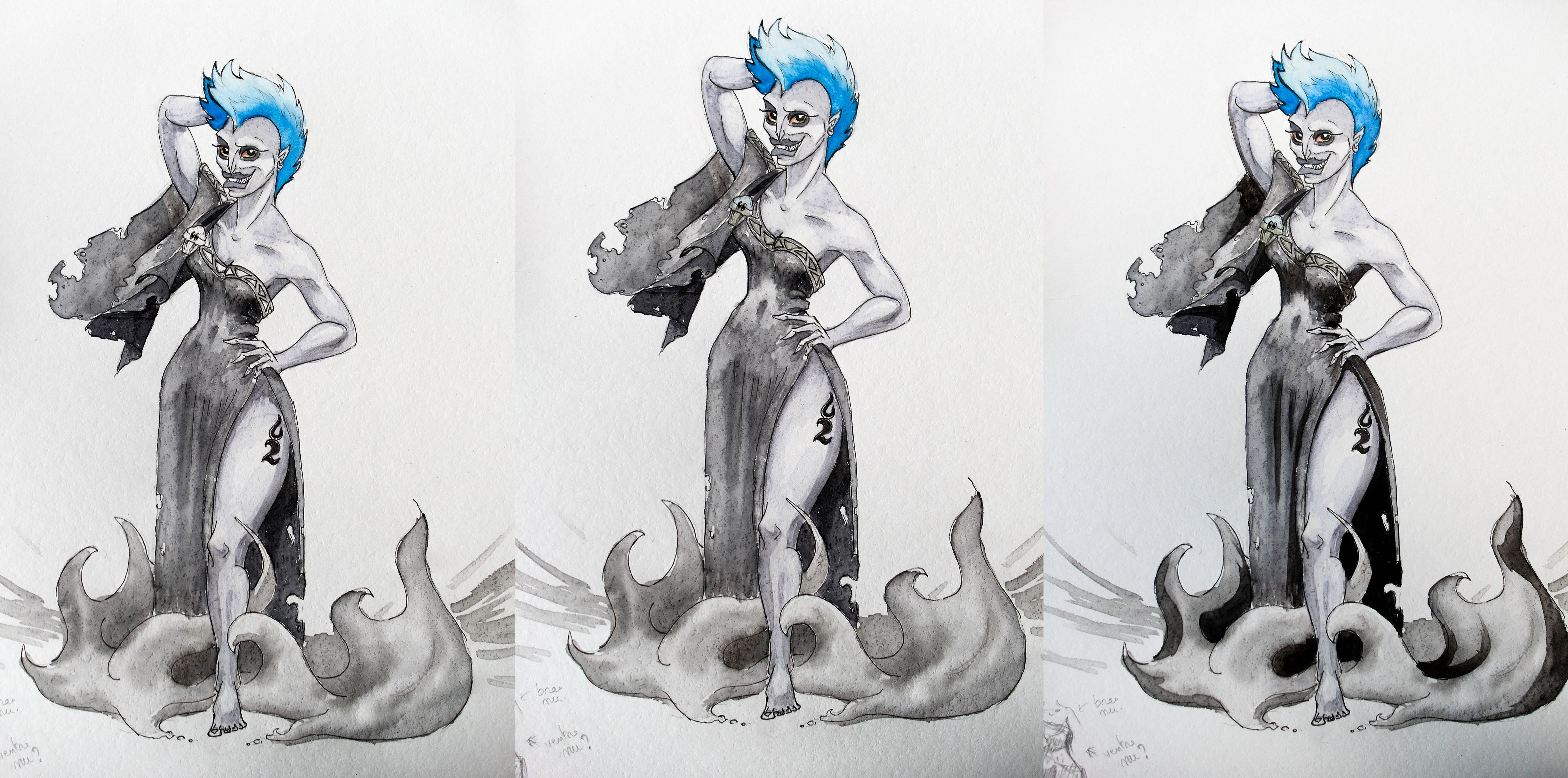
Step by Step
J'espère que ça vous a plu ! Merci à @w0olf pour l'organisation de ce concours.
N'hésitez pas à upvoter, resteemer, commenter... vous connaissez la chanson :)
Merci à vous pour votre soutien.
I hope you enjoyed it! Thanks @w0olf for the contest.
Don't hesitate to upvote, resteem, comment... you know the song :)
Thank you for your support.
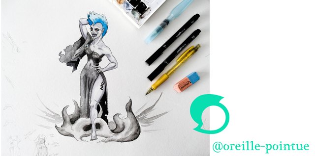
Oreille Pointue
Love the color, watercolor + pen is literally one of my favorite styles :)
Mine too ^^ I like photoshop too, but it don't have the feeling of the paper + pen. When I want to have fun while drawing, I always choose the pen + watercolor, and with this paper, it's magic :D ! The texture is so great !
Your'e a better person than me haha
I fake all of it in photosphop, watercolour brushes, ink brushes, even the texture paper,
I mean I still love the end result but it feels like i'm cheating with the infinite redos :(
It does save me alot of money on art supplies though :)
I don't think using paper makes me a better person than you. It's just a matter of preference :) you probably have a better practice on numeric painting than me.
And yes, paper + tools + watercolors are expensive... but hardware and software have a cost too (if you pay your license, which is only your concern, I will not juge). My tablet cost 350€, the computer about 1200€ (I've changed pieces, and I'll continue to improve it in the next years)... I don't think I've spend so much in papers and pencils.
I didn't know you could change the texture paper on photoshop. Do you use a layer in a specific mode or is it a fonction ?
Haha well, I bought my tablet and PC about 5 Years ago now for a grand total of about 950€
(which was a crazy amount for being just a waiter and paying for the studies at the same time, but it's still working so, hooray :)
As far a licensing I've got Adobe CC at work which I can use on two PC's, then I have an "illegal" version of CS6 at home, I don't really feel bad about that, considering it's very much outdated at this point and I use it more for practice than actually to make money off of. :/
The paper is more just something you can get off of google images or even photograph and upload yourself as the base, you can get some really cool looks with combination at different opacity's, however if you question is more about changing the look of the actual paper youve drawn on that's abit more work haha
But I can try give you a rough quick example.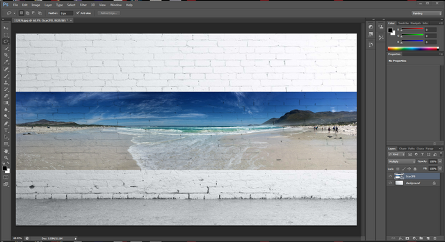
So in this instance the beach photo would be your drawing and the wall would be the texture paper, change the top layer mode to multiply and BAM! haha it looks like the beach photo has been printed onto the bricks, as would your drawing, multiply mode would make all the white areas of your drawing transparent, while letting the more shaded dark areas of the texture push through onto your image(sorry if you know all this i'm just trying to give a proper answer :)
Things start getting even cooler when you start adding texture masks and other effects on top
good idea and execution:) I like it!:)
Thank you ^^
Really funny and well done :D
You explained and showed the process great!
Definitely followed ^^
Thank you very much, and thank you for the resteem yesterday :)
I've followed you too.
No problem, it was very cool to see your workshop :D
And thank you!
Wonderful and very creative entry! And great how you swapped Hades gender :D Love it. Thanks for participating!
Thank you so much :D !
Je n'ai pas pu résister. Je l'ai encadré.
Great work! I love how much work you put into this. Good luck to you for the contest! :)
Thanks a lot :) !
Loooovvveeeeessss iiiittt
Thank you ^^ !
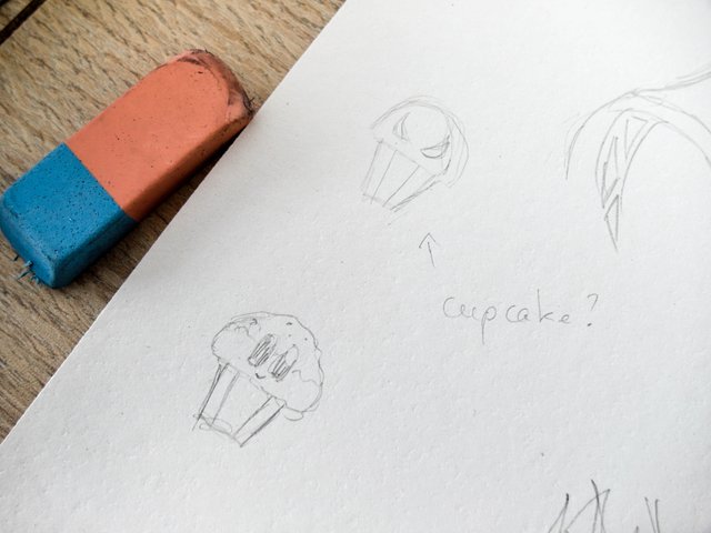
Great entry. It does look like a cupcake, lol
Thank you ^^
Yes, I was scrupulously reproducing the shape of the brooch... and then I realized that it had a cupcake shape. Love Disney.
Great work with the values of light and shadow, was even more impressive with the watercolor texture and character expression! Kudos oreillechan! :)
Thank you so much :D I've spent about 3 hours on this one, I'm proud of it.
Watercolour contrasts work in two ways: first, with good quality pigments, and then, with patience, by appliying layer by layer to intensify the blacks, without diluting the lower layer.
On this paper (which is very slightly hydrophobic when dry), I can re-wet a previously painted area to homogenize the pigments (and the contours of the area become more pigmented). Difficult to manage at first, but with practice, it's very helpful.
I love Disney's Hercules. I like how you turned Hades into a girl :)
Thanks ^^ !