Drug Abuse Advertising Campaign
Hi Steemians! Happy to be writing my first post! As I mentioned in my introductory post, I plan on posting about my Graphic Design projects. I have a lot of backdated projects, so I will begin with one of the first big projects I worked on.
Back in 2008, I was in my last year of college and specialising in Graphic Design. I hoped of getting to university to do a degree in Graphic Design. For 3 months of my last year, I worked on my"Final Major Project" which counted as 50% of the mark for the whole course! We also had an exhibition at the end of the year to showcase our "Final Major Project"(no pressure!). So, that is what I'm going to start with.
I would like to say that the images you see below aren't real and are for artistic purposes only.
Part of the "Final Major Project" was to write my own brief.
Summary
I chose 'Drug Abuse' as a theme and working title. I worked towards creating an advertising campaign to raise awareness of drug abuse. I hoped to design a range of posters, leaflets, short film and postcards. To achieve this I used the Adobe Creative Package (PhotoShop, InDesign, Premiere Pro) as well as my own photography.
Research
I went on to research as much as I could about drug abuse and advertising campaigns.
Below is a shot of my sketchbook from 2008 with my research.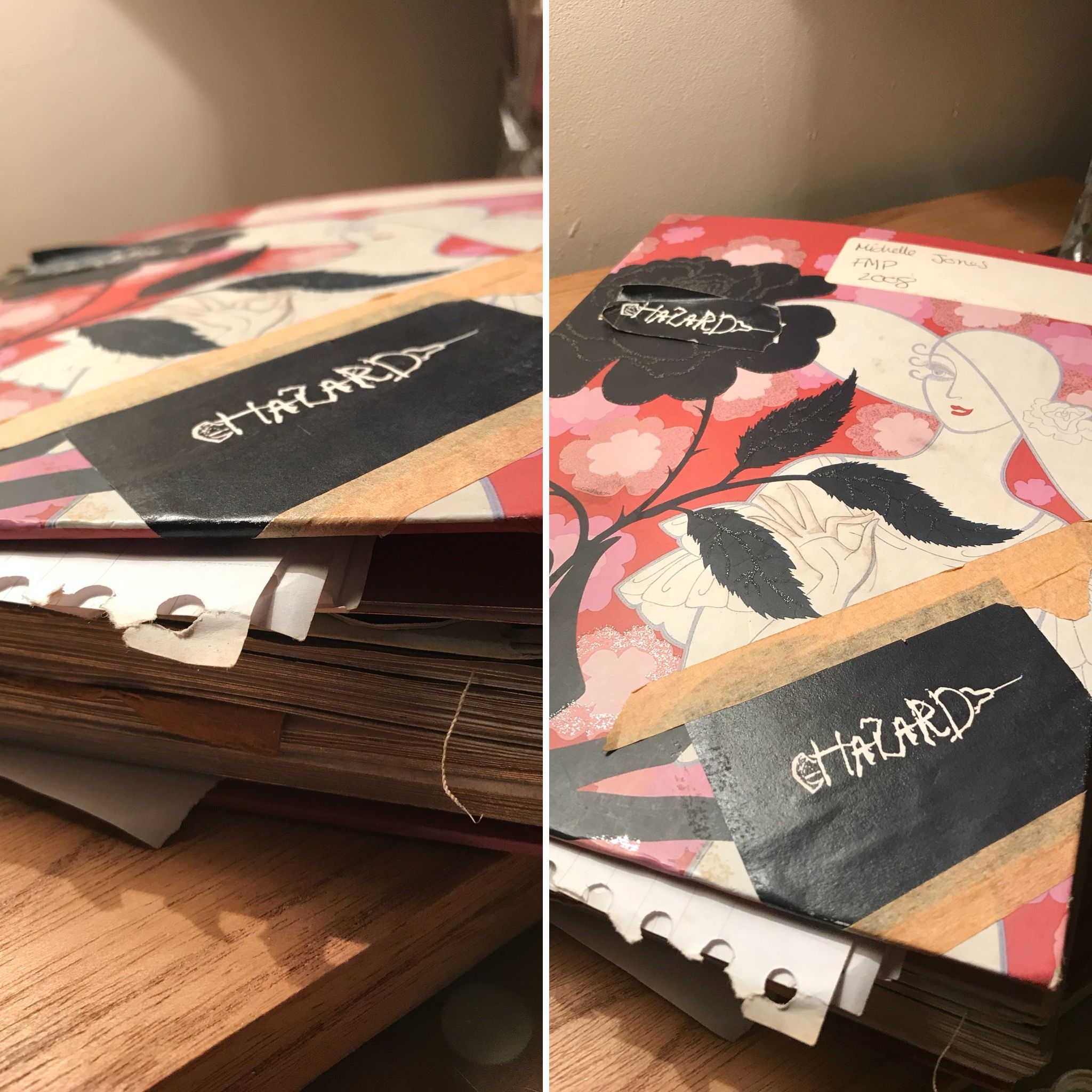
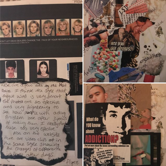
I came to the conclusion that a good advertising campaign, relating to drug abuse, contained shocking images paired with very strong strap-lines. So this is what I planned to do.
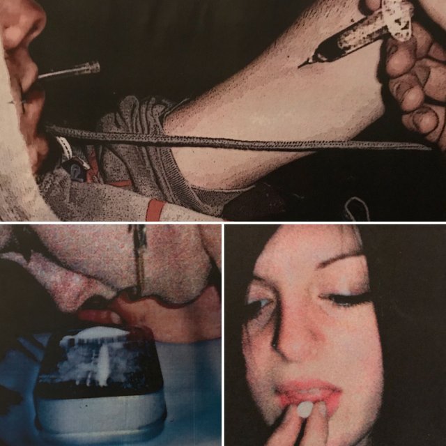
I had decided to use my own photography for this project. I asked a few friends if they would help me by posing for some photos. The photos took a few attempts. I experimented with so many different compositions. There are a few examples below.
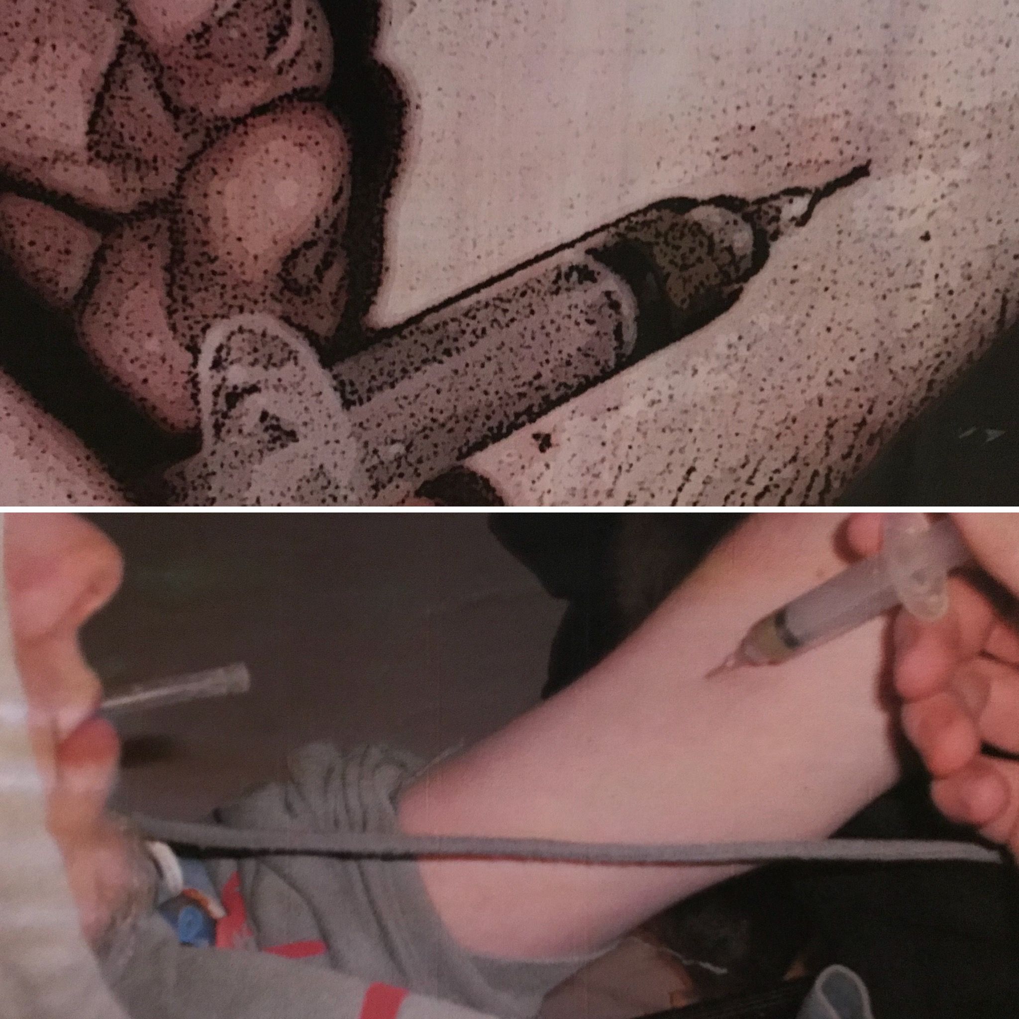
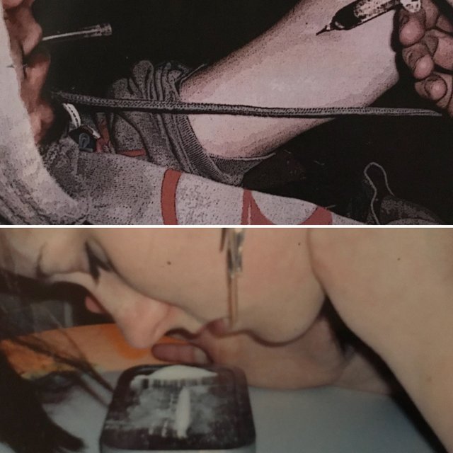
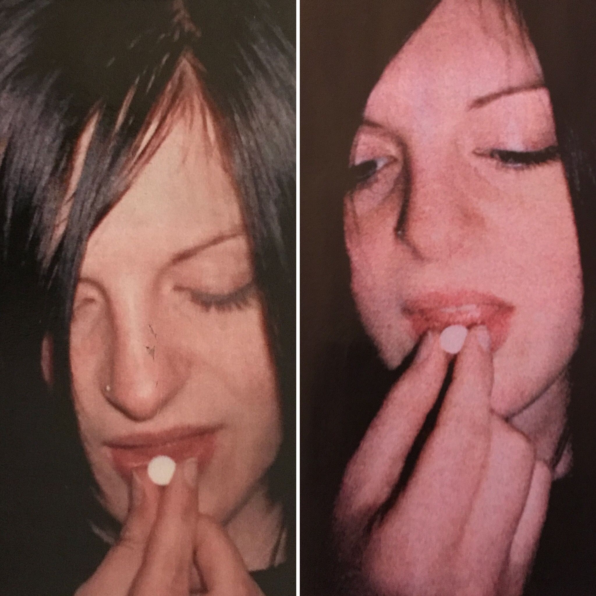
Out of all the photos, I chose one photo of each person to experiment with in PhotoShop. I explored various filters such as posterize, grain and also the contrast/brightness. I tried to achieve the grittiest and darkest effects possible. I finally decided to use the grain filter, low brightness and high contrast.
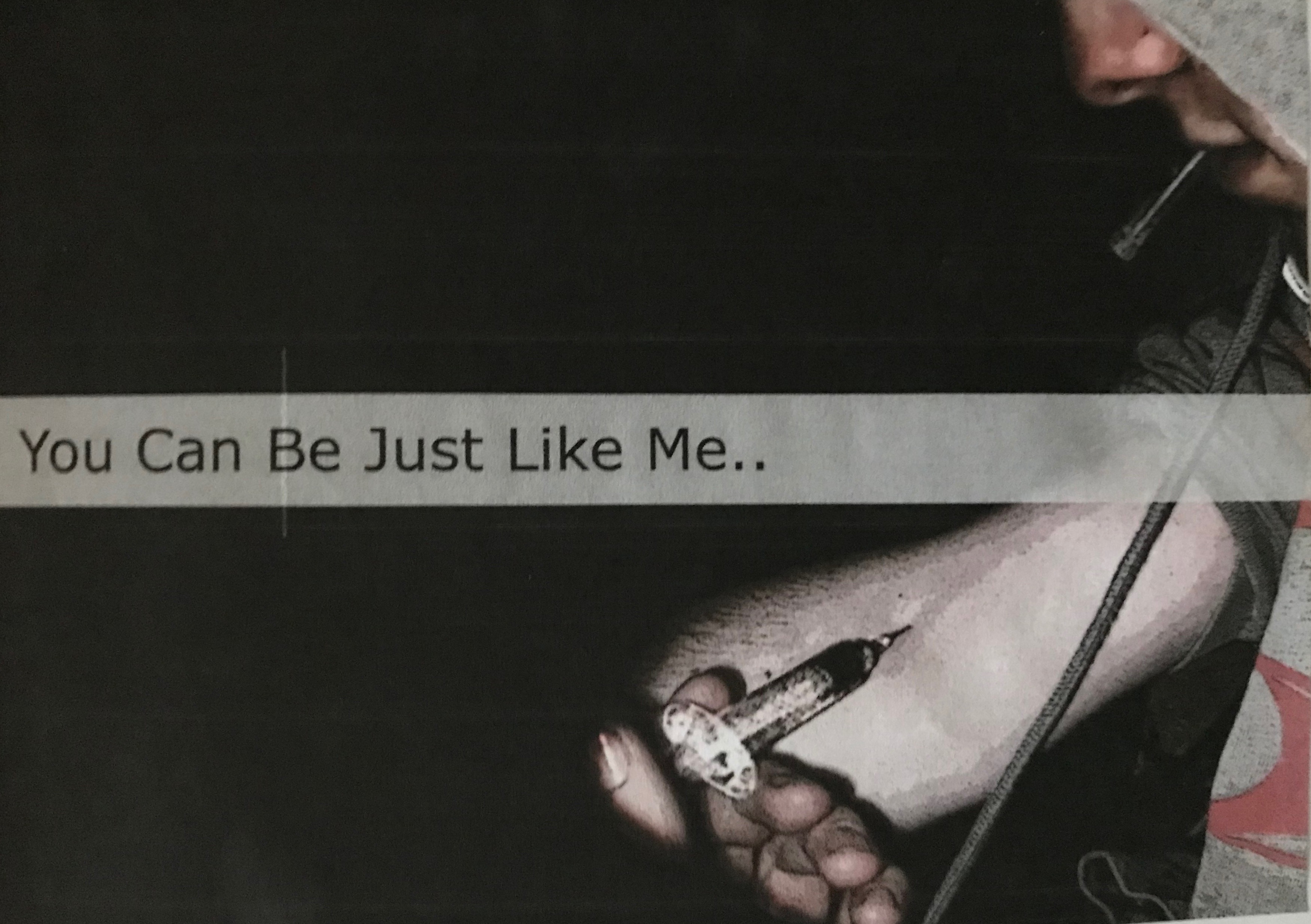
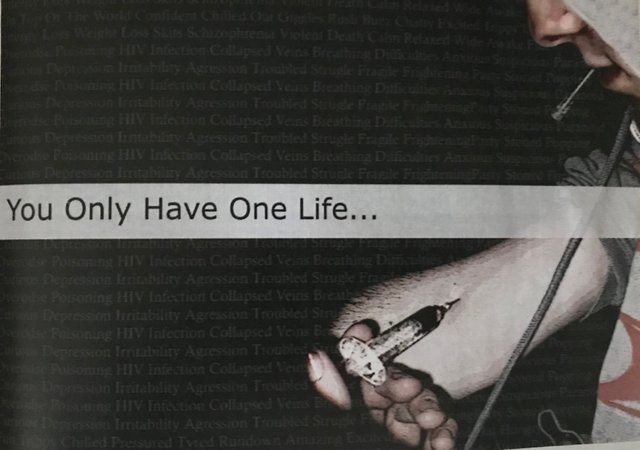
The next step was to come up with a strapline, create the designs for the advertising and a logo design for the campaign.
There were various straplines that I thought of such as:
Fancy a hit?
Wanna smack?
Drugs...worth it?
You can be just like me
You only have one life
A bit controversial I must admit! But that was the effect I was going for.
I went on to pair the images with the strap lines
I went on to design the logo. I experimented a lot (I don't have the images for these!) but I wanted to make it bold, eye-catching but simple. This was the result.
By this point in the project I was getting frustrated and didn't feel that my plan to produce ads that were shocking was going great. I went back to my original research and brainstormed to, hopefully, come up with a solution that would demonstrate the message better. I toyed with the idea of using images of the inside of a person that had suffered long-term drug abuse and creating a timeline of drug abuse within my design. I was unsuccessful in finding any decent images that were suitable for my idea/campaign.
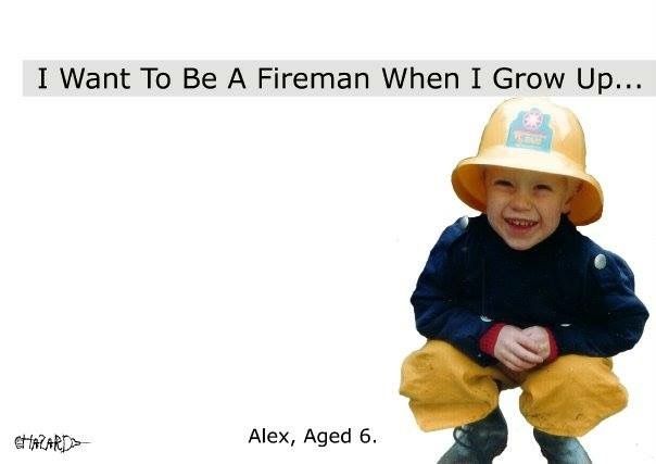
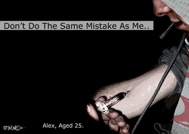
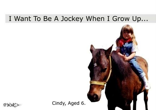
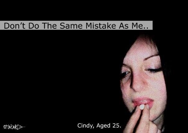
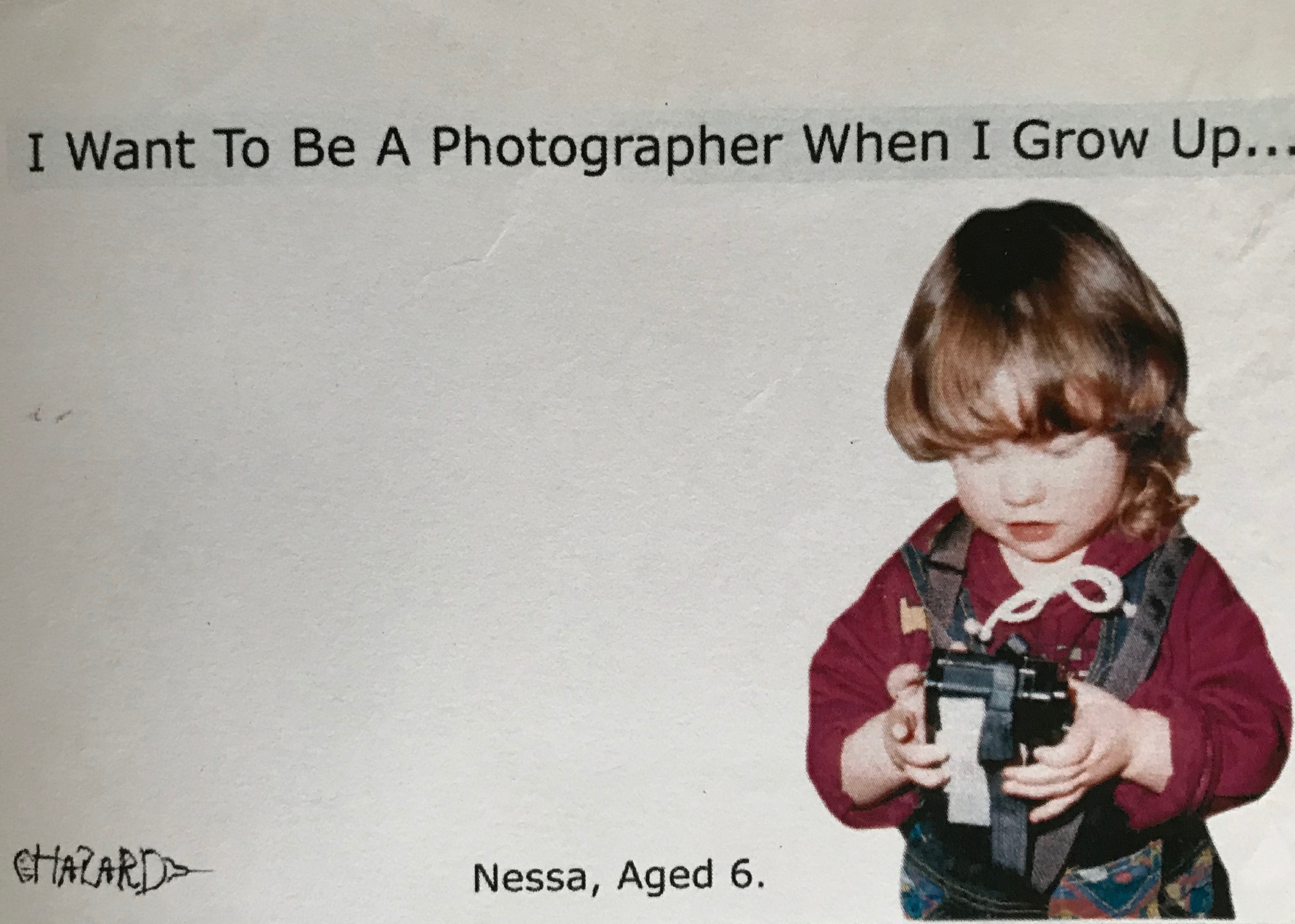
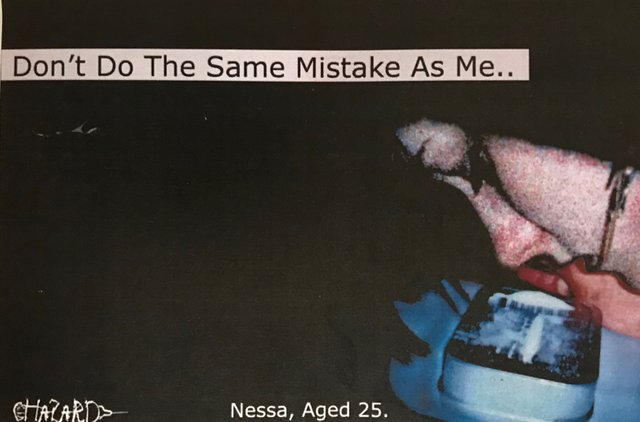
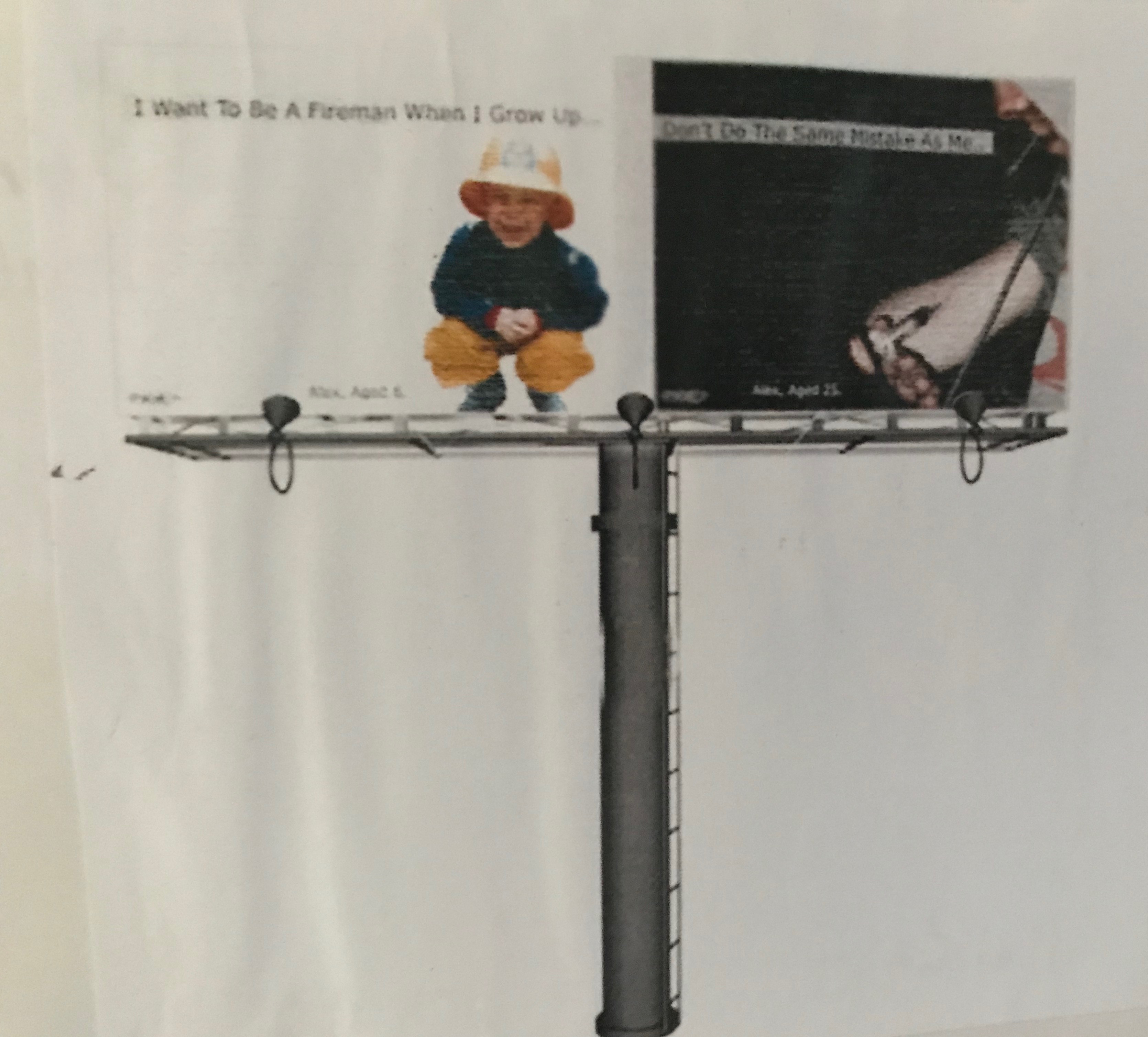
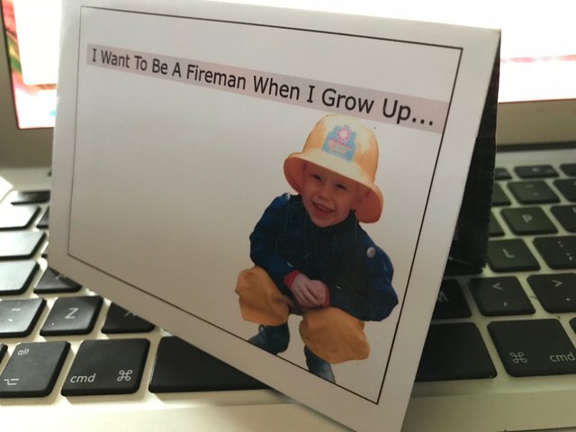
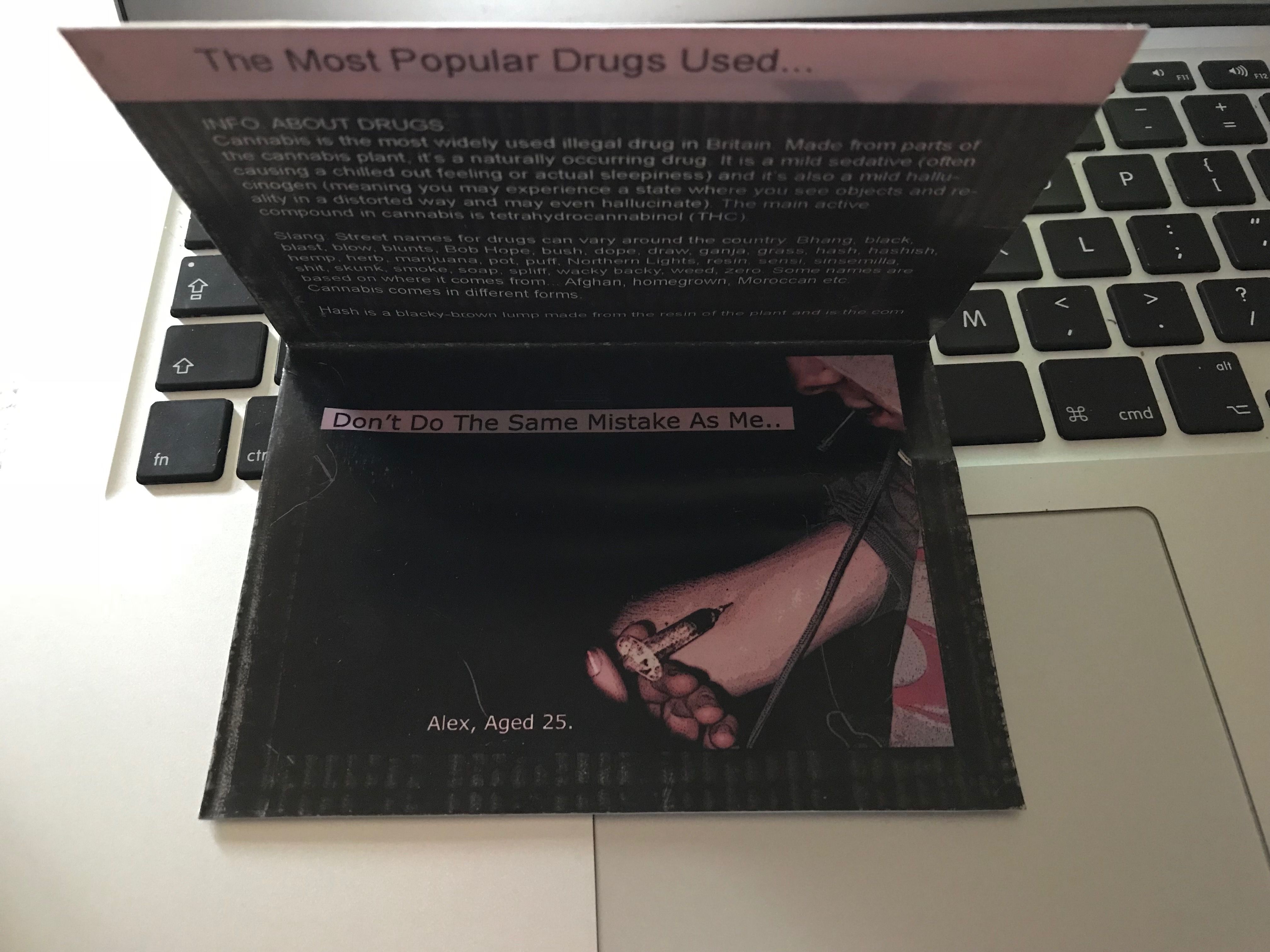
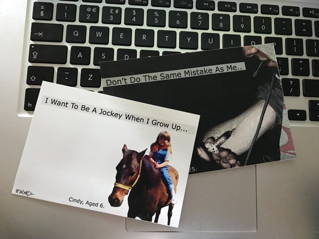
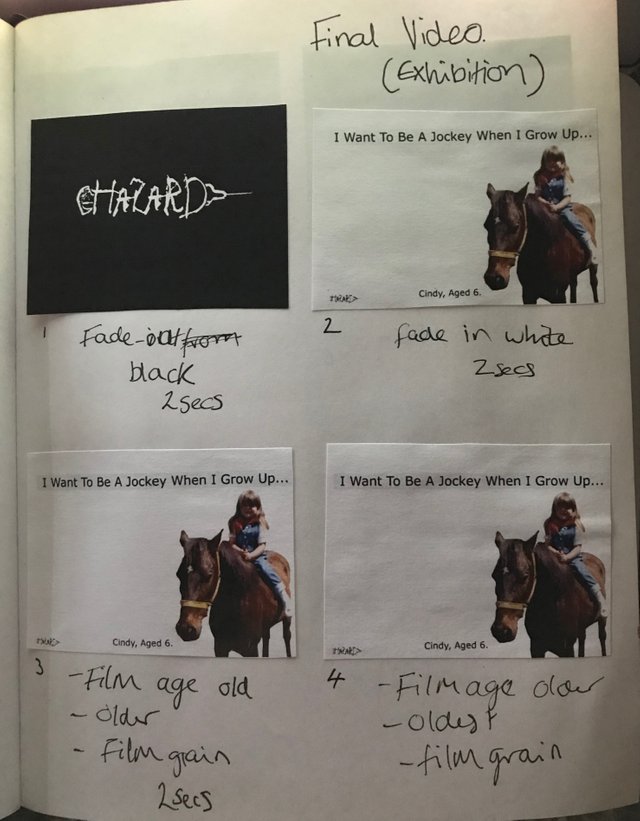
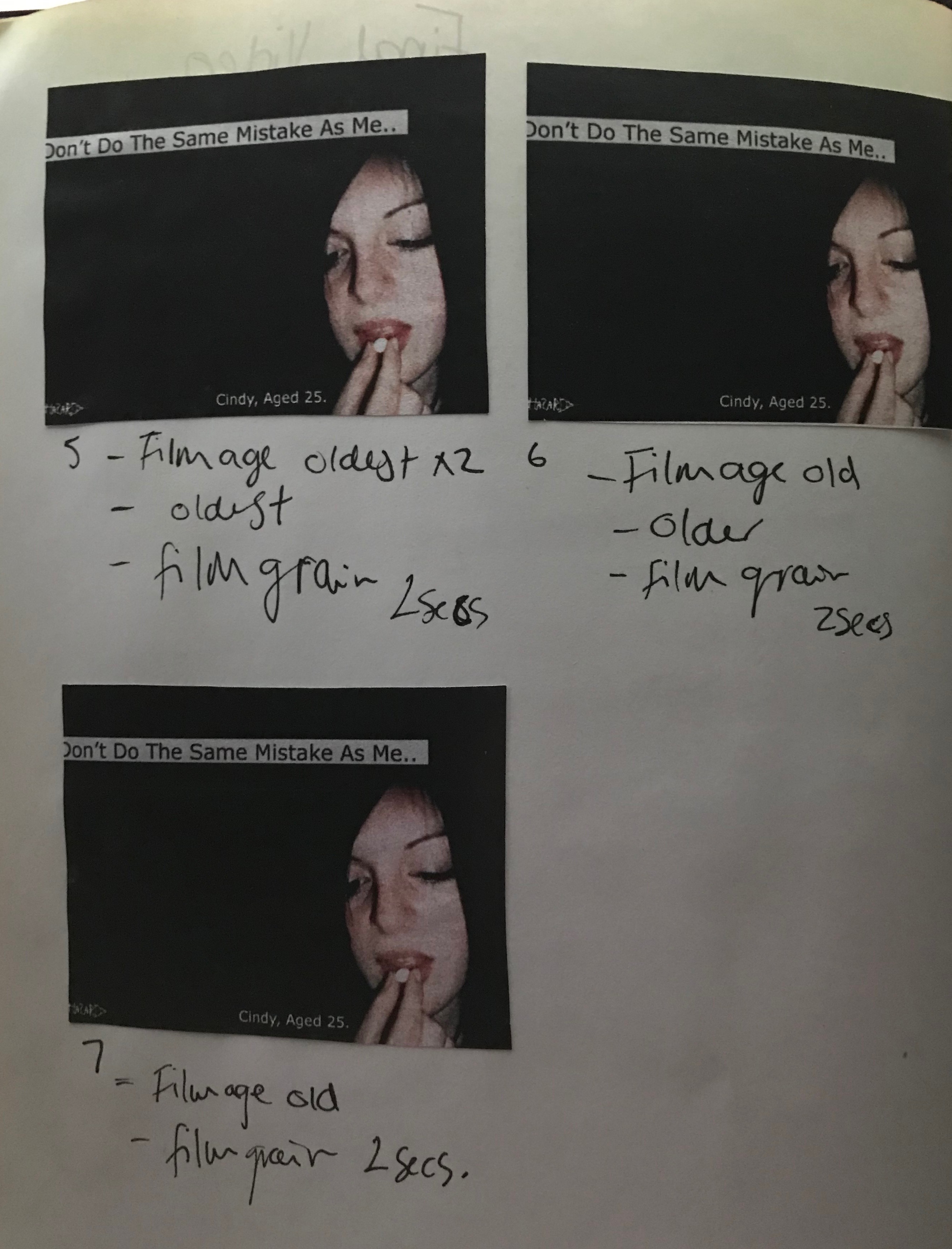
A week or so later I had a lightbulb moment! I came up with what I liked to call the "When I grow up" idea.
My new idea was to create a contrast and use images of the models from when they were children and show how a person can take the wrong path in life.
I asked my models/friends if it would be ok for me to have photos of them from when they were children.
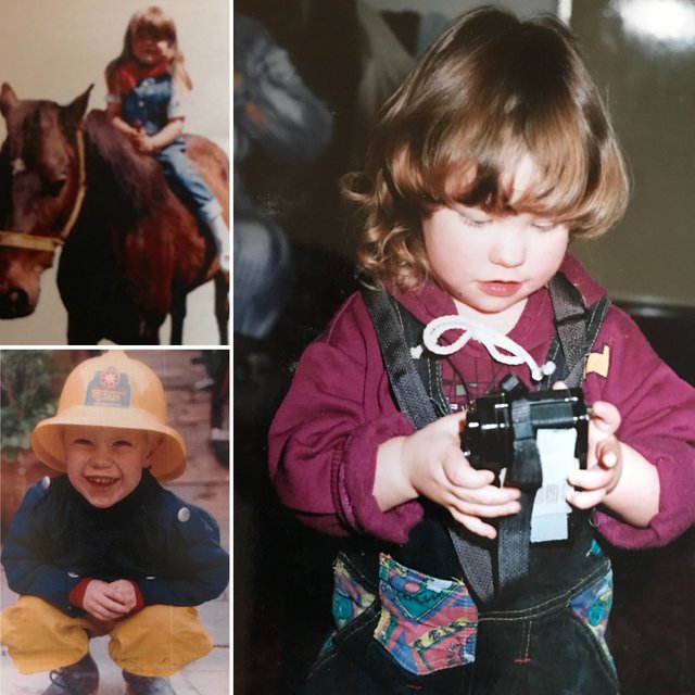
My intention was to create a shock factor and show what had happened to the innocent looking children after 20 or so years.
I used these photos and applied them to my designs along with the logo!
I went on to apply my designs to potential displays such as billboards and in magazines. I also produced leaflets and postcards.
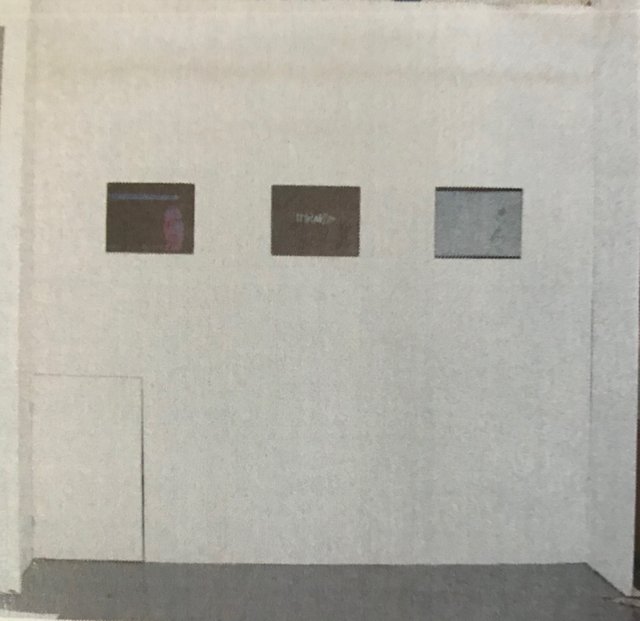
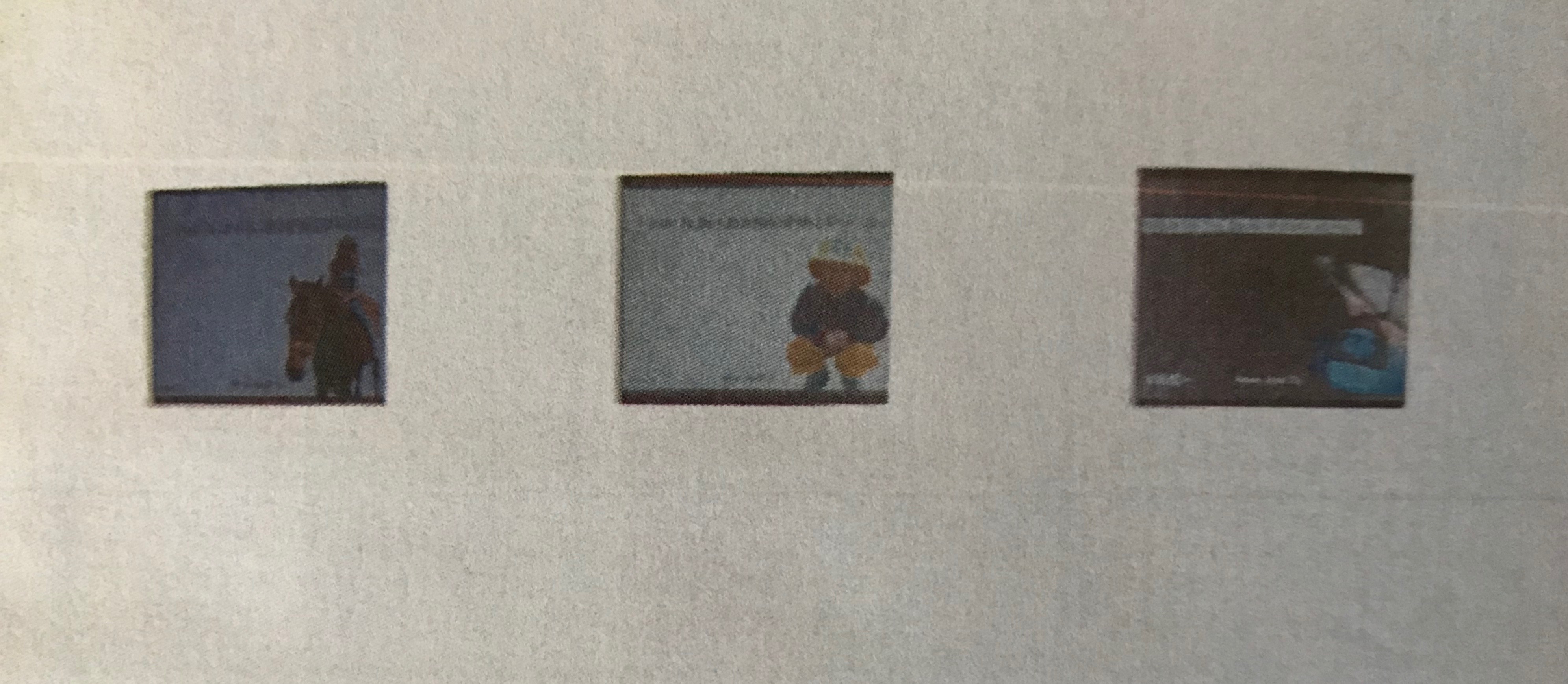
By this time in the project, it was time to start planning for the exhibition. My thought, from the start of the project, was to create a short film for the exhibition. I took my skills to the next level and created 3 different videos out of my designs to display at the exhibition. Unfortunately, I don't have these videos anymore! Below, is a timeline of one of the videos that might give you an idea of what they looked like. The videos had a glitchy effect which made them eye-catching and sinister.
For the exhibition, I set up 3 screens to display my videos!
Wow what a great post Michelle! love hearing more about your journey as a graphic designer and seeing laid out so well one of your earlier projects. This sounded like a fun project to work on, the ending results were perfect, I really like how you did the contrast thing from children to adults, stuff like that is impactful to people visually so absolutly aces. I have no doubts your career in graphic design is gonna go really far. brilliant
great post dear
Thank you
Congratulations @michellejones! You have completed some achievement on Steemit and have been rewarded with new badge(s) :
Click on any badge to view your own Board of Honor on SteemitBoard.
To support your work, I also upvoted your post!
For more information about SteemitBoard, click here
If you no longer want to receive notifications, reply to this comment with the word
STOP