You are viewing a single comment's thread from:
RE: [BeyondBitcoin Contest] EOSBit Logo Challenge 1 of 3 | 500 BeyondBits (150 $BD in Rewards!)
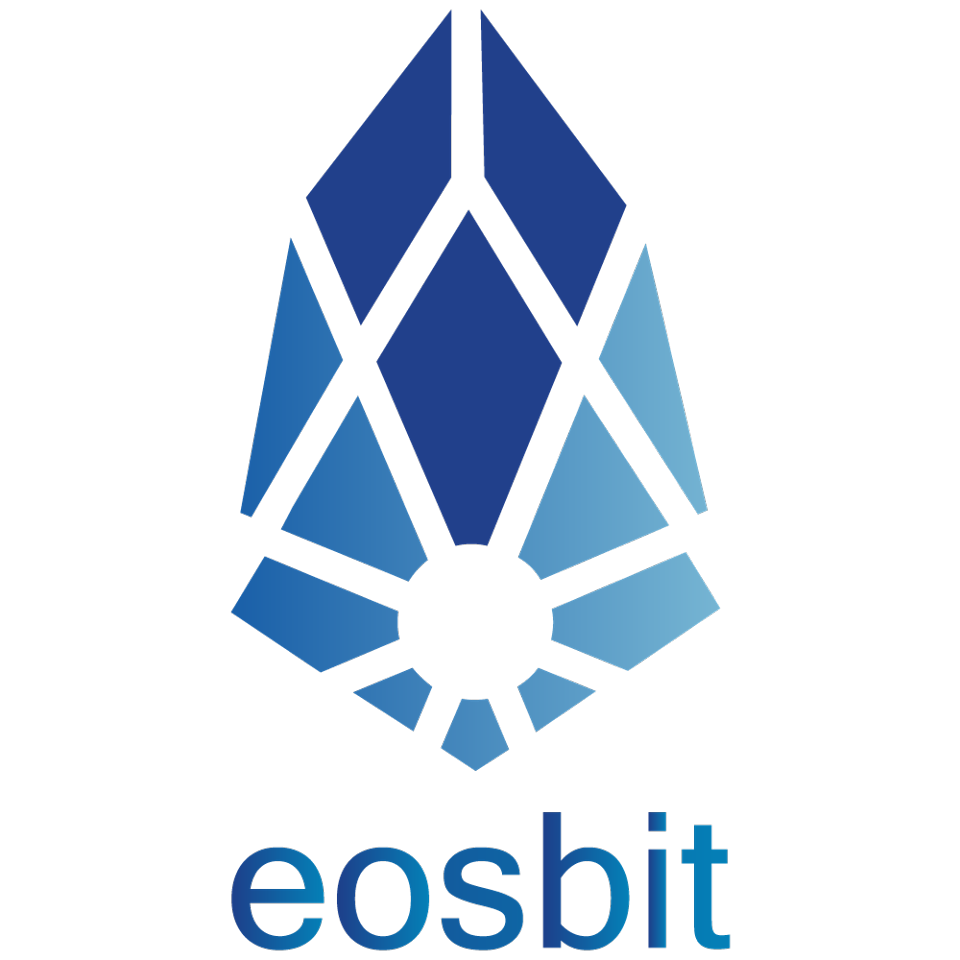
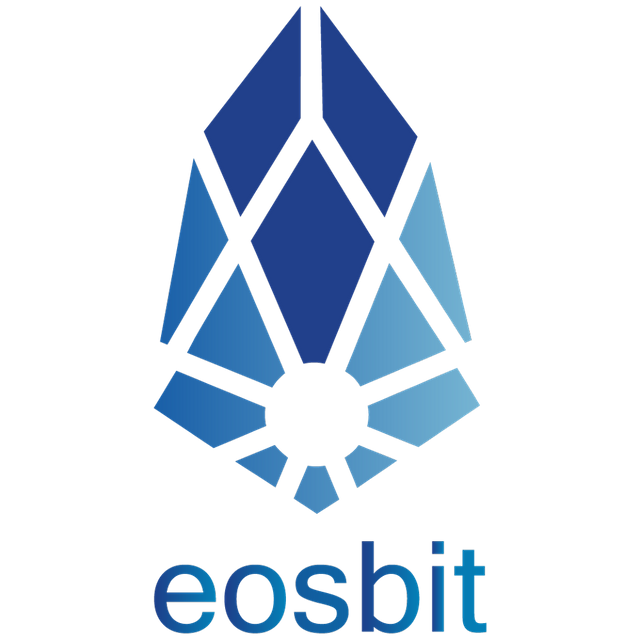
Hi @officialfuzzy, here is my entry :)
https://steemit.com/contest/@marty-arts/my-entry-for-beyondbitcoin-logo-contest
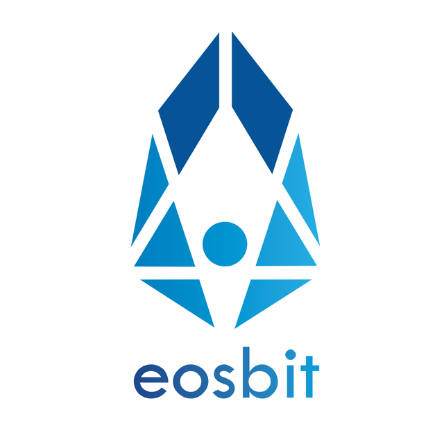
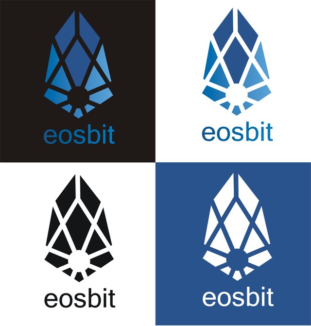
...and here is one more variant. it reminds me of a pearl inside of an opening shell...
🌟 Loving the clean and simple lines of this design!!!
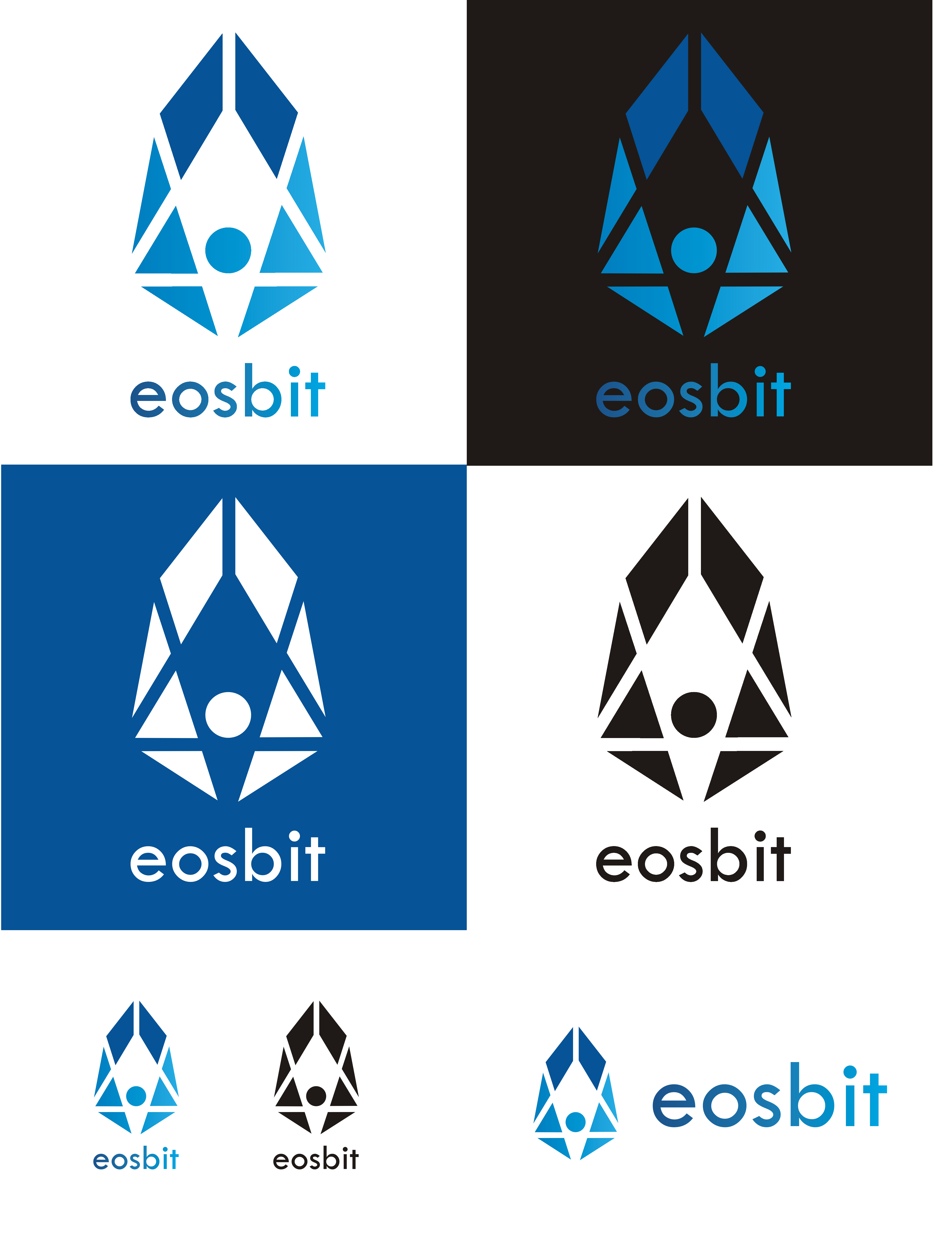
The second design style is my favorite of them... maybe even adjusting the font style to match EOS brings the clean feel full circle.
Thank you, you are right, it is better to match :) the truth is i focused more on the picture than writing, because there are many posibilities and its simple to change it.. there can be used both fonts for eos and bitshares.. also two colors dor separation..
lol...
we have another fan of this one!
I am super loving this design.
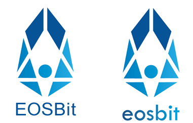
I like your design best because of the overall symetry but I think you should work out this one more:
Maybe try to do it in white. It's sort of the connecting dot which should connect us all, a centralized idea in a decentralized world?
Maybe make the lines thinner for the black background version!
glad you like it.. and what should be in white? the inside is transparent, so it depends on the background. I wanted it to be responsive and simple, so thats why the lineas are clear. It can be in one color too without problems.. and thin lines.. imagine the logo really small.. if the lines are too slim they become invisible. you can see it on the logo above :)
Wow. Pure wow...
glad you like it :)
Thats an understatement :]