Effective Trading Strategy using Line Charts ]-Steemit Crypto Academy | S6W1 | Homework Post for @dilchamo
Hello everyone, it’s another season of the Crypto Academy and in this week’s lesson, professor @dilchamo discussed about Effective Trading Strategy using Line Charts. So after reading through the lesson notes prepared and doing some research, I have decided to attempt the assignment task given.
 Edited by Canva
Question 1: Define Line charts in your own words and Identify the uses of Line charts.
Just as we talk about normal chats, the line charts is also a graph representation of the price movement of an asset in the market. This type of chart helps many investors to perform technical analysis in order to improve profits and cut down losses. The man responsible for the creation of the line charts is called Charles dow who developed this type of chart which focuses solely on the closing prices of the assets in other to form the price movement of an asset. The line chart is one which is very easy to use by beginners and experts to perform technical analysis and since it focuses on the closing prices of the asset under study, it does not require investors to input any parameters when performing analysis.
Aside from this chart being easy to use, it helps reduce the appearance of many false signals on the chart and as a results producing a more accurate chart representation of an asset. This means that, the noise in the market are reduced to the minimum with the line chart and as a results helps investor establish good market positions after making their analysis on the asset under study. Also users of this chart can also be able to identify the support and resistance levels of the asset and this also further helps to perform good analysis on the asset. Identifying the support and resistance levels of the line chart will be discussed more in the subsequent part of the post.

How to launch the Line chart on TradingView
First of all go to the TradingView platform and launch any chart of your choice.
Click on the Chart Type icon and select line.
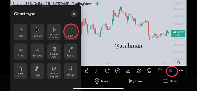
Below shows an example of a line chart.
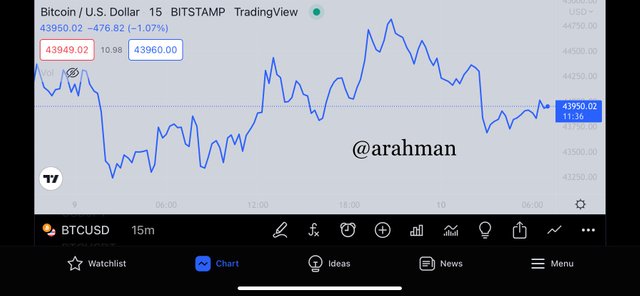 Chart of BTC/USD from TradingViewshowing a sample Line chart

Question 2: How to Identify Support and Resistance levels using Line Charts (Demonstrate with screenshots)
As I mentioned earlier, I will now talk about how you can identify the various support levels and resistance levels in the line chart and these levels are nothing new to what we have been identifying in the candlesticks charts. The constant price changes or movement of an asset in the market accounts for the formation of the line charts and this makes it possible to identify these support and resistance levels. When the market is in the trending phase, there can be back and forth movement which will help spot a support level and resistance level in the chart.
For identification of a Support level the key points to look out for in the chart is the subsequent Lower-lows in the chart and to pin point two consecutive lower lows points. After that, these two points are connected together with a Trendline in order to clearly identify the support Level in the line chart. The support line can only be formed when there is a constant buying and selling of the asset in the market whereby there is more selling of the asset under study which causes the price of the asset to become lower. As a result, lower-lows are spotted on the chart and connected to form a support line/level.
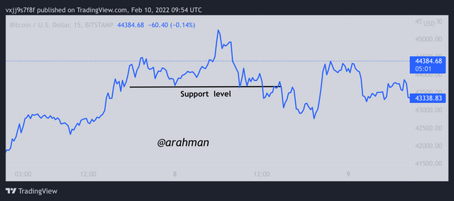 Chart of BTC/USD from TradingViewshowing support level of a line chart
Secondly, the identification of the Resistance level is the link exact opposite of the Support level. For identification of a Resistance level the key points to look out for in the chart is the subsequent higher-highs in the chart and to pin point two consecutive higher-highs points. After that, these two points are connected together with a Trendline in order to clearly identify the Resistance level in the line chart. The Resistance level can only be formed when there is a constant buying and selling of the asset in the market whereby there is more buying of the asset under study which causes the price of the asset to become higher. As a result, higher-highs are spotted on the chart and connected to form a Resistanceline/level.
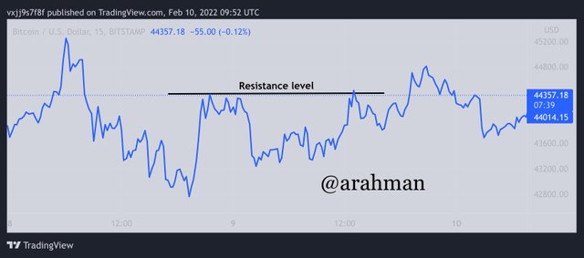 Chart of BTC/USD from TradingViewshowing Resistance level of a line chart
Question 3: Differentiate between line charts and Candlestick charts.( Demonstrate with screenshots)
With these two charts, they come with very different features which makes it very easy to the difference between the line chart and the
Candlestick chart. One major and very simple difference is that, the color of the line chart is just one and it is mostly blue from TradingView but the candlesticks chart pattern usually shows two different colors (red and green) in TradingView website.
As a result of this, the Line chart only focuses on the closing prices of the asset that is being analyzed in order to form the price chart of the asset and this accounts for its natural structure with just one single line. But with the Candlestick chart, it focuses on information like Opening, High, Low prices and closing price to display the structure of the candlesticks chart.
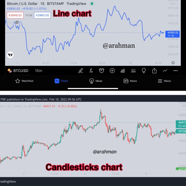 Chart of BTC/USD from TradingView
With regards to the Line charts, it is very easy to read and reduces the noise in the market. Thus, it filters out wrong market signals and helps traders to identify proper market positions in order to increase their profits. But with the Candlesticks chart on the other hand, several information accounts for its structure and hence there maybe false and wrong signals provided by this type of charts. This also accounts for the noises created when using this type of chart.
Because the line chart is very easy to read and it reduces noise in the market, it will be more suitable to be used by many traders as compared to that of the candlesticks chart.

Question 4: Explain the other Suitable indicators that can be used with Line charts. (Demonstrate with screenshots)
One major understanding I have learned about technical analysis is that, there’s no way investors can rely on just one indicator or strategy to perform analysis. This is because all these indicators or strategies cannot be 100% reliable or accurate and as a result, it is always recommended by many professionals to use two(2) or more indicators/strategies in order to yield a more accurate and reliable analysis of an asset. This will help improve good market decisions and increase our profits.
As a result of this I usually combine the Relative Strength Index (RSI) with other strategies/indicators when performing analysis which is the indicator I am most familiar with. The default parameters is set from 0-100 and with the Oversold region ranging from 0-30 while the overbought region ranges from 70-100. This simply means that, when the market is in the overbought region, it is a signal to prepare an exit in the market since there may be a downtrend approaching and the vise versa is said about the oversold region.
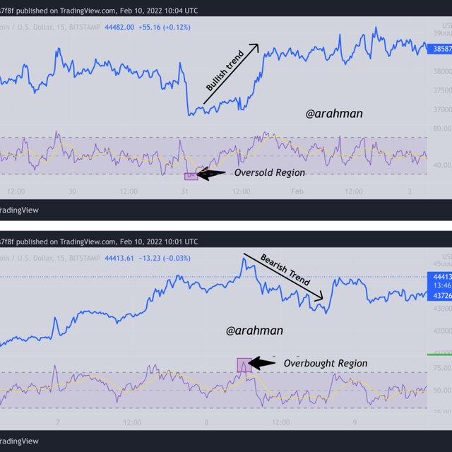 Chart of BTC/USD from TradingView
So basically, the RSI helps to confirm market trend signals that may be produced with the line chart. With an overbought region signal for a bearish trend in the market and oversold region signaling for an uptrend in the market. With this, I believe the RSI will be very useful together with the line chart to produce more accurate and reliable analysis of an asset.

Question 5: Prove your Understanding of Bullish and Bearish Trading opportunities using Line charts. (Demonstrate with screenshots)
In my previous paragraphs, I have been able to explain a little about uptrend and downtrend using the RSI indicator. In this part of the assignment, I shall be using the RSI indicator to further explain my understanding of Bullish and Bearish trend opportunities in a line chart since it is more or less the same as uptrend and downtrend.
I would like to talk about the Bullish trend movement first and how it can be spotted. As I mentioned earlier, the oversold region of the RSI Indicator is a signal which predicts forth coming of a bullish/uptrend.
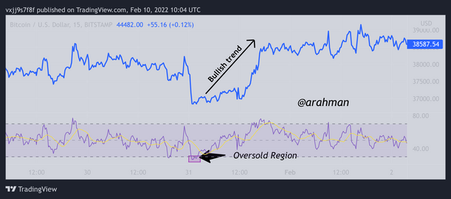 Chart of BTC/USD from TradingViewshowing bullish trend in line chart
This simply means that, there has been more of hard sales that have been made on the current asset under study and this causes gradual price reduction/depreciation of the asset until it reaches its minimum where there is a trend reversal. This trend reversal signals the end of a bearish period and formation of a new trend which is the bullish trend. So basically the oversold region from the RSI is signal to investors to set up market positions in order to benefit from the upcoming bullish opportunity in the market.
Now I will talk about the Bearish trend movement and how it can be spotted. As I mentioned earlier, the overbought region of the RSI Indicator is a signal which predicts forth coming of a bearish/downtrend.
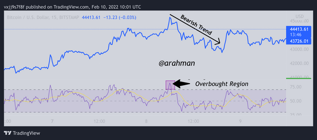 Chart of BTC/USD from TradingViewshowing bearish trend in line chart
This simply means that, there has been more of hard purchases that have been made on the current asset under study and this causes gradual price increments/rising of the asset until it reaches its peak where there is a trend reversal. This trend reversal signals the end of a bullish period and formation of a new trend which is the bearish trend. So basically the oversold region from the RSI is signal to investors to set up market positions in order to benefit from the upcoming bearish opportunity in the market.
Other chart patterns such as the triangle shape formation can also be used to explore the bulling and bearish price movement of an asset in other to benefit from the bullish and bearish opportunities from the market.

Question 6: Investigate the Advantages and Disadvantages of Line charts according to your Knowledge.
Advantages Of Line Chart
One very important fact about the line chart is that, it is very easy to read/use and can be used by both beginners and experts in the trading environment. The price movement is made of one single line which makes it very easy to read.
It focuses solely on the closing price of the asset which accounts for the single string of line and hence reduces the noise in the market, providing more accurate signals.
Line charts do not require computation of parameters unlike the indicators.
Line charts are very simple to read and the results shown is very reliable than that of candlesticks chart.
Just as I said earlier, indicator or strategy can be fully reliable or produce a completely accurate results. That is is why 2 or more are usually combined. With that, I will now explore some of the disadvantages of the line chart.

Disadvantages Of Line Chart
Since there is no full information provided on the chart such as opening, high and low price indices, there is a doubt created in the minds of some traders as to if the analysis is accurate or not.
The line chart is more beneficial when it is used to perform analysis on a longer period timeframe. Hence when it is used in a short time interval, the results are usually not reliable.
Line charts does not show other signals and parameters such as supply and Demand which might be of use in the analysis.

Conclusion
The line chart is simply a summarize form or a more simple version of that of the candlesticks chart which makes it very easy to read and understand. As a result of this, the noises that are created from the candlesticks are removed in the line charts and further makes it easier to read even with a little understanding of asset charts. Also the line chart helps investors identify the support and resistance levels of an asset which makes it easier to follow the market trend of an asset and anticipate good market positions.
Lastly, the line chart cannot be fully trusted to provide traders with an accurate results, hence it is always advisable to combine it with another indicator(s) in order to improve the analysis and make proper market decisions. This will help investors increase their profits from the market and also reduce their losses to the minimum. For example, I have decided to combine the line chart with RSI indicator in my analysis and it has help me to come up with proper market decisions.
I would like to thank the professor @dilchamo for such an excellent delivery of this lesson and I will to continue to journey of learning with the professor in the subsequent lessons to come. Thank you for reading.