Effective Trading Strategy using Line Charts - Crypto Academy / S6W1 - Homework Post for @dilchamo

Question 1
Define Line charts in your own words and Identify the uses of Line charts.
Charts as we all know are diagrams used to represent information. In cryptocurrency terms charts are used to monitor the performance of a crypto asset taking into consideration its price changes, its support and resistance levels.
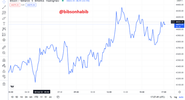
A line chart is a diagram which is made up of a single trend line which moves in relation to the performance or price changes of a cryptocurrency. i.e the line chart moves upwards when the price of the cryptocurrency increases and drops should there be a decrease in the price of the crypto asset.
Line charts are one of the simplest chart diagrams which can be read and understood even by a new crypto investor. Line charts are used by investors to monitor the price movements and trend changes of their desired crypto assets.
Line charts make use of historical price data of the cryptocurrency, hence all the closing prices of the cryptocurrency are joined together, making it much easier for traders to notice sharp price movements and perform the needed analysis which makes spotting resistance and support levels of the crypto asset very easy.
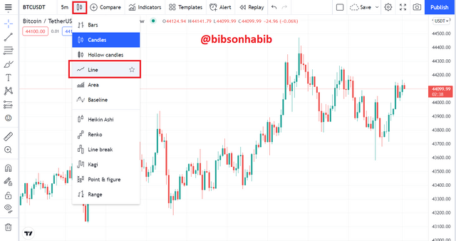
To use the line chart, click on the chart settings on the tradingview website and click on line.
Uses of Line charts
The representation of line chart diagrams is much easier to read and understand. Since it contains one trend line, a fall in the line would mean a downtrend, and a rise will indicate vice versa.
The clear representation of line charts helps to remove or filter noise in the market.
Helps to easily identify support and resistance levels. Since the line chart uses historical price information and also joins the closing prices together, a careful study of the chart will show past support and resistance levels of the cryptocurrency, which can help in current and future predictions of these levels.
Since line charts provide information on support and resistance levels, it provides key trading information for traders to enable them know when to enter and exit the market. So as to maximize their gains and curb their losses.
Question 2
How to Identify Support and Resistance levels using Line Charts (Demonstrate with screenshots).
Support and resistance levels are the basic key parameters of crypto space. Any successful trader in the cryptocurrency market understands these terms.
A support level indicates buying pressure, hence a chance for traders to enter the market. The resistance level also indicates selling pressure, which means that most traders are exiting the market at this stage. Any trader who seeks to make profits or cut his losses would exit the market at this stage.
Support level
The support level of a crypto asset refers to a certain price value where the cryptocurrency does not fall below over a specific period of time due to a higher buying pressure by investors, thereby preventing its price from dipping further.
To identify support levels on a line chart, the trader should identify current price downtrends and join these points with a straight line. If the line passes through at least 3 points, then we can refer to that price point as the support level of the asset. Let’s look at screenshot below of the BTC/USDT chart.
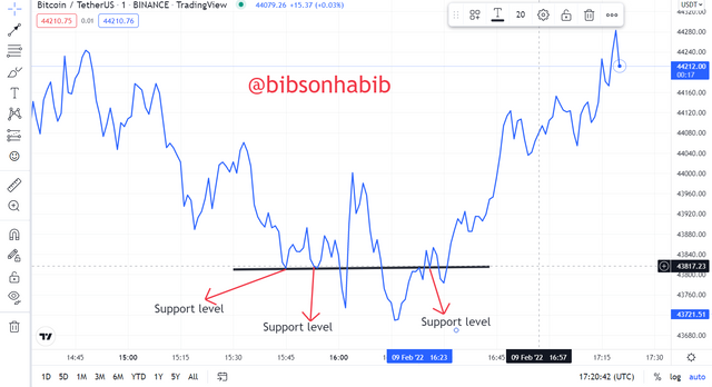
We can see that when the price of BTC gets to $43817.23, it’s price fail to decrease. Ruling a trend line across these prices points we can see that the line touches at least three of these points, indicating that the $43,817.23 price mark is its support level.
Resistance Level
Resistance level of a cryptocurrency refers to a certain price value of the cryptocurrency where the price of the cryptocurrency does not increase above over a specific period of time. This is due to the high selling pressure of investors as they are taking profits, thereby exiting the market.
This forces prices to reduce as its supply on the market would be greater than its demand. To identify resistance levels on the line chart, the trader should identify current price uptrends and join these points with a straight line.
If the line passes through at least 3 points, then we can refer to that price as the resistance level of the asset. Let’s look at the example below of the BTC/USDT chart.
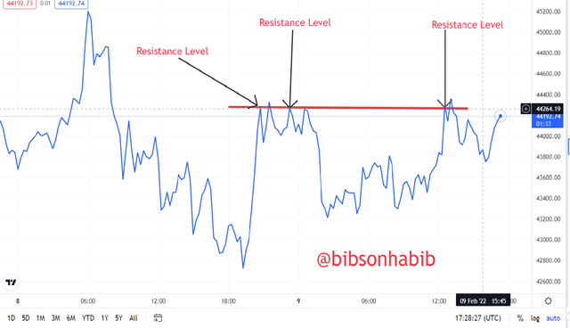
We can see that when the prices get to $44,264.19, prices do not appreciate greatly any further. Ruling a trend line across these prices points we can see that the line touches at least three of these points, indicating the $44,264.19 price mark is the resistance level.
Question 3
Differentiate between line charts and Candlestick charts.( Demonstrate with screenshots).
Line chart
As said earlier, the line chart is made up of a single continuous oscillating line which moves in correlation to price changes of an asset.
Candlestick Pattern
A candlestick chart is made up distinct lines i.e they are separated from each other and not joined to each other as in line chart. A line on the candlestick chart is made up of an opening and closing price, body, high and low.
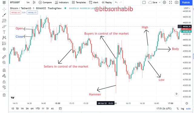
A Green candlestick with a larger body would suggest that buyers are in control of the market.
A Red candlestick with a larger body indicates that sellers have taken control of the market.
Some candlestick chart terminologies include: hammer, Doji, Shooting star and hanging man.
Differences Between Line Charts and Candlestick Charts
Simplicity and Understanding
In terms of simplicity and understanding, the line chart is easier to understand since it is made up of one oscillating line. Compared to the candlestick pattern, candlestick patterns have different parts like wicks, body, open and close.
This makes it difficult for a beginner to read and understand.
Performing Technical Analysis
In terms of performing analysis with a higher degree of accuracy , the line charts lag behind in this aspect since they are less sophisticated.
The candlestick pattern however with chart patterns like hammers, hanging man, shooting star, and Doji, investors who study and know these charts know how to react to any of the candle charts. This enables them to perform analysis to a high degree of certainty.
Providing Key Market Information
Also, the candlestick pattern can provide high insights into the market like the buying or selling pressure on the market.For example an emergence of a hammer indicates that the price of an asset has reached its support level.
A Doji would also indicate that prices would uptrend very soon. Line charts fail to provide investors with such important information.
Performing Analysis Over Long Periods
Line charts are also useful in performing analysis over long periods as they provide useful information on the price movements and trends. Candlestick patterns are however complex to interpret in this regard.
Question 4
Explain the other Suitable indicators that can be used with Line charts.(Demonstrate with screenshots)
In this regard, I would be using the Moving Average ( MA) indicator and the Relative Strength Index (RSI).
Moving Average (MA)
This indicator is made up of a single continuous oscillating line which is used to determine the trend of the price of a crypto asset. The MA had a wide range of values.
A 20-50 MA is used to determine trend direction for a short , a 50-100 MA to determine trend direction for a slightly longer period whiles a 100-200 MA value is used to determine price trend direction for a longer period.
In the screenshot below, we can see that the MA indicator moves in correspondence with the trend direction of the line chart indicates.
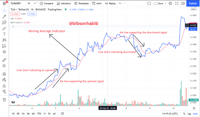
When the line chart indicates an uptrend, the MA indicator also indicates same. Also when line chart indicates a downtrend, the MA supports it.
Relative Strength Index
In this context, I will be combining the line chart with the Relative Strength Index.
The RSI is also a technical momentum indicator which is used to determine overbought and oversold market signals on the market.
Overbought signal on the RSI suggests that more buyers are entering the market, while an Oversold signal suggests selling pressure in the market.
Similar to the Moving Average indicator, it is also made up of one trend line which moves in relation to the current market trend. i.e moves up and down to represent an uptrend and downtrend in price respectively.
The RSI indicator range from values of 0-100.
A 0-30 RSI value indicates that the asset is oversold , which shows that price of the asset would soon uptrend. Whiles a 70~100 RSI value shows that the asset is overbought, stating that a price downtrend is very likely.
This gives traders key trading signals as to what the market trend would be to enable them enter and exit the market easily in order to curb their losses and maximize their gains.
Let’s take a look at the screenshot of the BTC/USDT chart.
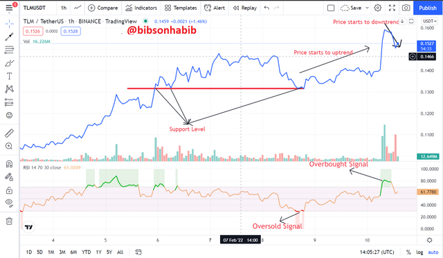
From the screenshot, we can see that at the resistance level of the line chart, the RSI also indicates Oversold. After both indications, we can see that price start to move in the uptrend/upwards direction.
Sooner we see that the RSI indicates an overbought region and true to that the price of the asset on the line chart starts to downtrend.
With this, the RSI indicator seem to be a very good indicator and would yield great results when paired with the line chart.
Question 5
Prove your Understanding of Bullish and Bearish Trading opportunities using Line charts. (Demonstrate with screenshots)
Trading opportunities are chances or possibilities a trader has in order to make profits or at least minimize his losses.
With this, a bullish trading opportunity is therefore a trading opportunity where prices are in an uptrend and a trader can make profits should he recognize such opportunity.
A bearish trading opportunity is one in which the price of assets are in a downtrend and a trader can exit the market in order to curb his losses if he recognizes this opportunity.
In this regard, I would be using the Moving Average (MA) indicator in conjunction with the Line chart to Show both bullish and bearish trading opportunities.
Moving average (MA) is a technical indicator whose value is calculated in order to determine the trend direction of the price of a cryptocurrency. With this, investors can easily identify support and resistance levels in order to maximize their gains.
The single trend line of the Moving Average indicator moves in accordance to the price trend of the crypto asset.
Similar to Line charts, a rise in the MA trend line indicates price uptrend and a fall in the MA indicates vice versa.
In this regard, I would be using Crossovers method in MA to indicate how to site both bullish and bearish trading opportunities.
Bullish scenario
In this regard, I would be using two MA lines to demonstrate. The 20 MA line or the short MA line and the long or 50 MA line.
For a bullish trading opportunity, the 20 MA line should cross above the 50 MA line. When this cross over occurs, is known as the Golden Cross. Then the Golden Cross occurs, it shows that buyers are in control of the market and hence an uptrend would soon occur.
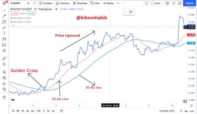
We can see from the screenshot that as golden crossover occurs, prices start to uptrend greatly.
BearIsh scenario
Contrary to the Bullish movement, for a bearish trading opportunity to occur, the 20 MA line must cross below the 50 MA line. This cross over is known as the Death Cross.
When this occurs, it indicates a selling pressure i.e sellers are in control of the market, hence prices would downtrend soon. Hence a bearish price movement would be apparent.
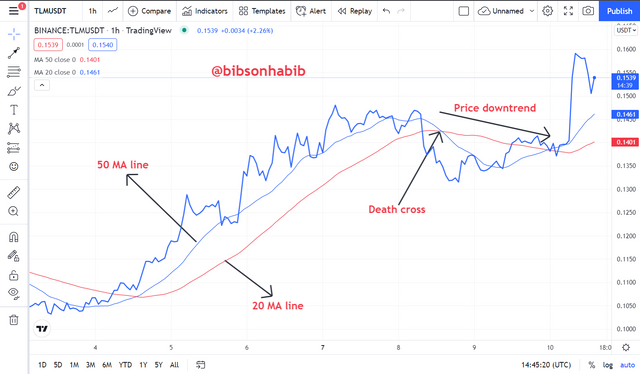
From the screenshot, we can see from the TLM/USDT chart that as soon as the death cross crossover occurs, the price of TLM starts to downtrend.
Question 6
Investigate the Advantages and Disadvantages of Line charts according to your Knowledge.
Just like any other chart, line charts also have their strength and weakness.
Let’s refer to the table below.
| ADVANTAGES | DISADVANTAGES |
|---|---|
| Line charts are easier to read and interpret | Lack of sophistication of line charts makes it difficult for it to be used to perform complex analysis |
| Line charts are very key to investors in observing price and trend changes over a long period of time | Line charts do not provide in-depth information on the market. For example, the intensity of the buying or selling pressure. Charts like candlesticks can provide this information. |
| Line charts can also be used to trace meager increases or decreases in the price of an asset which other charts may not detect | When a wide range of values to be plotted on the line graph it becomes very challenging or even possible to plot. This could also lead to plotting too many points, which makes it difficult for the graph to be read. |
Conclusion
A line chart consists of a single trend line which moves in relation to the price trend of an asset. Knowledge of reading line charts enables investors to spot support and resistance levels.
Just like any other indicator, the line chart is not 100% accurate in its signals.
However combined with some indicators, can result in desired analysis results.
I would therefore urge newbies in cryptocurrency trading to learn more on line graphs and all the key indicators required to perform technical analysis to enable them to strive well in the crypto space.
Greetings to all professors and members of this wonderful community.
My warm regards to professor @dichalmo for this educative assignment.
Thank you all for your time.