[Basics to trade cryptocurrencies correctly | Part 2] - Crypto Academy / S6W3 - Homework post for professor @nane15.
Welcome to week 3, I am excited to be back again after being sick for 2 weeks but I am healed now. this week we will be learning how to trade cryptocurrency effectively and accurately. I have read the lecture and will respond accordingly.

THE PRICE CHART
A price chart is a graphical representation of information using various elements like graphs, drawings, numbers, symbols, etc which arranges the information to disclose the movement of price in a traded market. Behold the image below
.PNG)
Price charts are two-dimensional graphics representing price fluctuations as a continuous element. Price charts have two components: Price data and time. Price data is represented vertically with analytic formations called candlesticks, while time is represented horizontally and reveals price reactions at intervals.
CANDLE STICKS
Candlesticks are a form of chart known as the Japanese trading chart, which includes the time and price. Within this chart there are six base parts: high, open, close, low, shadow and body. There are also categories that these candlesticks can fit into depending on their pattern across the price line.
The price of a Candlestick can be simply described by how much it has moved since the last time it was opened. They are easy to read, because the shadows represent the back-and-forth between buyers and sellers. Candlesticks offer traders significant information about the price that can be improved on with candlestick analysis.
TIMEFRAME
A price chart is a visualization of data that displays the movements in pricing with time. The timeframe dictates the date range discussed and how frequently you look at the data at a specific interval.
The timeframe can vary on the chart and the user's input of how often they are willing to trade determines the level of trade they are looking for. For example, a 5 minute timeframe suggests that candles will be depicted every 5 minutes while a day timeframe would indicate that candles will be depicts daily and show how the mood of the market changes over time.
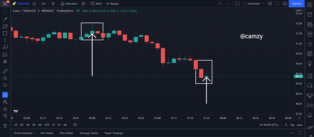
The chart shows the trade data, with sections of a 5mins time frame marked . The definition of a 5mins time frame is that each candle depicts 5mins, and these are represented on the price chart.
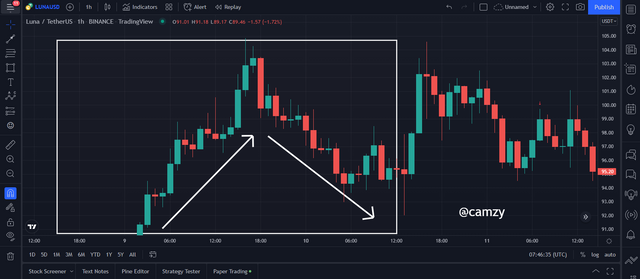
Levels of support and resistance are created by how well the market reacts to certain price zones. When we see that it has been reached or the price does not fall though, we can see strong levels of support and resistance forming.
A resistance zone is an area where the price of an asset has reacted and has failed to close above the zone, creating a barrier which prevents upward movement. At resistance levels, there is more resistance from sellers who may reject increases in value as they reject the asset and in turn move prices down.
A Support zone is where the price has reacted and failed to close below the zone, creating a support base for lower prices. When this happen at Support zones, one side of the market participants (buyers) react by rejecting the decreasing pricing and create pressure from buying which results in moving the price in the opposite direction (bearish to bullish). A strong support zone is characterized by how many times price failed to cross below that zone.
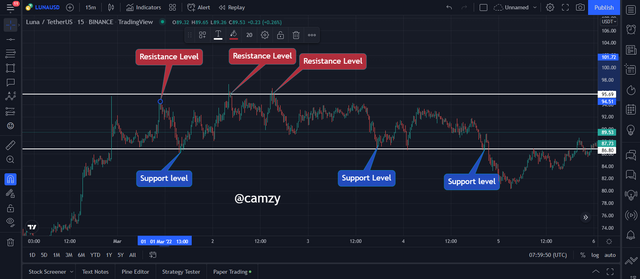
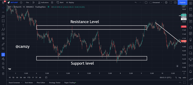
I was able to identify different support and resistance levels with the help of these two graphs. The market seemed to be moving within these levels until the market eventually broke through the resistance and support respectively.
Fibonacci Retracement
Fibonacci Levels are a way of measuring the levels on a graph. These measures can be numbers, percentages, or fractions. The know and used Fibonacci levels are 23.6%, 38.2%, 61.8% and 78.6%. Traders usually think of 50% as a message that the market is balanced instead of as a level from the Fibonacci sequence because it was not derived from the sequence.
The Fibonacci tool can be used to predict trading trends, but with knowledge of the market and being able to identify when the market is trending and countertrending.
Fibonacci is used to analyze a retracement/counter-trend move between points. In an uptrend, Fibonacci measures the low point (the trend's low point) and plots it against the current high. This often indicates resistance turned support.
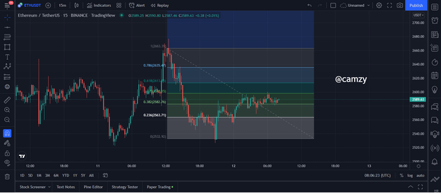
There are two types of markets; uptrend and downtrend. Fibonacci is used to measure the retracement/counter-trend moves in a yearly analysis. The points are plotted from a high point (lower high point) to the current low ( lower low point). This often correlates with areas of previous support now turned resistance.
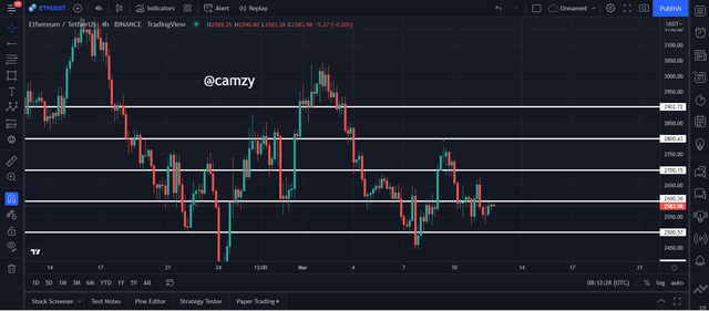
Round Numbers
In trading, a round number is expressed as an unending number followed by a decimal. An investor's sentiment might change with the price of that round number. Institutions pay attention to these prices and place orders around them because of how the general market reacts to those prices.
When prices get close to a certain round number, traders will react and push the price in one direction. look at the image below
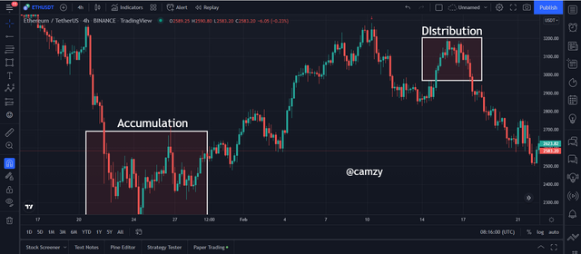
Accumulation and Distribution :
In the accumulation phase, When strong hand investors push a lot of capital into the market at low prices, it increases the demand for the asset which in turns causes prices to go up. This cycle continues until desired price levels are attained through large purchases. This is shown by the volume indicator revealing cash inflow into the traded market.
In the distribution phase, At the same time, strong hand investors (who can dominate the market) take cash out of the market by selling their previously purchased assets. This excess supply lowers the valuation of an asset or product. This can be seen in the volume indicator revealing how much cash was taken out of the traded market during distribution.
Breakouts happen when a price crosses a resistance or support level. A continuation breakout is a break outside of an established trend. A reversal breakout happens when there is a change in trend. A successful breakout is two types: continuation and reversal.
The bounce is a type of movement that is found in trading, in which the price rejects the resistance or support from the point at which it reached it and increased the distance between them to the opposite direction. It can happen because it encounters an opposing force on its way.
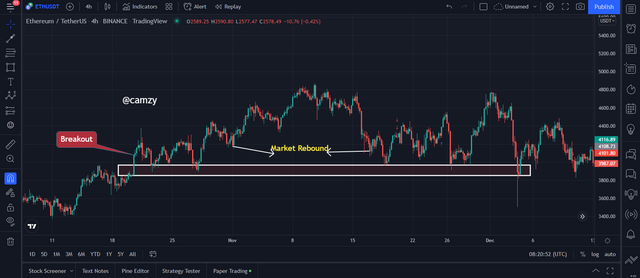
From the image above, we can see the break out from the resistance which turns out to be a new support and we can see the price actions bounce on the support and makes a reversal.
Notice that when the market bounces back after touching "the lower limit of the previous resistance level, or previous support" you can use this rebound to your advantage for an entry.
A false breakout means that a price level is taken out, but not with the ensuing volume of momentum. This suggests that there wasn’t enough pressure to push through the resistance level, often because there is a lack of liquidity in the economy. For example, a false bearish breakout would occur when a stock crosses below the support level and begins to rally back up again, or a false bullish breakout would happen if a stock were able to cross above its resistance level but then closed back under that resistance.
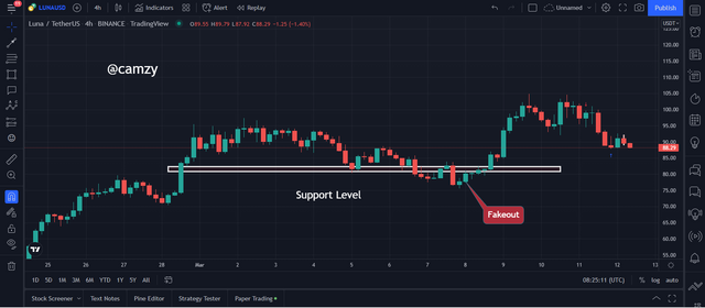
From the chart above we can see a bearish breakout which is classified as a false breakout when the price drops below the support and then rises back up to or close to the support level.
This trading strategy can be easily explained by the law of demand and supply. If the price is high, it means there’s less supply than demand and vice versa. This method allows you to predict a future market trend using past values.
When an asset is trending up, you can use the corresponding volume of bullish candles to qualitatively measure the demand for the asset and vice versa.
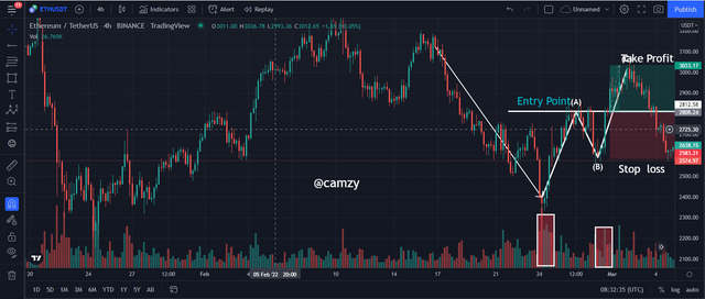
There is a trading strategy called trend trading, which involves using the market's movement. A popular example of this strategy is seen in the Elliot theory, where when there's a retrace by the market in line "C" being greater than that in line "A," and also the volume on line "A" will show more movements than on other lines.
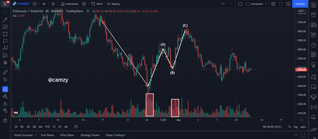
The market has broken the descending “c” line, so we purchase shares at that point and place our stop-loss order to protect a profit at the previous low of the “c” line. We set our target for this trade at 1:1
For the real trade, I will be using the chart of RUNE/USDT to place my trade. I observed the chart going downwards towards the support showing that the sellers are mounting pressure on the market pulling the price down
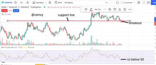
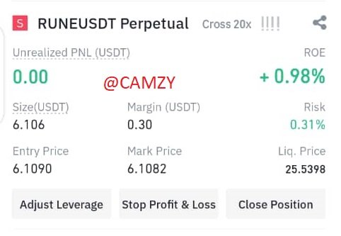
Immediately, I placed my stop loss and take profit at a 1:1 RRR ensuring to take profit for a sell. and immediately rushed to my binance. before I go into the details of my transaction, below is the verified screenshot of my binance account.
.jpeg)
I entered the trade at 6.109 and as we can see that the trade is already making profit
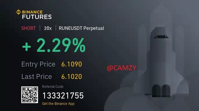
I closed the trade with a 2.29% profit.
.jpeg)
The price chart has a continuous line making up the price and time. The most common charts are of lines, bars, and candlesticks. The time is represented by when the price moves above or below a certain level (resistance or support). When it crosses and closes there is a possibility of trend continuation or reversal movement depending on the type of break out.
Early identification of trends is especially important as it allows traders to guess what will happen next, and either buy or sell depending on their predicted outcomes.
The Fibonacci Retracement is a tool that allows you to predict the levels where the market may bounce or retrace.
Best Regards
@nane15