Steemit Crypto Academy Season 3 Week 2. Introduction to Charts - by Professor @reminiscence01. Homework task - by @pangoli
.jpg)
Image: My own work
Hey guys...
It's been a very great experience learning about the financial markets chart system from professor @reminiscence01.
Prior to this time, opening an exchange trading interface was one of those dreaded activities for me. This was because of the random lines and colored shapes I get to see on the screen. I was almost certain that nothing there was designed to catch my fancy because I tried making sense of them to no avail.
Fast forward to my post-class experience, damn! Never knew this could be that easy to grasp. With the understanding gathered in the course of our lecture, I've come to realize that those were not just random lines and colored shapes; I've understood the message behind each and every one of them.
Below are my attempt at solving the homework task. Do have a pleasurable reading experience.
Introduction
Just before we go exploring the different chart types in the financial markets, I think we'd be well off if we had a general introduction to what charts are. Do you think so too? If yes, why not we scratch that desperate itch before proceeding?
What are Charts??
Charts often come as pictorial representations of facts and figures using tables, diagrams, or graphs; with an aim of making communication easier and more relatable. In other words, a chart is a tool utilized to make communications more objective.
Charts come in different forms, with each meant to fit into a predetermined purpose: to show the relationship between items, to create an abstract of reality, to translate texts into non-narrative visual content, etc.
The Financial market charts
Charts have always been a crucial part of the financial markets, with functions spanning across market analysis and data visualization. In this assignment, my focus will be on the use of charts in market analysis.
Whenever charts are mentioned in financial market analysis, the term that readily comes to mind is Technical Analysis. Technical Analysis is a kind of market analysis where insights from the historical data of an asset's price are used to make predictions about future prices.
With a chart, an asset's price movements, patterns, and tendencies become much easier to visualize and analyze. A typical chart has the price scale on the y-axis (vertical axis); and the time scale on the x-axis (horizontal axis). Prices are plotted from left to right across the x-axis, with the most recent price plotted furthest to the right.
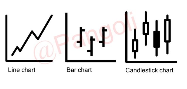
There are various chart types often used for Technical analysis of the Financial Markets. They include:
- The line chart.
- The bar chart.
- The candlestick chart.
.jpg)
Image: My own work
These charts differ with respect to their make-up, and the respective market information obtained from them. Depending on the chart type, information about market price, market volume, buyers/sellers behavior, opening/closing prices, etc., can be obtained by merely observing a price chart.
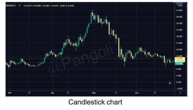
Q1: Explain the Japanese Candlestick Chart
.jpg)
Image: My own work
The Japanese candlestick chart is known for having originated in the 1700s from a Japanese rice trader called Munehisa Homma. This chart type preceded the western bar and point-and-figure charts by 100+ years.
Candlestick charts display price information in a pattern considered by many traders to be prettier, graphic, and more detailed. Traders prefer this chart because of how easy it is to extract the story behind its formation.
A typical candlestick chart embodies candlesticks with obvious open, high, low, and close price points for the market period it represents. A candlestick on the candlestick chart represents a particular market period- 15 minutes, 1hour, 4 hours, 1 day, etc. These candlesticks come in two color codes, red/green or black/white, each representing a particular market sentiment - bullish or bearish.
Also, an idea of the volume of buying or selling activity in the market at a particular point in time, can be extracted from the candlestick chart by paying attention to the size of its body. The body of a candle usually sits in the mid-range between the opening and closing prices.
Q2: Describe any other two types of charts
The other two types of charts are the Line and the Bar charts.
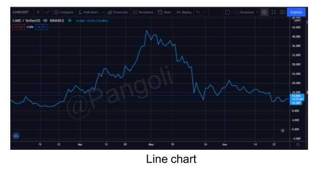
The line chart
.jpg)
Image: My own work
A line chart defines a line that connects one period's closing price to the next period's closing price in the market. The general price movement of a currency pair over a period of time becomes easily observable when viewed on a line chart.
In fact, the line chart is often the most utilized by traders when trying to map out key zones in the market. This is because the chart, by nature, selects out market moves that sum up to just noise. That is, by paying attention to only the closing prices, price fluctuations within a trading session are ignored.
Although the line chart is often called out for being void of detailed information on the behaviour of market participants within a trading period, it does help traders see the bigger picture more clearly, and spot trends very easily.
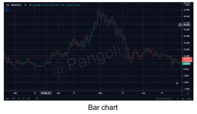
The bar chart
.jpg)
Image: My own work
A bar chart, just like the candlestick chart, shows the opening and closing prices, as well as the highs and lows. However, the bar chart is not as detailed as the candlestick chart. Bar charts are particularly useful in helping traders see the price range of each period.
A bar on the bar chart represents a trading period - 15minutes, 1 hour, 4 hours, etc.,- and the body of the bar expands or reduces in response to the volatility of the market price. Notice that the bar chart has very similar characteristics to the candlestick chart. The only difference between the two is that the candlestick chart presents price history with more graphic appeal.
Q3: Why the Japanese Candlestick chart is the most used by traders
An average trader gets to use the Japanese candlestick chart for most of his trading activities, while only using the rest occasionally. This preference is not coincidental, given that the candlestick chart contains roughly all the information present in the other chart types.
Here are possible justifications for traders' preference for candlestick charts:
- The candlestick chart gives the trader a one-stop shop to acquire all the insight he needs to dive into trading the markets.
- It has a more appealing and detailed display.
- It is easy to read
- It has mostly repeated patterns that have been named and made to be easily identifiable.
- The candlestick patterns are very accurate at marking turning points in the market.
Q4: Describe a bullish candle and a bearish candle identifying its anatomy?
The terms "bullish" and "bearish" are often used to connote market sentiments. The market sentiment is derived from the psychology around the formation of the prevailing candles at the time. For instance, a market is said to be bullish when it is dominated by bullish candlesticks; and bearish, when it is dominated by bearish candlesticks.
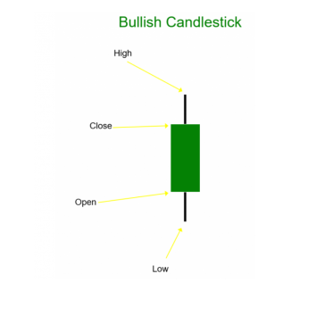
Bullish candle
A candle is said to be bullish when its closing price is higher than its opening price. Usually, this type of candlestick is green or white in color, depending on the user's preference.
The bullish candle simply presents an information that there is buying pressure in the market. That is, the bulls are mounting some pressure on prices in the market by buying up the circulating supply of an asset.
The intensity of the bull's activities is often told by the body of the candle. A long green/white candle without wicks represents a market dominated by the bulls, while a more narrow candle body with wicks represents a struggle between the bulls and the bears.
 Source: https://www.epitometrading.com
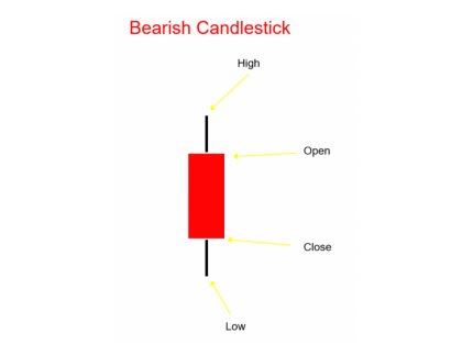
 Bearish candle
A candle is said to be bearish when its closing price is lower than its opening price. This candle type is often red or black in color, depending on the user's preference. And usually, show up when the price is going down.
The bearish candle presents a piece of information that there is a sell momentum in the market. That is, the bears are mounting some pressure on prices in the market by diluting -increasing- the existing circulating supply of an asset.
N/B: when bears sell off their holdings of an asset, they increase the supply of that asset, and if demand is not increased to meet the new supply, it drives down the price of such asset.
The intensity of the bears' activities is often told by the body of the candle. A long red/black candle without wicks represents a market dominated by the bears, while a more narrow candle body with wicks represents a struggle for market domination between the bears and the bulls.
Conclusion
Finding a good chart preference can sometimes be a daunting task, especially for beginners. However, it is important to look for the proper balance of having enough information on the chart, to help make good trading decisions. Just enough information is what is needed to have a good outlook of what the market is saying. And, thus far, we can agree that candlestick charts would be a good place to start.
Hello @pangoli, I’m glad you participated in the 2nd week of the Beginner’s class at the Steemit Crypto Academy. Your grades in this task are as follows:
Recommendation / Feedback:
Thank you for submitting your homework task.