Drawing my own charts with Canvas in my Lorenz Curves Node.js project
I've continued working on my Node.js project to draw Lorenz curves based on the reward payouts from Steem posts that I posted about last week. Rather than continue to have a manual step where I converted a .csv file into a chart I wanted the code to generate it automatically. On my previous javascript projects I became pretty familiar with the HTML canvas element to create images, so I thought that would be a good approach here.
I started with the PureImage module which is an implementation of the canvas element in pure javascript without any native compiled code. I had good results initially, but then I started running into some confusing errors. After a lot of debugging and pounding my head against it I realized that most of my problems were related to the way that Node.js does things asynchronously. So some of it was a good learning experience, since this is one of the most important factors in Node.js programming, and I came to appreciate things like the difference between calling a function that returns a promise in the argument to a then() and calling it in the function body of a then(() => { }). (You need it to be in the function body if you don't want it called until the actual event happens, the then() is evaluated immediately, which sets up the function to be evaluated later). However I ran into some roadblocks I just couldn't figure out how to get around, since it seems like PureImage loads fonts asynchronously but doesn't give you enough hooks to be able to "wait" until they're loaded before you draw with them.
So I switched to using the Canvas module. This slowed me down a bit, since I had to learn a bit more about Node.js file handling in order to figure out how to get it to dump out what I was drawing to the canvas as a .png file, since it did that differently than PureImage did. Eventually I got it working, and then did some more work to reintegrate my graph-drawing code with the Steem database querying code I had going last week. In the process I had to debug some things (I thought that fetching post records in "created" order would guarantee the timestamps would be monotonically increasing, but maybe not?), so it was slower going than I hoped it would be.
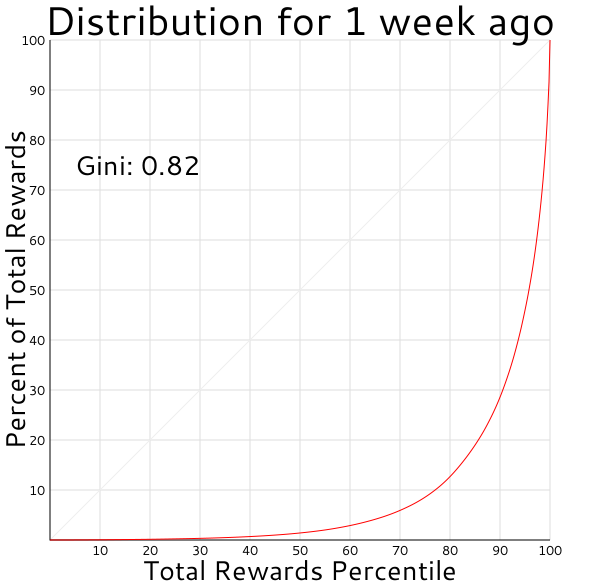
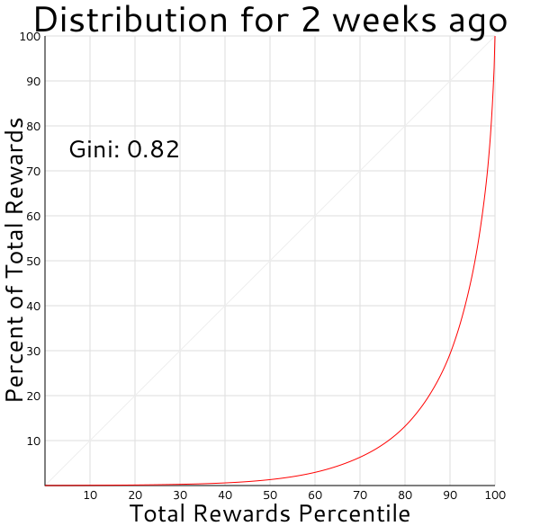
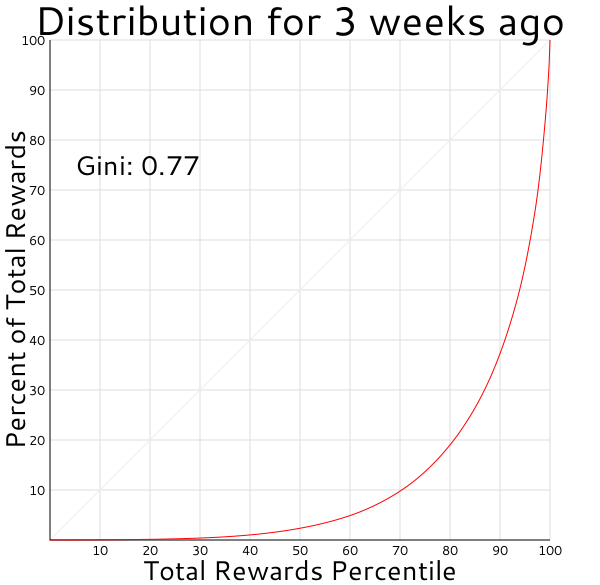
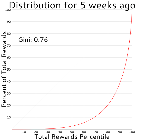
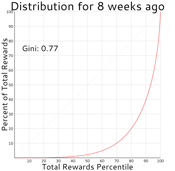
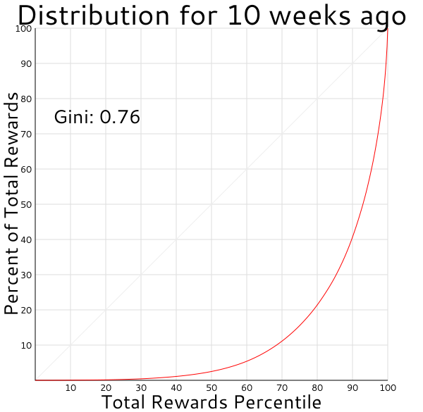
Here are some of the curves I generated for the distribution of top-level post rewards for the past several weeks (see my previous post if you want the background on how to read these graphs).


The code isn't in there yet, but eventually I plan to add support for a log-scale axis option and the ability to more easily overlay the curves for different weeks on the same graph, as was discussed in the comment thread of my previous post. And I still need to dig into other ways to get information from the Steem api so I can see how hard it will be to explore things like curation rewards.