Color Keys (Pirates of the Caribbean Reference)
Hi everyone!
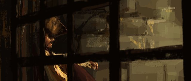
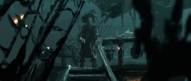
I have some time in between jobs right now to develop my portfolio, and one of the things I want to become better at is painting and lighting. I wanted to try my hand at color keys, which are created in the pre-production part of a project to visualize camera, lighting, and atmosphere.
I wanted to work loose, so I used a fairly large brush, and I gave myself a time limit of 30 minutes.
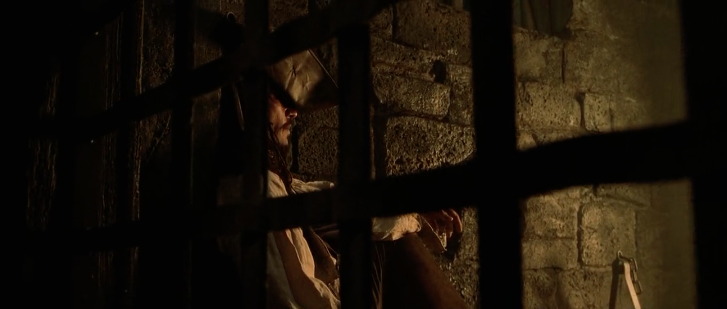
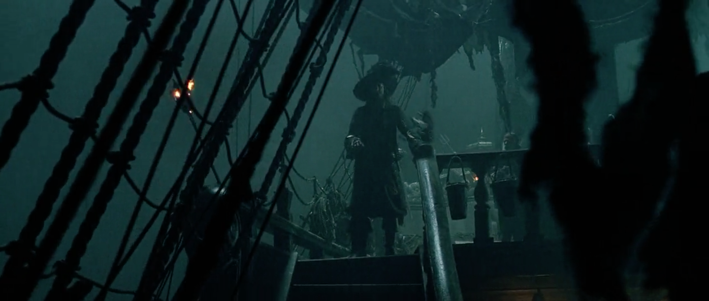
Last night, I watched Pirates of the Caribbean: Curse of the Black Pearl, and took screenshots of shots that I wanted to recreate. I tried to find shots that had really powerful color profiles, interesting lighting, and camera angles that would be fun to emulate. Then I used them as a reference as I painted.
Here's the first one I did:
And its reference:
Here's the second color key I did:
And here is the screenshot I referenced:
It was really fun working fast and loose like this. I tried to capture more of the feeling of the drawing rather than trying to get it to be a perfect replica. These two pieces were a great learning experience and I'm excited to do more of them.
I took some recordings of myself while I painted these and I'll be posting those later this week so stay tuned!
Thanks!
You should post more of your portfolio statement very creative
Thanks! I intend to :)
Very impressive! I love the palette and it’s a fun subject. I especially like how you idealized the scene into something better.
Thanks! These color palettes were both really fun to work with!
Oooo very nice! I think you also picked a couple of the best scenes for painting also!
Thank you! I tried to pick scenes that had really nice lighting and atmosphere that weren't overly complicated. It was super fun!