Thoughts of Analysis on Lincolns Slavery Map
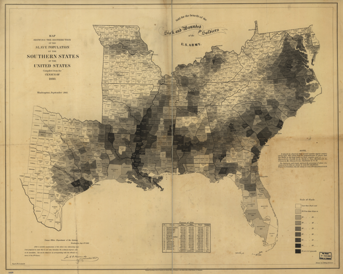
So this here’s a lesser known point in history and intelligence. Back in 1860’s, President Lincoln used census data to show population density of slaves in the Southern States of the U.S. Similar to a modern day heat map, Lincolns map broke down each state in counties and each county was color coded to represent the slave population.
Looking at this map reveals quite a bit in terms to targeting population, non-lethal of course. Had this map been relevant today or if we could travel back in time to the 1860’s. What could we do with this information. That states with low to minimal slave populations may be more receptive to an anti slavery information campaign. Interestingly enough the area in lighter shade surround the darker shades. Could the population in the lighter shaded areas be leveraged to pressure the darker shaded areas to abandon slavery? Could the lighter shaded areas disrupt trade routes coming out of and through the darker shaded areas? The Mississippi River is a highly dense area of slavery on this map, can we deny the river? Can we deny Virginia along the coast and the Chesapeake Bay? What about the general topography of the south and its correlation to the density of slavery, how could be leverage the forests, swamps, and mountains?
What the point of this? Well I would argue that the seemingly innocuous map data provides a great deal of information when developing a strategy. Understanding the human terrain is just as important as understanding the physical terrain, in terms of where to go and what do to there. Sometimes it may be more viable to leverage the population, then march in an Army. Its not always the case, but its definitely worth consideration and if it can be done it may be a better solution then armed conflict.
