This Predicted Every Recession: Yield Curve
Perhaps the single best leading indicator of recession for decades has been the shape of the yield curve. The yield curve is a graphical representation of the various US Treasury yields spanning from 3-months to 30-years. The slope of this line has three forms: normal, flat, and inverted. A “normal” curve is a positive slope from left to right, with short-term yields lower than long-term yields. This is the most intuitive situation; shorter-term bonds pay less interest because investing short-term is has less risk. Conversely, longer periods should be compensated for larger risk with a higher coupon. When the curve flattens, short-term interest rates rise making all yields close to the same. The longer-term Treasuries might also have a tenancy to lower during this time. An “inversion” occurs when a shorter-term Treasury has a higher yield than a longer-term. Under normal circumstances, yield would naturally adjust to maintain a normal curve sloping from left to right. However, a flat or inverted curve arises from abnormal circumstances that will be described.
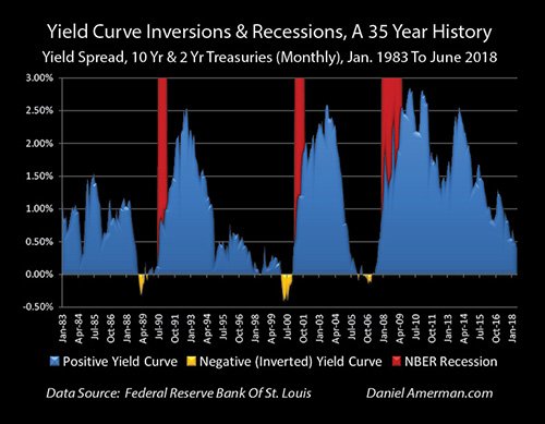
There are many definitions used to describe a yield curve inversion, the most common being the spread between the 10-year and 2-year Treasury yield. But as I will illustrate, it does not matter which of the maturities inverts. Historically, many different combinations of Treasury yields have inverted with the 10 and 2-years being the most common.
The chart below shows the spread (the two subtracted) between the 10 and 2-year yields. The gold areas are inversions of the spread, which are then followed by the recessions highlighted in red. The last three major recessions were preceded by an inversion of these two yields.
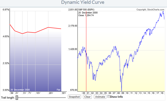
Major market crashes also have a tenancy to come after a yield curve inversion. The chart below shows the yield curve on the left with the S&P 500 index on the right. The 2 and 7-years, as well as the 3-month yields were all higher than the 10-year. This was before the Dot-com crash of 2000. This snapshot was taken the 20th of December 2000.
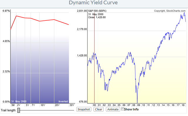
A few months earlier, on the 31st of May 2000, we see the 10 year and 30 year actually inverted with the shorter maturities - 2, 5, and 7 years - all higher than both the 10 and 30-year yields. This was a complete yield curve inversion.
Yield curve inversions are rare, but there are a few fundamental reasons why they happen, the most important of which being the Federal Reserve embarking on a tightening cycle whereby they begin to raise the Federal Funds rate. All of the last three inversions were preceded by the Fed raising the Federal Funds rate. The Federal Funds rate is the rate at which banks are allowed to lend their excess reserves, on deposit at the Fed, to other member banks. The Fed has the right to set this rate, but since they cannot force banks to charge each other at this rate, the Fed must influence the market through the purchase of Treasuries through Open Market Operations. Purchasing securities from the member banks increases their cash reserves which are then available to lend. [4][5]
The Fed, through this mechanism has much more control over short-term interest rates as opposed to long-term rates. This is because longer-term Treasuries are more indicative of inflation fears as well as long-term economic growth. This frustration of not being able to control longer-term rates may be why the Treasury cut back on its issuance of 30-year bonds in 2000. Alan Greenspan would eventually stop the issuance between 2002 and 2006. Rate cuts going into a recession only compound the Fed’s problems in controlling the shape of the curve as Daniel Amerman explains further in his article:
As a starting point, yield curve inversions generally occur when the Federal Reserve has been boosting interest rates. Because the interest rates that the Federal Reserve raises are short-term, this tends to push the short-term up relative to the long-term, which is exactly what has been happening.
The reason the Fed is increasing rates is to slow down the economy. Now, if high economic growth is expected into the indefinite future, then the main danger for bond investors is inflation, and long-term bond yields should be rising relative to short-term yields.
However, if lower economic growth is expected, then less of a premium is required to compensate for inflationary expectations, and long-term yields should be falling relative to short-term yields.
So, the net effect of the Fed's increasing interest rates to slow down economic growth is to simultaneously increase short-term rates while reducing long-term yields relative to short-term yields. This first produces flattening, and then sometimes - but not always - there is an eventual inverted yield curve. [1]
Wolf Richter points out, in his article written earlier this year, that a very rare occurrence has taken place with the Fed’s current rate cycle. The 1-month Treasury bill yield is now above the rate of inflation (CPI), giving it a positive real rate. This has only happened five times in the past 18 years, and only for short periods.
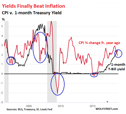
The Fed can manipulate short-term yields with reasonable consistency. So when it pushes them down below the rate of inflation, it’s not an accident. It’s punishment for everyone that has money invested in short-term low-risk instruments, from T-bills to savings products. And as the chart above shows, this form of punishment has been the “normal” condition over the past two decades. [The “punishment” results in money leaving the short-term Treasuries to chase yield in stocks.]
There have only been five fairly brief exceptions. One of those exceptions was in 2016 during the oil bust, when energy prices plunged. During that period, CPI growth dipped into the negative (deflation), but only very briefly, and only a tiny bit, just enough to put it below the one-month yield which was near zero due to the Fed’s zero-interest-rate policy.
The current positive “real” one-month yield of 21 basis points is more significant. And this is one reason why the Fed might want to be “patient” with raising short-term rates further if it wants to keep monetary policy near “neutral.” If short-term yields end up significantly above the rate of inflation, it has a tightening effect on financial conditions. [2]
As the Fed continues on its tightening cycle, which began very slowly in 2015, yield spreads are getting narrow as illustrated below.
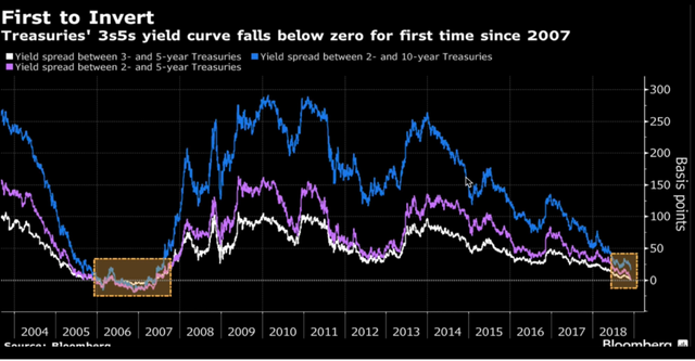
But the 2-year and 10-year yields have not yet inverted as of this writing, although coming very close.

[10-year in green; 2-year in blue]
However, on the 3rd of December 2018, the 2-year and 5-year Treasury yields inverted and have stayed that way since.
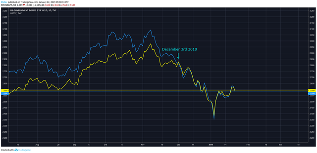
[2-year in yellow; 5-year in blue]
The 10-year yield bottomed in 2016 and after climbed its way up to 3.10% - 3.20% peaking at 3.25% on the 7th of November 2018. The S&P 500 peaked on the 21st of September 2018 and like clockwork began to crash on the 10th of October 2018 shortly after the 10-year yield entered the danger zone.
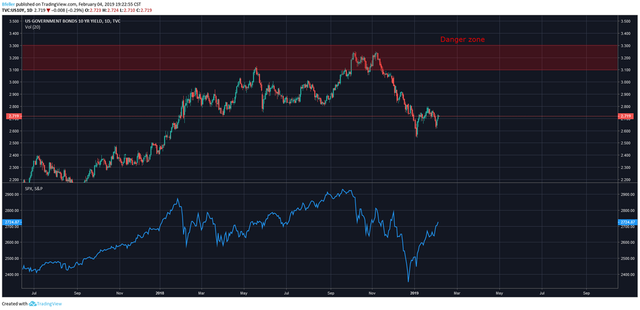
[on top the 10-year yield; the S&P 500 on bottom in blue; danger zone in red]
In summary:
21st of September 2018 – S&P 500 peaks
7th of November 2018 – The 10-year Treasury yield peaks
10th of October 2018 – the S&P 500 begins the crash selling off -3.10% in one day
The next logical conclusion is a recession. However, this is not guaranteed and can lag a few years behind the yield curve inversion. The Fed has also decided to halt their interest rate hikes for the time being, giving the market support. The S&P 500 finished -20.15% off its highs on the 24th of December 2018 and has managed to rally back above its 200-day moving average since.
Sources:
[1] http://danielamerman.com/va/ccc/YCinvert1.htm
[2] https://wolfstreet.com/2019/01/15/yield-curve-spaghetti/
[3] https://seekingalpha.com/article/4170082-can-federal-reserve-control-long-term-interest-rates?
[4] https://www.investopedia.com/terms/f/federalfundsrate.asp
[5] https://www.investopedia.com/terms/o/openmarketoperations.asp
Books:
Thau, Annette. The Bond Book. 3rd ed., McGraw-Hill, 2011.
Kirkpatrick, Charles D, and Julie R Dahlquist. Technical Analysis. FT Press, 2007.
Charts:
Bloomberg.com
Danielamerman.com
Wolfstreet.com
Generated charts:
Stockcharts.com
Tradingview.com
Congratulations @bretjfeller! You received a personal award!
You can view your badges on your Steem Board and compare to others on the Steem Ranking
Do not miss the last post from @steemitboard:
Vote for @Steemitboard as a witness to get one more award and increased upvotes!