Vlog #128: A new Logo + Steemit.com direction becomes more clear + new languages?
It seems to be STEEM Inc's hobby to drop bombshells in the middle of the night while I'm sleeping, lol.
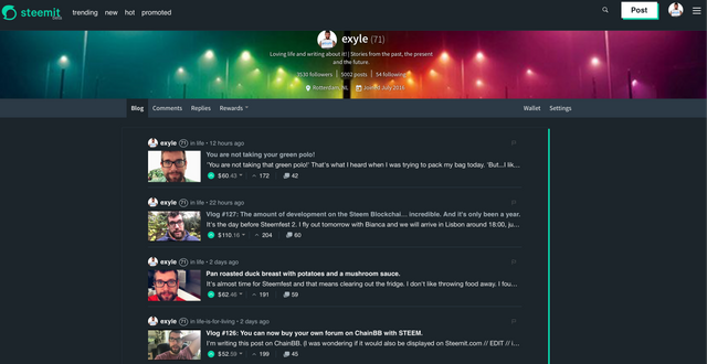
First a new UI and now a new Logo :)
I don't mind though.
I think the logo looks great and will make it easier for me to distinguish the STEEM blockchain from Steemit.com when explaining it to people.
But I also like it for another reason.
At some point I thought that Steemit.com would become less of a focus point with the announcement of SMT's.
I thought the focus would be even more directed on the blockchain itself.
But I think I was wrong there.
It's both.
A lot of work is being put in the website Steemit.com and that makes no sense if you want to leave behind.
Wich is good news for all content creators.
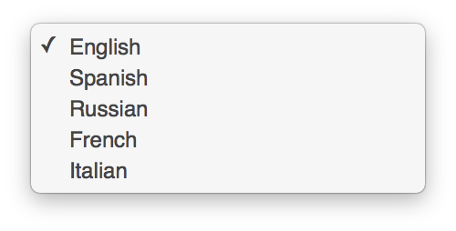
The new UI also incorporates a night mode with really nice and I also saw that it's now possible to change the language of the UI (although this might have been there for a while. I'm not 100% sure).
I talk about it more in my vlog.


These were much needed changes although the color scheme looked a bit better in the previous version, but that is a matter of taste.
New UI and Logo looks awesome, hope it brings much more growth to this great platform.
@exyle I hope if I purchase some more STEEM I will look back on this as one of the Biggest Bargains in history.
It's all looking very swish. I think the site is more responsive too!
The site is super quick, this is how it should be!
Couldn't agree more!
GREEN logo, steem is more sustainable!! I like
Hi dear @exyle, you are right same feeling here when I saw that new logo this morning, nice changing after seeing that logo and colour I feel fresh and realise boring because after seeing same thing after long time it become boring, thanks to technical and merchandising management for changing logo and other up gradations.good luck to all....
Steem On..!
nice post my friend, i absolutely love this new interface and logo, it's color is so beautiful and another great thing is that now we have two themes one is conventional light theme and second option they add is toggle to night mode and that night mode makes it looks even more cool and attractive and it's really easier to read in dark mode and it also give very less stress to eyes, i agree with your thoughts about adding languages and yes it surely gives good advantage to peoples who can't understand english and this new UI and interface really gives nice impression to new steemians,
Another cool thing is that when we hover over the mouse to steemit logo it changes it's color
Stay blessed, wish you a very cheerful and safe journey to steemfest2 my friend, thanks for sharing
New logo more stable, nice post
Yes, the logo is good most like the color, pleasant, gentle, does not shake.
For me, the platform still has some things to change, even because it really needs it. But for what has already been done so far shows how much Steemit is doing to its users! I liked the news! And more!