Microsoft Design Director: After six years, the Microsoft Office icon is updated again
Microsoft Office icon visual recognition changes behind the new experience
Editor's note: Microsoft announced at the Ignite 2018 conference last year that it will officially launch the Office 2019 office suite for Windows and Mac users. Soon after, Microsoft announced that it will bring new icons to the Office suite, and will be gradually promoted to the major platforms from the mobile and web pages in the near future. This article, titled Redesigning the Office App Icons to Embrace a New World of Work, is the design director of Microsoft Office Jon Friedman. Through this article, he introduced the story behind this update and shared how Microsoft is advancing with the times in visual identity, reflecting the simplicity, intuitiveness, and intelligent experience of the product.
I have heard such a saying before: the most terrifying thing in the world is a blank page. In this regard, what I want to say is that the person who said this sentence must not come from the design industry because he could not imagine the difficulty of redesigning.
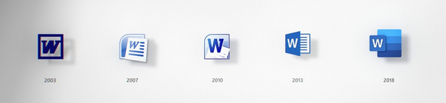
The last update of the Microsoft Office icon was 2013, six years ago. That year, the word "selfie" became the annual hot word for the Oxford Dictionary; it was also that year that emoji was widely used and used around the world.
There is no doubt that today's society has undergone tremendous changes. Among them, the way we humans do things is not the same.
The Microsoft Office office system has more than 1 billion users, from different eras and different countries, all over the industry. Although we are in a fast-paced, all-encompassing era, our attention is distracted by a variety of new things, but this 1 billion users are using Microsoft Office office systems on different devices and clients. .
In order to cater to today's ever-changing era, the Microsoft Office system is constantly innovating and upgrading, allowing users around the world to collaborate in real time on any device, anytime, anywhere. In this update, we also took advantage of artificial intelligence. You can more easily get inspiration from the file data, you can complete the thesis writing with the voice function, and you can even quickly create and update your resume with the resources of LinkedIn.
In addition, this update has added a lot of new features. For example, the artificial intelligence-based conference communication group chat system Microsoft Teams. Of course, behind this series of updates, we can't do without a unique new design, and it is the combination of these design concepts that makes our user experience more coherent and smooth.
In order to better introduce this update to users, we have specially updated the Microsoft Office icon to reflect the heavy upgrade behind the product. I hope that through this article, I will share with you the story behind the new icon update design.
A new and meticulous design: paying respect to the past and embracing the future
In the early days of redesign, we combined the history of the Microsoft Office system and based on this, a new design upgrade. The core of Microsoft Office brand design has always been inseparable from powerful color applications.
The new icon is the cornerstone of the color evolution update. Different colors can convey different brand tonality, which is one of the important factors to distinguish different software applications. With this update, we chose a bolder color palette, which gives us a feeling of lightness and a friendly experience. This is also the color selection principle that has been adhered to in the update of Microsoft Office icons.
In addition, we also incorporate gestalt principles in our design to emphasize the core changes of the product (according to the Gestalt principle, the working principle of the human brain is holistic, and the eyes and brain work together when watching, and Combine the various parts to make it a more understandable unity).
Harmony and simplicity are the two core factors that influence visual effects. They can reflect the seamless connection between products and bring a more intuitive visual experience. Although each icon is independent and has a high degree of discriminating, there is a high degree of correlation between the single icon point of view and the overall package perspective.
Flexible vision system: easy collaboration across platforms, devices, and people
In today's workplace, users of the Microsoft Office system span across five different eras. They use our office systems on different devices, different clients and in different environments. As far as visual language is concerned, we hope that users of different eras will resonate with products emotionally, with the same experience on different devices and clients, and at the same time reflect the efficiency of productivity in the modern era.
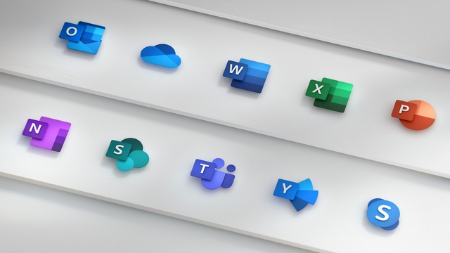
In order to achieve this, the main design we adopted was to separate the letters and backgrounds from the original icons and design separate visual levels for the letters and backgrounds. Through this scheme, we can maintain the same tonality as the original icon, while at the same time better emphasizing the simplicity of each icon.
In addition, the design of the letter and background is further reflected in the shadow, giving users a more obvious 3D visual effect.
Through this design, we have maintained the original design style and brought a different experience.
User-oriented design: focus on content and reflect the pace of modern life

Today, we live in an era where the pace is faster and everything is more connected. In order to better integrate this background, we use product updates to make it easier and faster for users to express their opinions, collaborate and stay focused in the workflow. It is for this reason that we have integrated all Office software into a suite that allows users to quickly and easily open PowerPoint or Excel files while using Teams or Outlook collaboration.
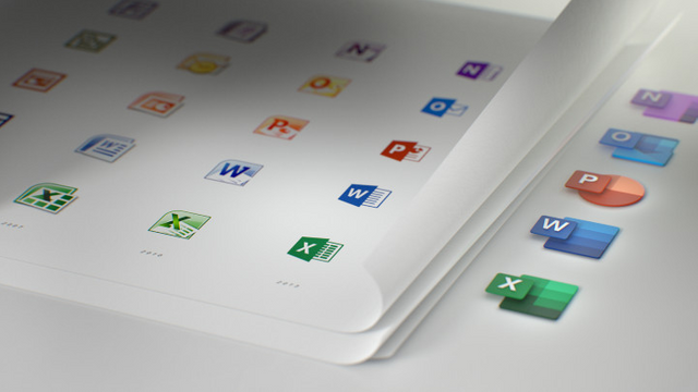
Specifically, in this icon update, the main change is reflected in the visual boundaries: we no longer retain the original formatting tool elements.
In the previous Microsoft Word icon, the background outlined the basic frame of the text through the blue bar placeholder; in the early Microsoft Excel icon, the background was similar to the chart frame. The updated Word and Excel icons are highlighted by text lines and separate table text boxes. By focusing on the nature of the content rather than focusing on specific formatting tools, these new icons better reflect the interdependencies and collaboration between the suite of software.
In addition, the scale of the letters and background on the icon has been adjusted accordingly. In the original icon, the letters basically occupy two-thirds of the icon, while the background only accounts for one-third. In the updated icon, the ratio between the two is exactly the opposite, and the emphasized center of gravity becomes the background icon. The reason for this adjustment is that although the letters can intuitively reflect the core functions of each software, the background icons can further enhance the visual recognition, which will have a more important impact on user creation.
Suggestions: Becoming a part of the design community
The updated Microsoft Office icon will soon be updated on different platforms. The first update will be the mobile and web pages. This update has also undergone iterations, research and testing again and again. It is the result of our hard work day and night, and an important milestone in our design journey.
As designers, we are also eager to get feedback from industry peers to inspire us and gain new design inspiration and design better products. Therefore, I hope that you can make relevant comments and suggestions without reservation in the comment area. Thank you!
The logos are looking very cute🙂
Posted using Partiko Android