Photofeedback #4: Fisgard Lighthouse picture by @deborahmack!
Good afternoon Steemit!
I's time for my fourth #photofeedback already. I'm pumped by the fact that people like my posts and I look forward to write more of these for you in the near future. Your comments motivate me and make me want to improve this series as much as I can. I need you guys for this! So if you have comments about improving this series in any way possible, please leave them as a reply on this post. I will read them and use them for improvement of this account.
And remember: if you want a photo reviewed by me, please post it as a new story on your feed, with the hashtag #photofeedback and I will provided detailed feedback on your picture. If possible, please tell me the camera and settings that you used for that specific picture. Thanks in advance!
My fourth feedback will be of a picture by @deborahmack, which she shot for the Monday Red Colorchallenge. As her profile tells you, she loves photography and she has uploaded some amazing shots! Please visit her profile and leave her some upvotes and a follow, you won't regret it!
The picture I'm about to review was shot in Canada, at the Fisgard Lighthouse. This was the first lighthouse on the west coast of Canada and it was built in 1860! The lighthouse is located adjacent to Fort Rodd Hill, which was used to defend Victoria from naval threats.
The picture:
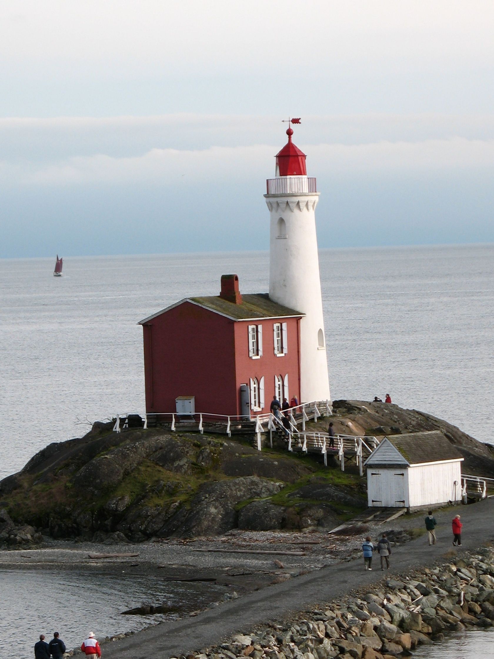
Some first impressions:
- The first thing I see when looking at this picture is the horizon falling to the left. This is very distracting, but luckily easily fixed!
- Pictures of lighthouses always have a certain calm over them. This one has a few distractions though: the people in the lower left draw the attention to them, which is unwanted. In my opinion, the ship on the left is also a bit distracting.
- I like the crop of this image. The little island on which the lighthouse is located is cropped off the picture a bit, but I actually quite like this. It makes me focus on the lighthouse, which is the subject of this picture. It is always pleasing if a picture makes you focus on the subject immediately, instead of having to look at a lot of distractions before seeing the beauty of the subject.
- The diagonal line of the road leading to the lighthouse gives this picture a bit of flavor. Diagonal lines often make pictures more dynamic and playful. I think if the diagonal line wasn't shown in this picture, it would look a bit more boring, which isn't what you want.
- I really like the (horizontal) angle this was shot at. You can see two sides of the house, which gives depth to the subject. If this picture was shot head on, it would have lost a lot of its power.
- The lighthouse is quite high, which could be emphasized more by shooting this picture from a lower (vertical) angle. You would lose the diagonal line of the road in that case, but I think the more impressive looking lighthouse would make up for that.
- This photo was used for the 'Colorchallenge: Monday Red' and you can immediately see why. Red is the most prominent color in this picture. I like this a lot. The red of the house is a bit washed out though. This could use a bit more saturation in my opinion.
- The rocks at the bottom of the lighthouse are a bit dark. I think if I up the shadows a bit, they would look more pleasing.
Considering these impressions, I imported this photo into Lightroom and made some minor adjustments. This is the end result:
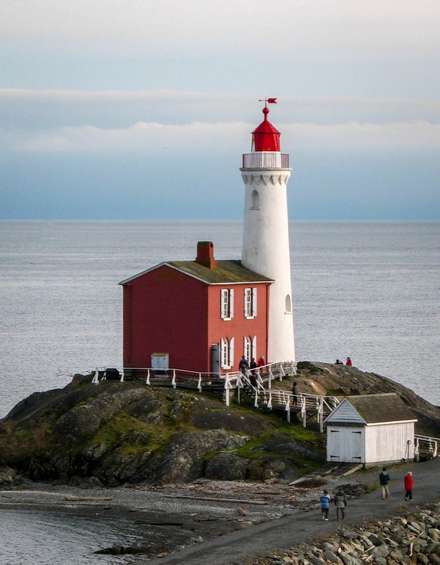
As you can see, the picture has a bit more noise in it now. This is because it is a small sized JPEG and when I upped the contrast and exported the image, the noise became more visible. But it doesn't bother me too much.
What did I do and why?
- I straightened the horizon to make the image way more calm. The focus now shifted more to the lighthouse.
- I cropped off the people on the lower left with the same intention as straightening the horizon: making this picture more pleasing to look at by removing distractions.
- The last distraction I edited out was the ship. I normally don't like it to remove objects from my photo by using spot removal. I prefer to wait for the distraction to disappear and then shoot the picture. But in this case, I removed the ship with spot removal and I like the way it worked out. It isn't removed perfectly though (which is easier in Photoshop), you can see that the horizon is crooked a tiny bit now but it isn't distracting me.
- I upped the contrast while brightening the shadows. The transition from lighter parts to shadows are more accentuated now, but the shadows became a little brighter. This is clearly visible in the rocks. They have more detail and are a bit brighter.
- I decreased the highlights to show some more detail and color in the sky.
- I upped the whites to make the tower of the lighthouse whiter, instead of more grayish.
- I added a very little amount of overall saturation. The blue in the sky and the green on the rocks are a bit more lively now.
- The saturation of the reds in the picture was most important to me. Especially when considering this photo was originally uploaded for a red colorchallenge. So i added a bit more saturation in the reds!
- A little vignette was added to shift the focus to the lighthouse even more.
What would I do differently?
- I would try to wait for the distractions to leave the frame and then shoot the image, this saves you some editing (which is always better in my opinion).
- I would shoot the picture from a lower angle and then see what happens. Maybe the shot would improve, maybe not.
- I know (by researching on Google) that the fort is very close to the lighthouse. Maybe including a bit of the fort in your picture would add more story to it by showing that this place was used for defense of the Canadian coast.
Conclusion:
@deborahmack did a good job shooting this picture. The main things (horizon, people and ship) that were making this photo less pleasant to look at were easily removed. She did a good job on the composition/crop and especially the horizontal angle it was shot at. In the end, these things are the hardest part of photography. If you understand composition, the rest will come more easily in my opinion. Deborah definitely has an eye for photography and I really hope she will keep improving and entertain us with her shots and blogs.
Thank you very much @deborahmack for letting me review your picture! It's great to do this work, because it makes me look at photos in a different way. This helps me to improve my own skills, while helping others improve theirs.
If you liked this post, please leave a comment, upvote or follow. Actually, even if you disliked it, please leave a comment too! I would like to keep improving these feedbacks and this can only happen if you share your opinion with me. I would greatly appreciate it!
I look forward to reading your responses.
Laurens
This is uncanny, just as I thought of you, I see that you just posted again. So I get first draw at upvoting!
By the way I am currently not the furthest from you, being in Sweden, and am heading to Germany for Christmas!
My advice for your posts would be maybe try and format your text a little wider apart, and try learning a little more markdown stylings to help you out!
Nonetheless, value is value and it will be appreciated, in that sense, you're doing great and will always have my support.
God Speed Brethren.
Haha nice! Thank you for leaving this comment, I really appreciate any feedback given by others. I will definitely try to learn more about markdown to make my posts more pleasing to read.
I'm jealous of you being in Sweden, it's such a beautiful country! Enjoy your time there
Cheers
Sure thing! I'm glad I can help.
Indeed it is, I am born and raise in the modern city of Singapore and I absolutely adore the old architechture of Sweden. I really onyl started taking photos when I first came to Sweden. That's what really got me started.
Even in the town, I can almost feel the age of this place, I love it.
img credz: pixabay.com
Nice, you got a 68.0% @dkid14 upgoat, thanks to @photofeedback
Want a boost? Minnowbooster's got your back!
img credz: pixabay.com
Nice, you got a 65.0% @glitterbooster upgoat, thanks to @photofeedback
Want a boost? Minnowbooster's got your back!
img credz: pixabay.com
Nice, you got a 98.0% @brains upgoat, thanks to @ansonoxy
Want a boost? Minnowbooster's got your back!
The @OriginalWorks bot has determined this post by @photofeedback to be original material and upvoted(1.5%) it!
To call @OriginalWorks, simply reply to any post with @originalworks or !originalworks in your message!
Another great, detailed and useful post. Thanks to @deborahmack for providing the photo. Could you explain what the vignette is and how it is done? I haven’t heard the term used with pictures.
Thank you @kunschj!
A vignette is a technique that adds visual weight to the center of your image. You can add a negative vignette, which makes the edges of your photo a bit darker, or a positive vignette which makes the edges brighter.
I think it is more clear if you Google 'vignette photo' and then select images. You'll immediately see what I mean!
The vignette I added in the review is barely visible, but when you see the before and after vignette pictures next to each other, it suddenly becomes obvious.
Thanks. I think I will have to play around with that. I normally use GIMP mostly just to crop pictures but I have a free trial of Lightroom after seeing what you are doing.
That's great. Lightroom takes some time to learn, but with Youtube videos and some articles you will quickly understand it.
There isn't a piece of software I'd recommend more than Lightroom.
When I see this photo that @deborahmack took, all I can picture in my mind is a monochrome rendition with added drama in the skies. The tastefully applied processing certainly does raise the image up a level for sure. Nice concise critique and advice.
Hmm yeah, maybe I should have added a monochrome version as well! I just converted it to b&w in Lightroom and indeed it comes out quite nice.
Thanks for the comment angel, appreciate it
Some valuable and interesting posts over here :)
I must follow you!
Thank you very much @ananuaremere! I quickly checked your profile and already like what I see, you've got a follower too :)
Much appreciated! See you around!
Nice initiative you started there. Really like it! Now following you...
Wow! You did a fantastic job on my picture. Thank you very much for taking the time to do this. I appreciate the advice as I am a complete novice and have much so much to learn. You are a complete gem and will fit in perfectly and will be very successful here. Thanks again :)
Thank you so much for your kind words @deborahmack! It was an honor to do this and I hope you learned something valuable.
It's beautiful, I'm sure you will enjoy it here.
Lots of Steemians love photography.
I like your photo reviews:) very interesting for me, new things to learn.
Enjoy and have great time:)