Photofeedback on an old picture I shot myself!
Hi there photofeedbackers!
I want to start off with saying that I really appreciate the comments and replies I've received so far! Everyone is enthusiastic and willing to share what they think about this new idea called photofeedback. Thank you from the bottom of my heart!
Second (and quite important): a Steemit user called @juliank gave me a great tip for making this page more accessible.
He advised to create my own tag: #photofeedback, so that people can post a photo they want reviewed together with this tag. I will check new posts containing this hashtag daily and choose one I would like to review in a new post on my feed. Thanks again @juliank! Please don't forget to follow @juliank and give him some upvotes.
So if you want your photo to be reviewed in this blog, please upload the photo with the hashtag #photofeedback and I will check it out! Please mention (if possible) your used lens and camera settings.
For today I chose an old picture I took myself in my hometown Amersfoort in the Netherlands. I like to look at my old pictures and see what I would do differently today. It's a great learning process!
This is a photo of an old building that was part of the medieval city wall. You can still see where the wall used to be on the side of the building. Amersfoort was an old garrison city, surrounded by a wall and many canals. This photo also shows the canal (which was being emptied, to remove garbage thrown into it). See the picture below:
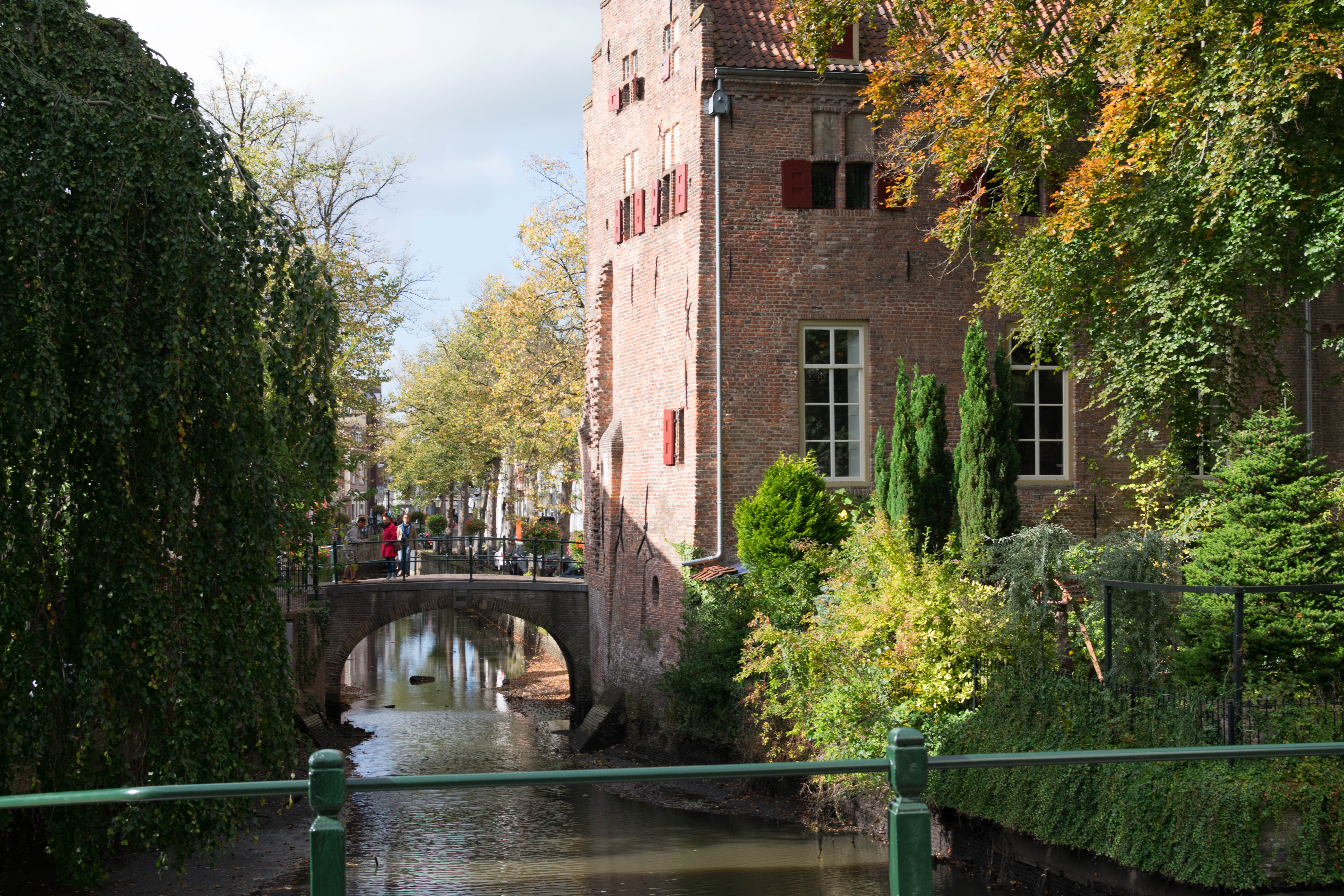
Settings:
Nikkor 35mm 1.8g, aperture at f/7.1, ISO at 100 and shutter speed at 1/125th of a second.
Some first impressions:
- I think the settings in this photo are quite nice. f/7.1 is a good aperture, but maybe f/10 (more closed diafragm) would have made the end result a little less overexposed.
- I see a lot of potential in the colors I tried to display in this photo. They are a bit faded by the harsh light (it was midday), but they are there! That's why converting this one to black and white would not be my preference.
- I don't like that the top of the building isn't in the picture.
- I like the (imaginary) diagonal line that is visible if you draw a line from the top of the bushes on the left, all the way along with the shadow that you see on the building. I think I did this by accident, but it looks nice and gives the photo something more.
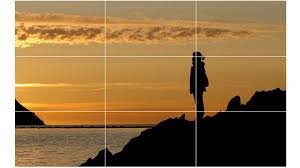
- I like the use of the famous photography rule: 'The rule of thirds', which says that a picture is more pleasing to look at, if you more or less divide your photo in thirds ( see picture I downloaded from Google below). This picture has that!
- The people on the bridge are a little distracting.
- The sky is too blown out in my opinion.
- The railing in the foreground is a nice element, but I think it should be more in the frame, or not at all.
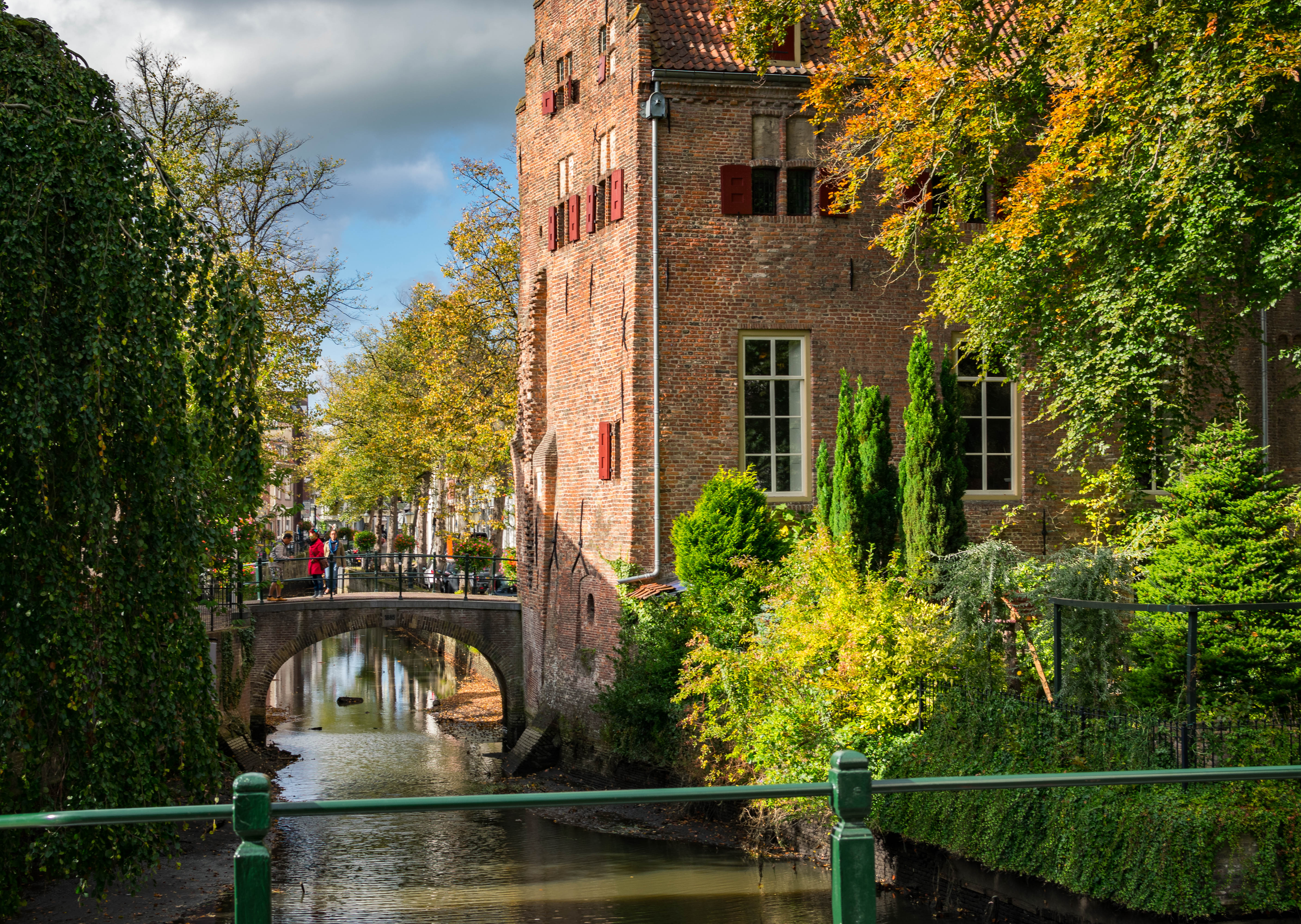
I did a quick edit in Lightroom to correct some things I didn't like and this is the result:
What did I do?
First of all: My edits are pure personal taste and opinion. Some people may find them beautiful, other may think they suck. But what I think is important is the reason why I made a certain edit. Then, even if you don't like it, you can learn something from it.
- I didn't like the excessive highlights in the picture, so I decreased the highlight slider to zero.
- The colors in this picture are great, but they were a bit washed out. So i upped the contrast and added some saturation.
- I made the top of the bushes (top left) align exactly with the top left corner of the picture to emphasize the diagonal line.
- I added some dehaze. This is normally used for hazy pictures, but I like to use it for making the sky look more threatening and detailed.
- I added detail in the plants and in the building to show more of the beautiful structures.
- I added a little vignette, to attract more attention to the centre of the picture (that's where the magic happens).
- And last but not least: the shadows in the lower part of the picture (especially the bridge) seemed a bit too dark for me. I locally upped the shadows to make this better.
What would I do differently in shooting this picture?
- I would definitely zoom out a little more. This wasn't possible with this lens, because it was a 35mm prime lens. But maybe stepping back a little would have made this a better picture. The top of the building isn't visible and that's a pity, because it's beautiful and quite high actually!
- I would wait for the people on the bridge to walk by. I think this picture would have been better without them in the frame.
- I would try shooting this with various diafragm settings and choose the best one. Maybe a higher f-stop number would have made this picture more colorful without even editing a thing.
-I would play with the composition a little bit. Shoot it from different angles to make lines or light appear.
Conclusion:
I kinda like this picture. It has some dark parts and some bright parts. Automatically my eye is drawn to the brighter parts, which is good because my subject is the bright building.
The plants on the right add a lot of color and make this a 'rule of thirds' picture.
There are some interesting lines, which make this photo more pleasing to look at. I especially like the imaginary diagonal that separates the bright from the dark parts.
Thank you very much for reading this post! If you liked it, please leave an upvote or a follow.
And remember: if you would like to have your photo reviewed, post it on your feed with the #photofeedback tag!
Love
Laurens
Great stuff, I'm happy to follow someone I can learn from. Keep it up.
img credz: pixabay.com
Nice, you got a 95.0% @imacryptorick upgoat, thanks to @photofeedback
Want a boost? Minnowbooster's got your back!
The @OriginalWorks bot has determined this post by @photofeedback to be original material and upvoted(1.5%) it!
To call @OriginalWorks, simply reply to any post with @originalworks or !originalworks in your message!
Finally! Someone with a passion for composition! I am pleasantly surprised with the depth of your posts in the context of photography. What a breath of fresh air! You have a solid follow from me!
Thank you very much for your reply @angel35mm!
Maybe it is a bit merciless to say, but in my opinion composition is the only extremely hard part left in photography. Nowadays with all the software (which I really really love by the way), you can easily fix a blown out sky or faded colors. But composition, oh boy that's something Lightroom can't fix for you. It requires the photographer to see instead of to look. I think composition is the part of photography that is hardest to master, yet the most fun to play with.
Have a lovely day angel!
I agree with @angel35mm, very well done @photofeedback, I followed.
I actually like the person in red on the bridge as they draw your eye into the photograph.
Great idea. This deserves a tip! I wish you all the best. I too am trying to get people to properly give feedback on photos, and not just "great shot ." Always, as you say, it's a subjective matter. But critiquing helps both sides grow and become better photographers.
Thanks a lot! I completely agree with you. My feedback isn't 'perfect' or 'right', but it helps with giving other people a different viewpoint, from which both people improve. Followed you!
The rule of thirds is very important... great post... yes use a special hashtag.. mine is #imkindaweird I have followed you upvoted this and resteemed!! Where are you from??
The rule of thirds is so simple, yet so powerful. Thank you very much for your reply! I followed you back. Thanks again for the support, and the tip of course :)
😁😁😁
It's just a tool too, but I think everyone should at least understand it. Not all powerful images follow the "rule" because it is not really a rule at all. There are no rules. Lol! As I quoted Ansel Adams in one of my own posts: "There are no rules for good photographs, there are only good photographs."
Wow! @photofeedback, you really do a total exegesis on a photo. This clearly reflects your expertise. I on the other hand prefer to post unedited original photos. I follow a simple system and it has stood me well through the years. It is called (Raw) That being said, I think you can deliver a valuable service to steemit members that have an interest in professional photography, especially the new members. Yoy should find a way to advertise your services! Blessings, Stephen.
If you make absolutely no changes in Raw, and leave your images exactly as the camera depicted them, then you are not editing. Lol! The camera is just a tool, so I don't allow my tool to make the decisions for me. I do adjust in RAW and also in Photoshop. It's basically the same as I used to do in the darkroom over 25 years ago. There is no such thing as an unedited photo. An unedited photo is what a point and shoot takes. 😊
Sorry, I didn't mean I use a program called RAW, I meant that I use no programs. We are a charity and I don't have the funds to buy any of the editing programs. So what you see is what you get! Blessings.
Ah, so you are shooting jpegs! That means the camera has done all the editing for you by throwing away pixels some calculation decides you don't need. When you shoot using RAW, you tell the camera to save every pixel that is recorded, and then YOU make the decision about which pixels to dispose of!
The only editing program I use and promote is all free.
In Darktable you can edit photos like a professional, and you don't have to pay anything. It also works on all major operating systems.
Also...
Be careful when using the term "raw" when talking about photography, because that term already has an established meaning, as it means the RAW format that cameras produce, a sort of digital negative of the photograph that carries all the information the camera sensor sees when shooting the photo.
These "negatives" will always have to be edited and much of that information discarded, before they can be published. So if you say "raw" when talking about photography, all photographers will automatically assume you mean RAW the picture format instead of anything else.
Thanks a lot for your detailed response @papilloncharity! I like unedited photos too, especially when shot with older cameras to give it a vintage look.
I really appreciate your commentand you give me motivation to continue on this journey.
Bless
:-). Vintage photos are heavily edited! There is no such thing as a straight out of the camera unedited image. That's a common myth. The results you see depend on many, many different factors. In the darkroom we would dodge and burn (that's where the Photoshop term came from), and I could get dozens (probably hundreds) of different results depending on the time the paper was in the developer, which developer I used, which paper I used, whether i decided to raise or lower the enlarger head etc. etc. There were many different printing methods too - all of which gave its own edited style. LOL! If you simply took your roll of film to the drug store to get it developed, an automated machine made all those decisions for you, but it the result was never because if the way the image came out of the camera! :-)
Such a great reply again @dmcamera! I can only bow down for your expertise, it's amazing. I would love to have worked with old school film. 'Dodge and burn' nowadays in Lighroom is so different haha!
I can still smell those chemicals yet! LOL!
I just finished my third review by the way! Please drop by and tell me what you think @dmcamera :)
You did a good job as I mentioned over there. You said why the image worked for you, and you gave some encouraging suggestions for changes!
Hi @photofeedback! @dmcamera is sending you 0.1 SBD tip and @tipU upvote :)
:)
@tipU - send tips by writing tip! in the comment, get share of the profit :)Well Done post photofeedback ! I will be following :) Welcome to Steemit!
Thanks for your reply and the kind words Deborah!
Oh! And your post deserves an Upvote! Keep at it!