Four Stock Photography Trends That Need A Refresh

For the past few years, it’s become a ritual for stock photo agencies like Shutterstock, Getty, Adobe Stock and even Depositphotos to publish heavily researched trend forecasts, predicting what buyers will be searching for in the coming year. These are great merchandising and content marketing pieces for their collections, are consistently inspiring and data-driven, and are often based on trending search terms in and out of the stock photography landscape.
But with all these trends circulating the 1-trillion images per year visual atmosphere, what’s getting tired? What boundaries need pushing? What trends have become tropes in need of a refresh? Our editors compiled four trends in stock photography we’d like to see through a new lens.
Top Down, Flat Lay, and “Knolling”

You’ve likely seen this trend dominating food, lifestyle and product blogs for the past five+ years. Recipe ingredients, tools, camera lenses, fashion accessories and other objects are “laid flat” and organized neatly against a table, floor, rustic wood, stone, or various other backgrounds, then photographed “top-down” at 90 degrees. This clean approach gives viewers a sense of product transparency and is deliciously enticing to look at.
Also called “Knolling,” a term which was re-popularized by artist and sculptor Tom Sachs a few years ago, it comes from a practice that Andrew Kromelow, a janitor at Frank Gehry’s furniture fabrication studio started in the late 1980s. At the end of each day, Kromelow would arrange objects in this style, riffing on the furniture brand “Knoll,” and it’s stuck since.
So what’s the problem? Nothing really. But, like so many trends, it’s losing its design savvy impact, and in its worst cases, doesn’t connect as seamlessly with the content it’s trying to represent. We hope photographers and designers find new ways to reinvent this trend and make it exciting again.
Staged Authenticity
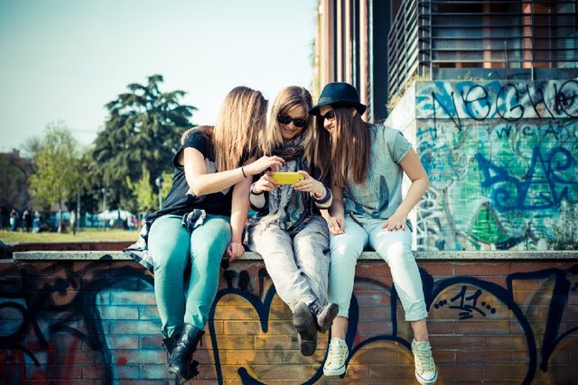
As we mentioned in our guide to taking stock photos that sell, photos that feel “authentic” continue to be in high demand from small businesses and big brands alike. And it makes sense. Who wants to see a rigid stock photo of four anonymous models pointing at a computer screen, when they can see a “real” person, perhaps with a subtle lens flare to show just how “natural” it is. For the past few years, trend reports have indicated that buyers are tired of sterile studio photography and often search for images that are imperfect, and consequently true to the real world.
In their best form, authentic images break classic stock clichés and can be used by brands to add a more accessible human touch to whatever products or narratives they’re selling. But when overdone, they can embody the same contrivances they’re trying to replace, and feel more like a simulation than an honest, off-the-cuff moment. What’s the solution? Don’t fake reality. Include a lens flare if it actually happened, but don’t fabricate it in post production. Include a filter or color treatment if it makes sense, but try not to overuse filters just to seem every-day. We — and likely buyers looking at your work–want to see real life. Show us real people. Show us authenticity in its most legitimate forms.
Hyper Minimalism

We’re big fans of minimalism. Clean lines, brutalist architecture, smart color patterns, “less is more” and Swiss design are tops — and we’ll gush at a Josef Albers print on any wall. But over the past few years, this once-profound way of looking at the world has morphed into an assembly-line formula that anyone with a decent understanding of how to work an iPhone can quickly replicate. And they have: the hashtag #minimalism claims 10MM+ photos on Instagram, and “New Minimalism,” which combines classic minimalism with futuristic accents, was highlighted in numerous 2018 stock photo trend reports. Before this trend fades into a muted, candy-colored sunset, show us something new. How can the beauty of simplicity stay fresh and groundbreaking? How can we keep photo editors and agency art directors excited?
Confused Nostalgia

This might be a call to curators, content marketers, and photo editors more than creators, but we think there’s some overlap. While many stock photo trend reports of 2018 noted an increase in looking to the future, visual and cultural nostalgia (remember South Park’s ‘’’member berries” spoof a couple years ago?) have continued to reign in stock photography shoots, content marketing and big brand campaigns.
When it works, it takes us back and helps us connect with brands as peers. Many of us marketing millennials grew up in the eighties and nineties and have a special place in our hearts for imagery of cassette tapes, horror movie references, and flashes of colorful neon. We loved Stranger Things, the IT remake, and still mourn the loss of shows like Freaks and Geeks. But often in stock photos and nostalgic roundups, time periods are confused. Eighties ephemera is mistagged “nineties” in stock photo keywords and bell-bottomed jeans are mistakenly linked to the wrong decade. If we’re going to keep this trend alive, let’s get it right.
=====
To get the latest updates about Wemark, follow us on social media:
Telegram Facebook twitter
Info about our upcoming Token Sale can be found HERE