Showcasing the Steemit #promo-uk Flyer Design Concepts - Feedback Needed
So, it’s taken a little longer than expected, with several last minute changes, but we are now finally in a position to show the flyer designs that will be used for the #promo-uk major city distribution.
This post will give the #promo-uk team and all other people of Steemit to provide any feedback. Whilst there isn’t a huge amount of difference between the concepts now, I am looking to get ideas on which version people prefer and what changes you think we should make. Remember, this campaign is directly involved in growing Steemit, so your input is vital.
These flyers have been designed to conquer some very clear goals:
- To minimise colour without losing impact or quality.
- Catch attention.
- Highlight the key points.
- Attract the short term target audience of students.
There has been quite a few changes made. We have reduced the amount of content to create a minimalist design, whilst retaining some of the content we know works well from previous distribution campaigns.
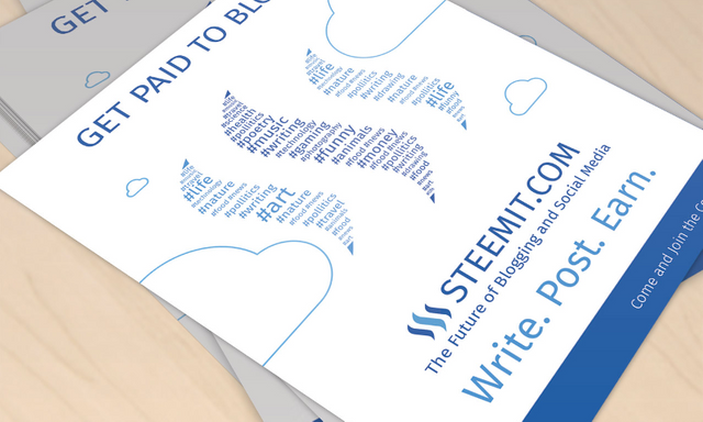
We have removed mentions of the most popular tags on Steemit from the old flyer and replaced it with the new version, which shows the most popular tags as part of the main Steemit logo. This was a very last minute change and the inspiration came from the fantastic work of @malicered in his recent flyer concepts. The designs he has done so far are great and it deserves all of our up votes. He is putting a lot of time into offering design concepts around Steem. So, thank you @malicered, your ideas made our flyers much better.
The end result is now the following designs.
Design 1 - Click to Enlarge

Design 2 - Click to Enlarge

Design 3 - Click to Enlarge

We have spent a lot of time testing different layouts to get to this one. Now we have the layout confirmed we need your help perfecting it. If you’d like to input, please answer one or both of the questions below in your comment:
- Which design version do you prefer?
- What design or content changes would you make, if any?
Once we have feedback and implemented any changes, the final version will be polished and I will announce it in another post to show you. After this, it will go off to the printers and be distributed in the 10 major cities we are working on in #promo-uk.
I have also been informed of a recent comment @ned made about using the term Steemit in advertising material. I have reached out via a comment to check these designs, if they do not meet Steemit Inc’s terms or guidelines, these flyer designs may change to accommodate that.
I want to say a quick thank you to the #promo-uk team and everybody who has supported us. The team is getting bigger each month and soon we will have the whole of the UK covered. My plans after the print redesigns will be to look at supporting all #promo-uk efforts with digital marketing.
great clean design!
Could i suggest the following: put the steeemit contacts of the promo uk team so that people can friend us immidiately and get upvotes and be a more integrated part of the community.
Maybe even add an activity on the flyer saying "post ur picture with this flyer on steemit and tag the steemit team and we will upvote you" or something along those lines (i can see that going viral) but also see that we may not be able to upvote all so maybe we put first 200 people to do this task get guaranteed upvote for example....
thanks @starkerz and good points.
i definitely think adding the accounts of people doing to local campaigns. i'll see how we can add an area in to allow for this. it would give a few accounts for new people to follow and get used to steemit.
we can do a blog called steemit for newbies or something. then write the photo + flyer tagging instructions in this blog. then on the flyer have a QR code that flyer holders can scan and get routed directly to the instructions...
funny you say that. i've seen a comment from Ned the CEO of Steemit saying that he may not want 3rd party adverts to include the word "Steemit" but "Steem" is OK.
If this is the case. We could get round it by getting our own domain and having a blog.
Definitely worth discussing more and I have a server to put it on if needed.
Ok, but I think we just need a simple blog on steemit that just says:
STEEMON!
It's probably OK to use "Steemit" in this context. If Ned doesn't like it, he or Steemit Inc should tell that more clearly and publish guidelines.
Hey @starkerz regarding your mention about adding the contacts. I'm struggling a bit to keep the design minimal. As a work around. What are your thoughts on having a business card sort of thing for people to hand out with the flyer?
ok, also this. but you can just put a QR code on the flyer in the bottom corner or on the back that links to instructions. its really simple and doesnt take up space.
These flyers look great. I really like the idea of not putting the most popular tags on the poster to showcase Steemit to other lights of interest. My favorite is the blue background on the circle of tags. Also, one idea that popped into my head was, these posters are great and people may get intrigued about the idea, but would it be possible to list a contact of the person physically posting them, or a link to your group chat, just to help them along in the process. Just food for thought. Keep up the great work!
Hey @elderfinancial. On the part of adding contacts to the flyer. In aid of keeping the design minimal what are your thoughts on handing a business card of sorts out with the flyer? It would allow the people handing out the flyers a way of giving people somewhere to start with followers.
I think that would be a great idea. Also, it would give the individual handing out the flyers some credit for connecting and building that connection to the network.
agreed and just posted a similar response to @starkerz comment. it needs an area for the accounts of people pushing the campaign. ill see how i can get that added in.
To address another one of your points. There isn't actually a group chat area anywhere although one is very much needed and on it's way. Stay tuned.
Yeah, maybe have one set up so that way there is not a single point of promotion to any one individual, but to all who are participating the the flyer campaign. Great work by the way!
Love design No.2. It's clean and states everything clearly. Simple and effective.
Hi Adam. Thanks for the designs. I am struggling with them. I see what you are trying to achieve and that is by incorporating the categories into the logo, I like that, but what happens is you loose the powerful impact of the logo itself. The logo is the most important thing, the categories are secondary. By incorporating the categories into the logo I feel waters down the logo. Repeating the categories multiple times is also very confusing and it is unclear which is the the most popular. For instance photography is and you you can barely see it. What stands out is Art, Life, Funny, Money and that sends out the wrong signals and Politics has one L. Lets see what everyone thinks but for me I think we run the risk of loosing our identity and that is the logo itself. Stephen
thanks for your input stephen. I agree on the tags could be confusing. I will try to change them to include more in as this will show that steemit is a lot more diverse in topics. it's just harder to fit it in design wise :)
with your points on the logo. it's difficult because you always need the main points on a flyer to stand out so people know what it's about about what to do next. I always try and make the content stand out first with the imagery and logo as second. it's ok to make the logo the main focus if you are a well know brand but with steemit we may need to advertise the main points to get people to convert. regardless, I will see what I can do :)
I do like designs One and Two :) they are all awesome though and the # tags in the logo is sick. Really look forward to getting a batch and box from @stephenkendal and yourself @Adamm!
Just commented that I am waiting for it and here it is! Looks awesome. Minimalist, readable. I prefer the first one :)
I like them mate well done, very clean and clear designs whilst still retaining the key information. I would say either design 1 or 2 is my favourite. As for something to add, maybe mention something about it being free to sign up and use?
good point :) free is always good and it encourages. ill see how it can be added in.
Hi Adam. It was great to chat with you earlier. As we talked about, I think it is very important when branding to keep everything the same across all Promotional Merchandise. Colours, Fonts, Slogans etc. When you start deviating away from these it can begin to get quite confusing when you are out selling. One of the things that I have found when I am out on the streets talking to people is their fear of the complexity of the Platform and what I have found is if you can breakdown that barrier while talking to them it is a massive help. We have found that quite a lot of people actually access their mobile and pull up Steemit.com in front of us. To have a flyer that represents as much as we can of what they see on their phone/ipad/screen allows them to engage straight away in a conversation. That is why it is important to have the categories on the flyer. I have knocked this up in an attempt to produce a flyer that is close to the platform "look and feel" that we can use to help demonstrate how it works. A Redesign was never going to be straight forward and requires a lot of chopping, changing and bouncing a few ideas around. Keep up the great work. Stephen
Thanks Stephen. I will see which design is the most popular and I completely agree that it needs to match the merch you already have as well as be very close to the Steemit brand guidelines already set.
I will take these points and get them implemented into the next design.
Hello, great design, this is very cute. The tags on the logo give it an original touch. I like the work they are doing to promote Steemit.
Greetings.
I really like design number one.
Amazing work @Adamm and I can't wait to see the new flyers printed
Great Work!