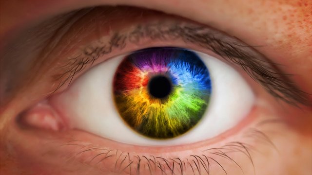
The Science Behind Colors: How Colors Trigger Our Emotions - How Big Brands Use Colors To Sell

Color resonates with people in different ways. We all have a favorite color, however; every single one of them has a different impact on the human brain. That’s a fact.
Colors play a big role when it comes to graphic design and psychology. Different colors means different moods.
It’s important to consider the message you want to portray when selecting the color per se of your company’s logo, what’s your goal? What emotions do you want to trigger?
Now I want you to think about the biggest food restaurants out there, think about their logos. Do you see any similarities?

Yup, that’s right. Same colors. Red and Yellow. Now I don’t want you to think of this as a coincidence, because it’s not. These companies have done extensive scientific research on the impact of certain colors on our brain, and guess what, they’ve all come down to the same conclusions. Red and Yellow are the best choice.
It’s likely that you’ve heard that the color red makes people feel hungry. Well that’s true. Research suggests that appetites are sparked when we see the color red or when we are in red places (as opposed to when we’re on blue places, which for some reason, they don’t want to make us eat at all). Red is stimulating, and associated with activity.
Yellow, on the other side is a cheery and exciting color. It’s used mainly because it grabs the client’s attention (we can see yellow from far distances). I mean, we could be really far away in the highway and we are still going to be able to spot that little golden arch with the “M” sign begging us to stop and have a Big Mac.
So we have the perfect combination between red and yellow, funny enough some people labeled it as the Ketchup and Mustard theory. My point is that together they form the perfect psychological visual sign for making us want to stop and eat.
It’s a fact, the language of color is communicated quicker to the brain than words or shapes, since they’re linked directly to our emotions. So it’s not surprising that big brands understand the importance of color, these guys know what they’re doing and so should you.
Next time you have to choose colors for any graphic design, I want you to ask yourself, what emotions do you want to trigger?
Marketing, graphics, and mind control are essential to economic success.
It is crazy the amount of manipulation that big corporations use on us. Even down to the placement of food on the aisles in the grocery store. We need to be more educated we are about what they're trying to do. Good post!
Now I see why everyone in the industry is using red AND yellow. Neuromarketing all the way!
Congratulations @bencord! You have completed some achievement on Steemit and have been rewarded with new badge(s) :
Click on any badge to view your own Board of Honor on SteemitBoard.
For more information about SteemitBoard, click here
If you no longer want to receive notifications, reply to this comment with the word
STOP