tutorials handling of color degradation and detail
Welcome to my new tutorial I hope you are pleased I always say that if God gives us a talent it is for us to spread and help others, in this tutorial I will teach you how to vectorize, add color degradations and we will also reinforce the part of minimalist details that make the difference, sometimes we do things to do them or we just do not put the effort ebido in the design is the opposite as more love and love you put what you do I assure you that more beautiful is, this is a contribution that For a long time I wanted to make and today I dedicated myself thanks for the support and the opportunity.
- Manage Gradients
- Make Details
- Create vectors with different perspectives.
The whole community is able to perform these types of illustrations, however they will need essential things .You must know the basic concepts of Illustrator or Photoshop.
- Requirement No. 1: A computer with the program of your choice, be it photoshop or Illustrator.
- Requirement No. 2: Intermediate management of the programs.
- Requirement No. The provision to learn and create.
The content will be directed to the population of illustrating designers illustrators will give
you different techniques so that when making an illustration with so many people know how to get along.
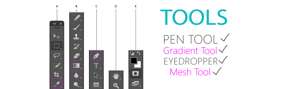
Tools
- Adobe Illustrator
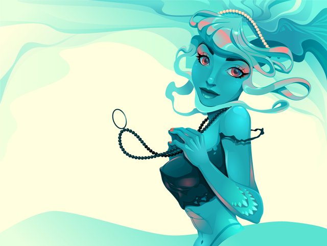
An unusual Siren.
Before starting to illustrate, it is always good, filled with information, this makes you more passionate about art.
The sirens, unlike the popular custom, within the Greek tradition were marine geniuses, half women and half birds. His ancestry is unclear. According to the most common versions of the myth, they are daughters of Melpomene (muse of tragedy) and of Achelous (god of the homonymous river and first-born of the river-gods). But other versions make them daughters of Achelous and Estérope, or Terpsícore (muse of poetry and dance) or also of the god Forcis. According to the version of Libanio, they were born from the blood of Achelous, which was shed by Heracles (Hercules).
They are marine maidens who deceive the navigators with their great beauty and the sweetness of their song; from the head to the navel they have the body of a virgin and a form similar to the human race, but they have a scaly tail of fish, which they always hide in the sea. Although in modern iconography mermaids are usually depicted as overwhelmingly beautiful, it is likely that in the classical tradition their only appeal lay in their voice and that their appearance was nothing short of monstrous.

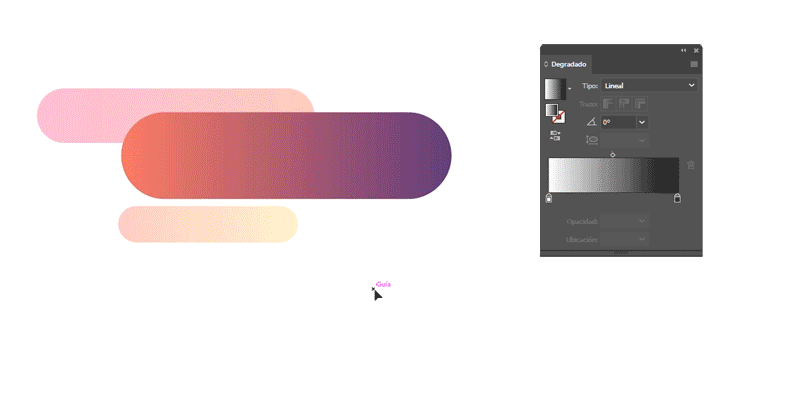
Gradients of color
It is a gradual transition between two colors or shades of a color. Currently the illustration and layout programs include the possibility of performing linear, central, circular or conical gradients. is a range of colors arranged linearly with the intention of visually giving a smooth and progressive transition between two or more colors.1 Most photo retouching software allows you to easily perform gradients with which to fill out shapes and contours. A complete description of the topics covered in this tutorial, plus the contents of the tutorial itself.
they are formed by a progression of colors that operate in the color space (RGB or CMYK usually) from the first to the second, in which the percentage of the first color is progressively reduced and the percentage is proportionally increased to the same extent of the second color.
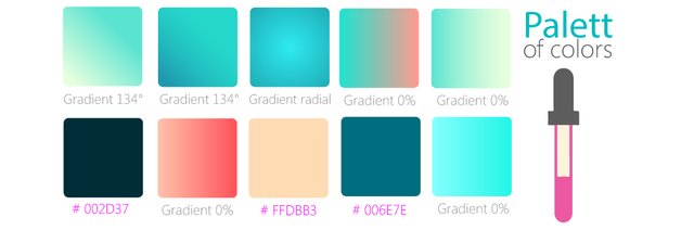
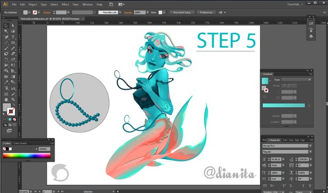
Toolbox, these were the most used when performing the siren
PROCES
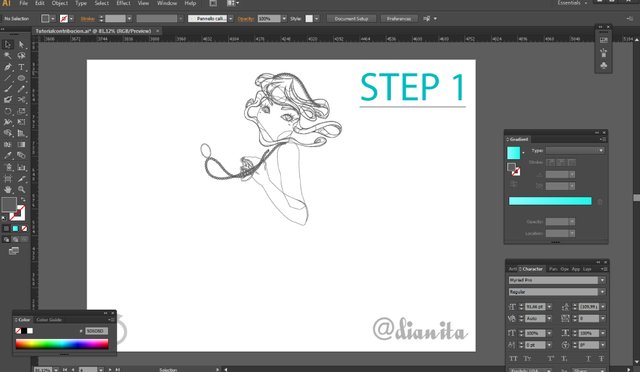
The stroke is very important in the image, so an image will call much more attention if it has a consistent stroke, than another in which the stroke is poor. For this we will ink using shapes instead of simple paths.
The next step is to polish the forms created, so that no peaks remain, round the edges that we see that appear, so the set will work much better and give the feeling of a real inking.
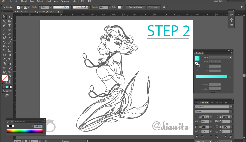
Now we will add the details, these details if they can be strokes, if you use strokes better to create another layer only for strokes, at the time of selecting them all will go much better. If we use forms we can continue in the same layer.
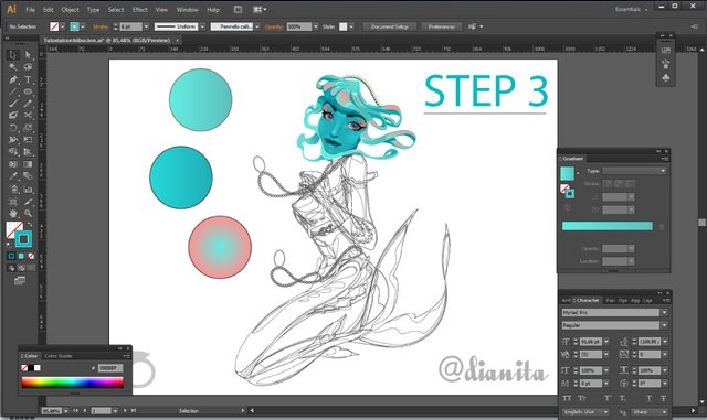
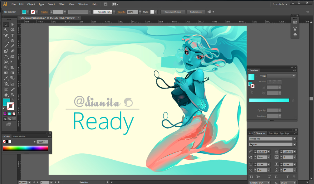
Now it is the turn of the coloring, for the base color, we will use not very bright but intense colors, so our illustration will be striking.
(bringing the original content)
This work is licensed under an international Creative Commons Attribution 4.0 license.
Having turned off the option multiply and left the layer in normal mode, as we have done a powerful inking, we will not have problems when coloring, since the areas that are free to color, will not be too large.
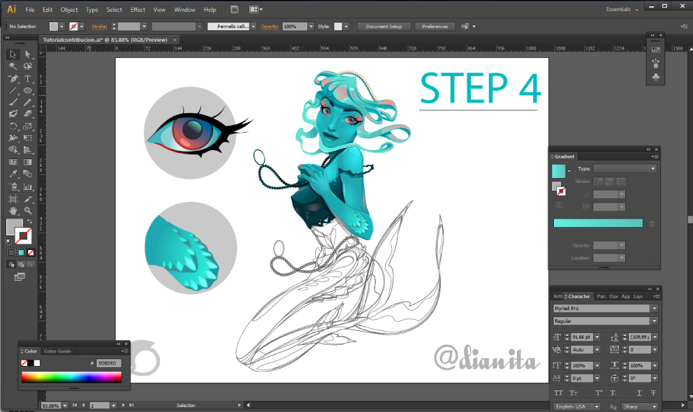
We will add small shadows to give a little volume to the final result. For this, we will create a new layer and place it between the layer of the inking (stroke) and the color, we will put it in multiply mode and we will lower the opacity to 40%
And with this we have finished our vector illustration! These concepts are what I have been collecting during this time. I hope they are useful for you as much as they have been for me. Possibly not all the steps are essential but having an order in the time to work and organize is important.
Plano Medio
Plano Detalle

@dianita
This work is licensed under a Creative Commons Attribution 4.0 International License.

Sounds easy but its really tough..Will refer whenever in need.