The State of the Sndbox Monthly Thumbnail Competition #10! Entry
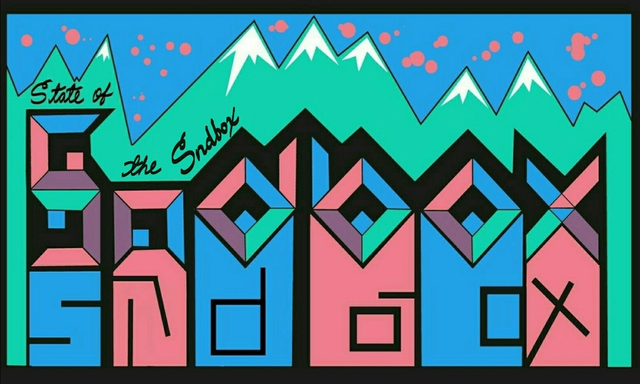
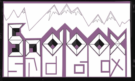
The state of sndbox art was inspired by the cubic shape of the logo. The word sndbox was designed utilizing the logo and adding it to each word, some with some add-ons to the shapes, without loosing the essence of it.
I extended the shapes from the logo downward and from there I added the word sndbox again by placing some lines in the shapes.
The snow capped mountains was a follow up from the backdrop in the wording that have mountain shape already.
The splat in the sky is for color and contrast. A variant in shape to break the sharp edges a bit and to add some equilibrium in the design.
The cursive wording to add some flow and a bit of sophistication like a signature of property. The stair like position to give it a playful look and movement.
This is my entry to the contest The State of the Sndbox Monthly Thumbnail Competition #10! by @sndbox
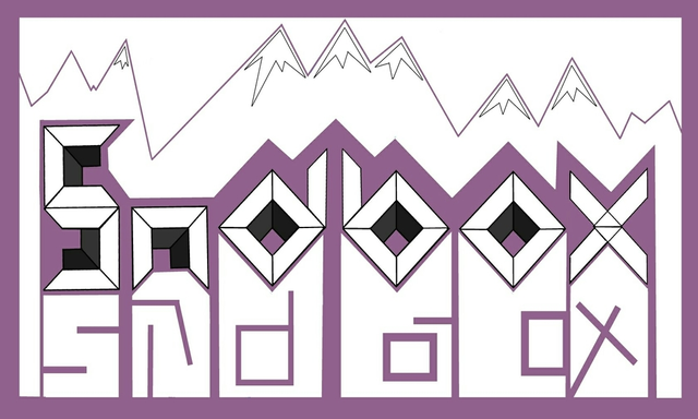
Purple Alternative Version
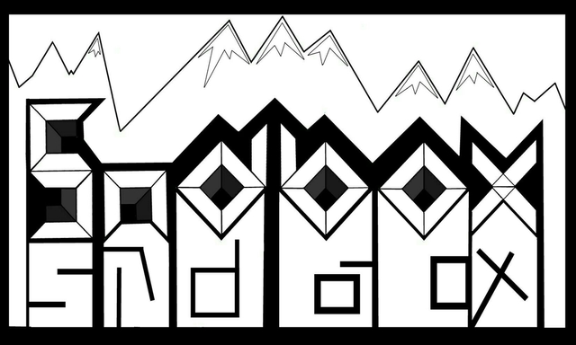
Black Alternative Version
Animated Process
Dear Artzonian, thanks for using the #ArtzOne hashtag. Your work is valuable to the @ArtzOne community. Quote of the week: Art, freedom and creativity will change society faster than politics. -Victor Pinchuk
Thank you!