Steemchurch Mobile App: Actractive User Experience (Update)
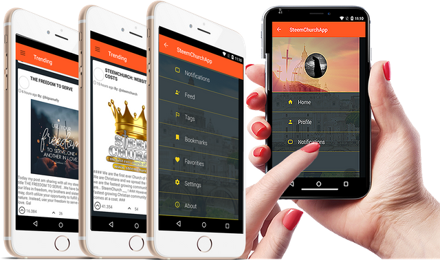
Brothers and sisters of the first church of the blockchain, I want to announce that while developing the changes we have made to the SteemChurch App, to improve the user's appearance, when downloading the Steemchurch App you can notice that in the main menu it has a riple effect from left to right and from right to left, this allows a very attractive user experience. To carry out these effects, we use colors of material design, which are recommended by google.
Transparency in the buttons.
Effects of the main menu.
Background of the feed with new background color.
Adjust the corners of the edges of the card frame of the google cards. Visivilidad of user that realizes the publication.
To see the new changes, you can update here

Soon I will show the following advances pending how to bring the user photo to the feed and login
I like these changes, I'm much better.
Thank you brother
I love this. This is brilliant. We would be waiting for whatsoever you wanna bring to add beauty.
Thanks for your comment brother God bless you
Excellent work, continue like this @michellechristie
Thank you sister
We are changing and improving the user experience come many improvements this gets good God bless you all
Congratulations @michellechristie! You have completed some achievement on Steemit and have been rewarded with new badge(s) :
Click on the badge to view your Board of Honor.
If you no longer want to receive notifications, reply to this comment with the word
STOPTo support your work, I also upvoted your post!
Do not miss the last post from @steemitboard!
Participate in the SteemitBoard World Cup Contest!
Collect World Cup badges and win free SBD
Support the Gold Sponsors of the contest: @good-karma and @lukestokes