Is This Going to be The New Steemit Look?

There are often times when I login to Steemit.com it doesn't work. Either it gives you an error or it goes on real slow. It's a good thing that we have an alternative called Steemitstage.com (verified it's owned by Steemit as well). So whenever the site does not work - I use Steemitstage.com instead. Recently, Steemitstage also stopped working. Presenting me with a broken robot image telling me that the website is down or something. However, it's up and running now and I noticed something very different.
If you look at the screen capture above, the trending page looks different. The list of posts has been updated with a new look. The author names are now on the upper-left corner of a post together with their Avatar. Along with some other layout changes: Tags are on the left side. There are "Links" on the right side. There's also a button that transforms your feed into a 'busy.org-like' or 'facebook-like' environment. Look, here's what happens after pressing that button:
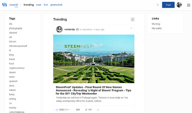
It makes the 'thumbnail' bigger, just like how you'd see it in Busy.org. This can make the website look much more enjoyable for some, especially if they like to focus on the thumbnail and have problems squinting their eyes just to see what the first photo is about without opening the post itself. Other than that I didn't notice any other changes on the main feeds.
The same format also applies to your blog's page. It now looks like this:

Your comments and replies also had the same changes. The comments page looks like this:
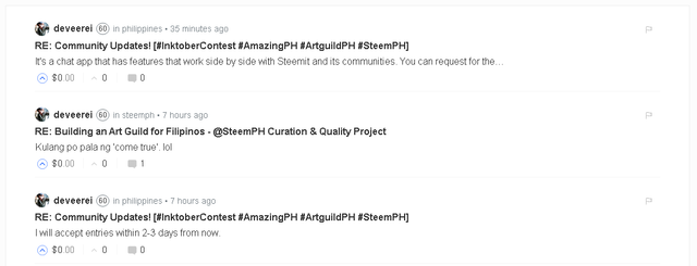
You'll notice that the replies page has troubles loading Avatars (much like when you open a reply in Steemit.com, it won't show you their actual avatar, rather it will show you the 'anonymous' avatar by default - it seems you have to go to their main blog first so that their avatar will load the first time, once it is loaded you're able to see it in the replies page). It looks like this:

The rewards, wallet, & settings page stays the same without any noticeable difference. The only thing I noticed is the font could be different, both in type and size (but it's possible that was just brought about by change of device - I'm on a desktop PC in Steemitstage.com while at work now and I'm usually on a laptop at home.). Another thing is my Cover Image doesn't show up and that space stays white (it works ins Steemit.com btw), while users who doesn't have one will retain the blue gradient as their Cover Image.
Since my voting power is not up above 90% I decided to upvote the entries I got for one of my contests, then I've noticed is that hyperlinks and the Upvote icon now has a brighter and deeper blue (the slider also gets a somwhat bigger box). Here's a look (I can't take a screenshot of the slider without moving my mouse away):

Another one that's notable is the Powered-Up Posts does not have the Steemit logo on it anymore instead it's a blue 100% logo.

Could it be that they're doing updates on Steemit.com that's why it's working intermittently? I did notice that notifications are working properly on Steemit.com now (most of the time). I wonder what other things are in store for us Steemians? After all, this is a Beta site so changes are inevitable and will be a vital part of improvement not just in the website interface but in the experience as a whole. Any changes here can directly affect communities and the Steem currency. Hoping for the best. Let's change Steem for the better!
Maraming Salamat!
Thank you so much!


I really hope there are some UI updates in the works, because the current Steemit.com interface needs to be updated, ASAP! A more polished look, along with advanced sorting of posts/comments, will go a long way in retaining new members and improving the user experience.
I'm pretty sure they will migrate the changes that's happening in the Steemitstage.com website. It's like an Alpha site for a Beta Site which is Steemit.com. So far I like the improvements there, just not the additional colors and icon changes. I've updated this post with some other changes I noticed while using Steemitstage.com.
What's a powered up post? I noticed some posts have the steem icon beside their titles. o.o
Hello =) it means that instead of getting 50/50 (half SBD, half steem power) of the post payout, you will get full steem power (from the 75% you will receive from your post) (does I make sense ?)
btw, thank you for the update @Deveerei !
Ah, I get it now. Thanks for explaining it to me, really helpful of you. 👍
You're welcome !
This deserves some attention. Upvoted and resteemed...
Thank you so much, I appreciate that @ipkiss.
Looks nice!
I believe we are still under ddos attacks which slows or even stops everything. :(
I see, we have that issue too. Hopefully everything gets fixed asap.
I think the new layout looks a bit better - I just don't like the brighter blues. The resteem button also is blue now when you've resteemed a post (previously it's green). I'm also using Steemitstage.com now.
Thanks! I did notice that. I will add that in my post if that's fine?
It's cool. :)
Thanks, cheers!
Yes, hoping for the best. :)
:D
Been using busy for a week now, but this looks more familiar, with tons of improvements like you pointed out. Will start exploring this too.
I suaully use busy.org in the office for browsing - cause the main Steemit.com website is blocked. I was so relieved when Steemitstage.com works since I'm able to do stuff while I'm in the office in my free time. It's such a waste if all I do with my free time are unproductive things. Haha - don't turn me over to our IT saying I'm doing ilegal browsing lol.