Steemit Home Page Redesign Part 2
Steemit Home Page Redesign Part 2
After reviewing all of your comments, direct messages, and chatter in discord here's part II.
Burning the midnight oil and thought I would complete out the request for Steemit Home Page Part 2
I wanted to take all comments into effect in this 2nd iteration for the home page for steemit. I received a large response from many high profile advocates in the community like @aggroed @themarkymark, @velimir, @fredrikaa and @fulltimegeek. I also received great constructive comments on how best to build the 2nd iteration wireframes from @brandonp, @geofftk, @fourfourfun, @dlew, and @venalbe just to name a few. I greatly appreciate the communities involvement to push forward my ux work to assist the community and the comments to not only better the design for steemit but to improve my skillset to meet the demands of the users that use the platform. Thank you!.
Comments on Iteration I
- Insert the sorting methods for feeds into the header
- Proportions for tiling of tags too wide and adjust alignment
- (Add) a smart sort for things I’m interested in to surface to the top (will add this as a featured in logged in)
- Establish additional ways to personalize the dashboard for the user
- Perhaps adjust the actual short post of the user feed ( we can do this once we explore the "blog" section )
- Remove cosmetic things like “beta” it deters new users
- Rework a pull down for personal stats: voting power, vote value, bandwidth, etc. (also will address in the "blog" view section )
Additional Comments
- Many different requests about 3rd Party Plugin metrics for posts, and how to display it. Make this content centric around posts as well as my blog section.
- Create in a preferences panel a way to turn on metrics for specific posts for advanced users vs standard users. When I really become engaged in posts and comments I want to know my metrics for them easily
- Allow a better dashboard for logged in users to access their page vs a general home page.
It has been brought to my attention about additional constructive features to place on pages outside of the home page as well as described above. I have a list of additional requests for fixes on other steemit pages.
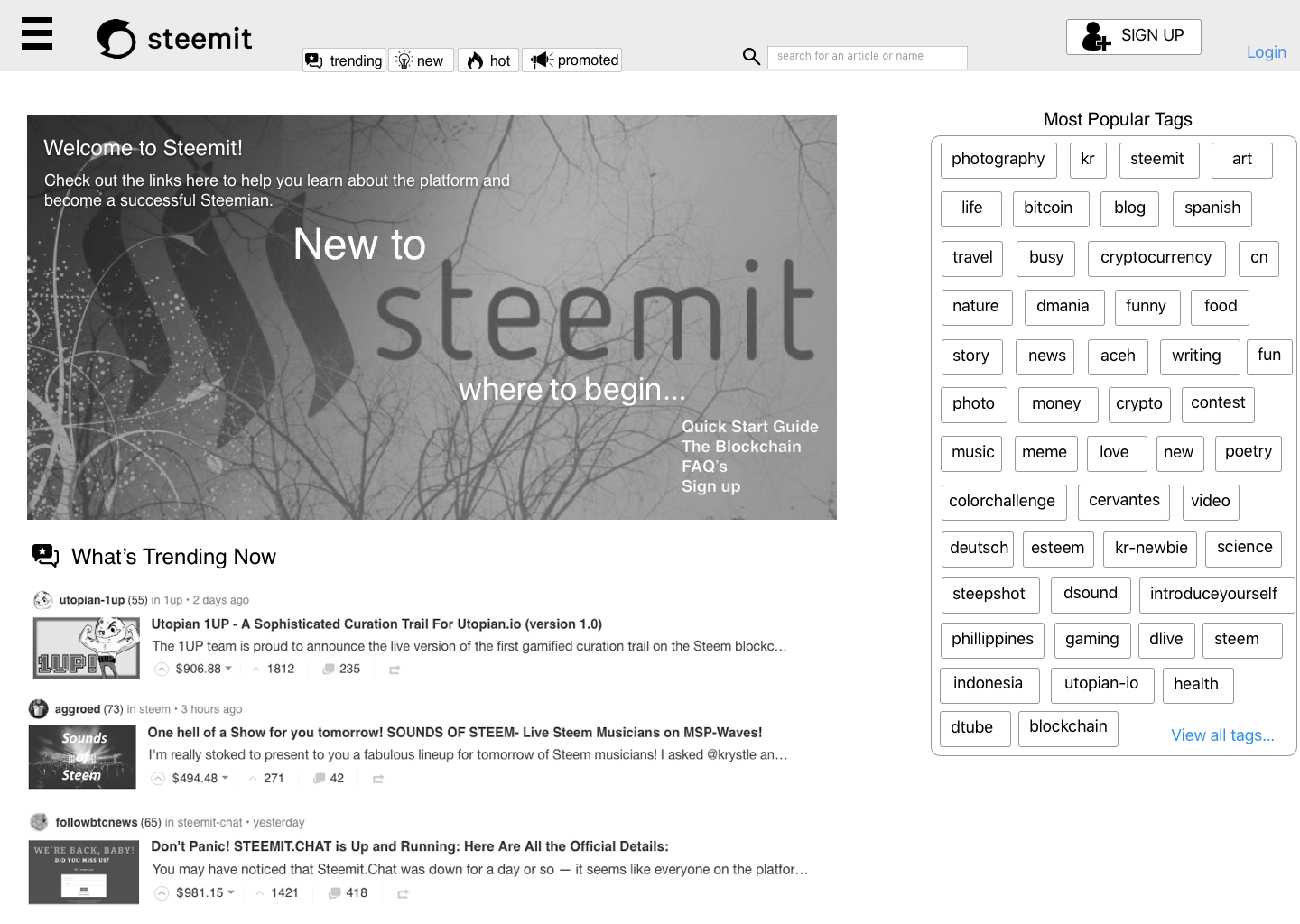
Below is the newly revised version of "Logged Out New User Home Page"
Logged Out New User Home Page
Persona: I am a new user coming to Steemit for the first time. I have possibly been to Quora and Reddit before.
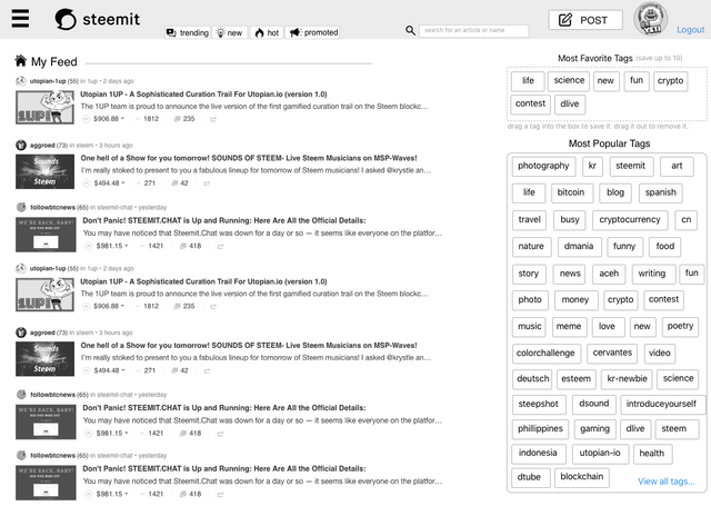
Logged In - Returning User Home Page
Persona: I am a current user. I am returning back to the home page after I have logged back on. This is my home page not my blog page.
Before I work towards part 3, for the actual visual aesthetic and design, I wanted everyone to take another round at the UI and provide comments, improvements, adjustments?
Some things to note. this is NOT the Blog page. I will address that in the next iteration coming in a few days.
This strictly is for a new user to the site, and second a returning user accessing the home page. Once I can establish enough of a style and pleasing approach here I can then start to rebuild the interior pages like blog, wallet, settings etc.
Did you MISS Part I of this redesign document? Did you want to check it out still?
To review Part 1 of this ongoing iteration story check it out here
Interested in seeing more content from THE UX YETI

@theUXyeti - This is me! Hilarious, funny, ex reality tv guy, loves app and web UI, competitive card player, scuba instructor, dart thrower, MTG player, WSOP player, gamer, hearthstone mechanic exploiter, sports handicapper, Geek of all trades.
How to find me
Steemit: www.steemit.com/@theUXyeti
Discord: TheUXyeti or TheUXyeti#5698
Dtube Channel:
Check out some great Steemian Communities that I'm a part of as well.
@dtube / #dtube - gotta follow these guys for all new videos coming out everyday...
@adsactly / #adsactly - a great group of steemians paving the way for learning, educating, teaching, listening and talking humor.
@minnowsupport / #minnowsupport - a great discord server with great steemians helping everyone learn the platform by encouraging advocacy to all members new and veteran.
@thealliance / #thealliance - another great group to belong to. a good team to upvote and resteem your posts. Check these guys out as well.
@cryptoempire / #cryptoempire - a new community I found that is everything from on boarding to crypto chatter.
Very nice! Way to take the criticism and churn out an even more improved design. I love it!
YAWN... is this really the best that Hollywoods finest has to offer, i guess can't expect much from an exploiter, with no empathy who rinsed artist work for free. time waster. think he should try harder.

Much appreciation any new comments to improve would be much appreciated
Loving your work! These mock ups look great. I think that as with all GUI interface design, different users will want different things so keeping it as generic and flexible as possible is key.
Agreed! Flexible and modular I’d agree! Thing is we’d have to lock in a ui that all users would see. Customizable dashboards tend to always fail so we’d have to user test or build two ui’s and vote i think
Agreed. It’s starting to take shape which is great. It’s really difficult with such a diverse user group. Maybe voting on wire frames is the way forward!
eh i have a few design principles in place. Its always the case of People wanting Features for everything vs what should we control in the UI. So for me itll be if it makes it easier and doesnt require lots of dev time then it wins. if its a crazy feature bc of a pain point a user has then we address the pain point to figure out how to improve the ui to allow them to do what they want to do. People always come up with solutions but the problem is that most of the time they should be telling us about the problems and leave design and ux up to the solve :)
I hear you. People are great at articulating their suggested solutions but ask them for a requirement and they go blank. You seem to be doing really well here, so keep it up and let me know if I can help.
Got any chops in visual design? I could probably use a hand soon once i finalize iterations lmk
It really gives a cool look and make steemit blog more "easy". I guess new people will like steemit this way more, and having a less time to look everything up how things work. In my opinion
Eh a repository for onboarding sounds great! The question is what information helps a user best? That’s my long term mission is either finding all the good articles and compiling them together or rewriting the articles to build a library
Then I would say, mission complete. This is a great way to improve the library and make it easier for not only new people, but us steemians also.
The steemit concept is already easy for other blockchain terms, next move is make it more easy and less complex for the average Joe.
Lets make steemit mainstream and call all the creative people on this platform!
Great perspective!
You have been scouted by @promo-mentors. We are a community of new and veteran Steemians and we are always on the look out for promising authors.
I would like to invite you to our discord group https://discord.gg/vDPAFqb.
When you are there send me a message if you get lost! (My Discord name is the same as here on Steemit)
Awesome thanks for the reach out! I just joined
I like the favourite tags. I think a favourite users would be good too so you ensure that you see their posts.
I agree with this!
Favorited users. Agreed! Could be a tab that lives at the top. We’d have to build a machinist to favorite a user as well.
agreed there IS a BIG DISCONNECT in this platform for users to find other users easily, as well as read their content. I hate that i have to use the search tool to find people to read their content posted. I will surface this as well. I think on the blog page some of this will be addressed. Im still convinced that the home page for logged in isnt really where people land, they go to whats called the "blog" page to see their content. and there i believe we have some additional features to allow you to see other feeds ie favorited user feeds and possibly a widget that shows favorited users easily accessible for you to review. kind of like old school my space days when you could have your top 5 or top 10 lol
A foreign language filter would be good although would probably need users to nominate what language they are posting in unless it was fairly smart
there is a standard for localization at least on the games and websites i have worked on. For a language filter to be accurately added I am unsure of the implication on the platform it would have but its a great feature to have on the front end and in the header. I will add it. Great add on.
we really need more ways to filter content. content creators should be able to attach a 0-100 priority for posts. users should be able to choose how many posts from which users, tags, and priorities appear on the wall.
most importantly, users should have an average payout per post variable attached to them so its obvious which posts are getting paid more than they usually would, given the average.
For your first part, I’ll compromise on a favorites tab that you assign which users are favorites and you would see content from them.
Feature sets you listed may be too meticulous to impose as it goes against a simple interface like occums razor approach. Trying to keep it simple and easy to use but i think a favorites tab would solve your priority issue
At the post level that’s metrics at the blog level. I’m already on that for the next post. We’re still reworking the home page logged in. But agreed on that note
That looks great. Also can you make the Login/SignUp button more visible on the login page. I've noticed that when your phone have a small screen it is somehow compressed together with the other options. Anyway, I've made a suggestion to utopian, too bad they rejected it though lol https://steemit.com/utopian-io/@jlordc/suggestion-add-a-visible-login-signup-button-on-steemit-landing-page
You are running into what’s known as a responsiveness issue. But great point! Once the build has gone through Enlight iterations I’ll provide a responsive mobile view! Great insight i missed that. But yes there should be an easy way in and out of the site. Thanks! Great observation. Making a note!
Happy to have chipped in. You know the internet - everyone has an opinion!
Thank you! Iteration 3 will be coming soon. Once i can get everyone me comments together
Cool! I like the idea of doing iterations based on feedback like this. Here are just some thoughts looking at your draft and also some points to share about my own opinion about the current UI.
1
If I am browsing Trending, looking at my own blog, or reading someone else's article, where do I find my "Feed" in your UI? A current lack to the steem UI, imo, is the fact that the feed is probably the most used tab for content discovery but still it doesn't have a button that actually tells a user that's what it is (apart from the House you see with the text "Feed" once you click your image) the other way to get to your feed is hidden behind the steemit, beta logo, which is confusing. Is it intuitive that the steemit logo would take you to your Home Feed? Wouldn't most new users expect that to take you to some kind of front page? I don't unserstand why there isn't a button called "My feed" together with "My Wallet" and "My blog" in the links tab on the right.
2
I think the tags in your draft takes up too much space and receives too much attention. But I do like the idea of "favourite tags". How about an option to "filter by tags" where you have the list of tags as usual (which a search tag funtion as well to help you find different tags and quickly see how many posts have been made with that tag) where you can check a box to only display posts made with that tag also in your feed. (Let's say I follow a lot of science people on steemit as well as just contacts in general, how can I quickly browse the science content posted only by the people I follow?)
Part 1
Agreed i had an issue not understanding that “my feed” wasn’t a tab. It felt disconnective. I haven’t started revising the “blog” page yet but agreed i would want “my feed” to be a tab in the home page. For me having used Steemit for 60 days the tabs have little value. That said as a user we should make them usable. I think to your point if we add in a my feed tab or use that one as the default logged in user tab we solve that problem. I think I’d also want your feedback on what tabs we should really have that assist the user to discover content.? For me hot and trending are similar. Perhaps the tabs should read
My feed | trending | discover | onboarding
Something that illustrates to a user they want to access the content. I think a smart filter of whatever you upvote could be a new sort as well like “curated” if it was smart enough to data sort articles i like.
Part 2
This is a cool feature. We could do that. It’d be a series of selections and toggles. I agree the tags take up a fair amount of space and should be hidden in a collapsible accordion or something only exposing the tags you have favorited.
For example i think i could select science from tags then check a box either (see all) or (favorites) assuming my favorites have tagged their content science, i would then have a cta button that allows me to filter the my feed list to favorites science.
I’ll work this feature in. We’d create a widget in the tags section that allows you to sort based on tag and favorites.
the logo should take you to the Home Page that we are working on now as a logged in user. not to the blog page. but your point is right. the default once i select the logo should be home page > default "my feed" not trending etc.
@theuxyeti, I really like your ideas, and design. One additional thing I wish I could do (and maybe this will be addressed later) is I wish I had an option to turn my feed off, allow only certain profiles in my feed, or have it full on as it is now. As I understand it, my feed activity impacts my bandwidth usage. Is this correct? So far, the only way I have found to limit my feed activity is to mute or unfollow people. Is that the only way? Since bandwidth exceeded limits are a great concern for new users I believe there needs to be a lot more education / information available in the FAQ about best practices on bandwidth preservation. It is extremely frustrating for new users to try to figure this out, and then not be able to do anything about it because of the active restriction.
My bandwidth is currently severely restricted, but I've managed to upvote and resteem this article as one of my daily post promotions for the @mitneb Curation Trail Project. It will be featured in the @mitneb Curation Trail Project Daily Report for 15 FEB 2018. I'm following you now, too! Thanks for sharing this on PYPT.
Cheers!
So collectively it seems there is a demand for a feature that allows you to create a favorites. or favorite say 20 users. Once i do this i can then select a Favorites tab that will then be a feed of the people youve favorited. Now this isnt really a solve to bandwidth conflicts it does however allow you to follow a curated tab of followers you want to view differently then the full feed. I hope this is a happy compromise. As for the bandwidth conflict. I too had an issue in the beginning, so perhaps there should be a help section with a request to amp my bandwidth etc. I thought about this as if perhaps a user receives a greater bandwidth as a new user but then perhaps much is wasted and unused due to user fall out. that said perhaps there is a request ticket location to ask for upped usage and then that would automate additional steem for the true advocates. that was my thought at least.
Thanks for following and thanks for the comments. Redesign III coming tonight if i can complete it
@theuxyeti, I like your idea of the ability to pay for additional bandwidth. I would suggest that a person must have a minimum reputation score of say 35 or 40 before being permitted to do this. I'd really like to see some better and more easily accessible information about bandwidth so that new people like myself can understand it, and make more strategic use of activity choices.
I follow and resteem a lot because it is the only way I have figured out to manage my curation activity, and then go back to the articles to build my daily reports from. I would really love to see separate tabs for my published articles and my resteems. That would be amazing, and so much more useful than the current single stream of activity. When I visit someone's blog I want to see what they are writing, not what they are resteeming. I've actually been posting my own writings on my Discord Server so I can find them again without having to sift through my own resteems.
Thanks for caring, listening and working on improvements.
Cheers!