Part 2: Creating the Steem Tag Explorer -- The Scatterplots
.png)
In the previous post in this series, I described how to create the table lens graphs for a web-based interactive Steem Tag Explorer that I created in Tableau Public. In this post, I will show you how to create the scatterplots.
To follow along with this post, you need to complete all of the steps in the last post:
Part 1: Creating the Steem Tag Explorer in Tableau Public--The Table Lens
One warning: the data behind these charts was dynamically updated several times while preparing this, so you might notice that some of the numbers vary a bit in the images.
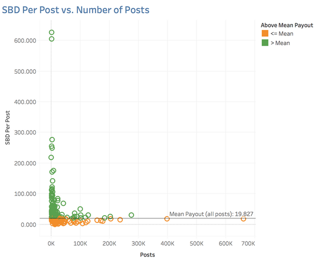
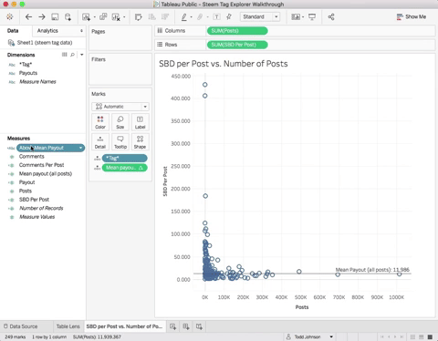
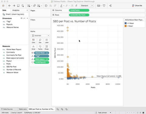
Create the SBD Per Post vs. Number of Posts Scatterplots
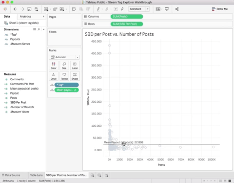
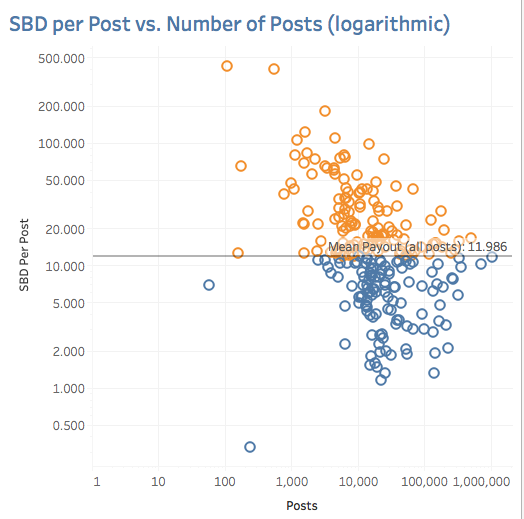
Recall from the last post that we need to create two versions of this scatterplot: one with linear and one with logarithmic axes. Here is a closeup of the linear axis version of this graph:
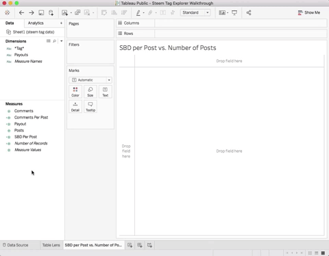
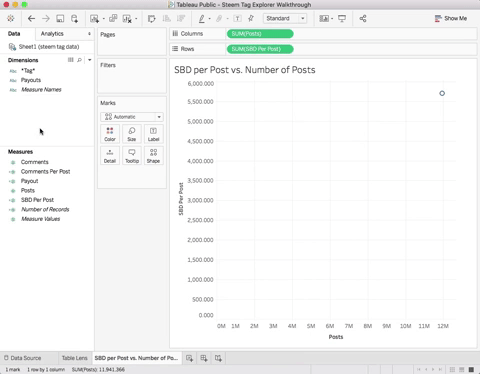
To create it, first drag Posts to Columns and SBD Per Post to Rows:
The graph shows a single mark representing the sum of the SBD Per Post vs. the sum of Posts, but we want a separate mark for each tag. To do this, drag *Tag* to Detail:
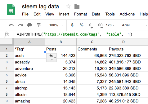
Dragging *Tag* to Detail tells Tableau to map each tag to a different mark on the graph (see this post for an explanation of this). It also tells Tableau to split your data into groups by *Tag*. This is similar to SQL's GROUP BY statement. Now each mark shows the sum of SBD Per Post vs. the sum of Posts. Since each tag has a single row in the data file, the sum of these fields is just the value in that row of the data file. For instance, the sum of Posts for the tag aceh is equal to the value shown in cell B2 below:
Add Mean Payout Reference Line to the Scatterplot
The scatterplot has a reference line on the Y axis that shows the mean payout over all posts. To add this line, first create a new calculated field called Mean payout (all posts) with the definition: WINDOW_SUM(SUM([Payout]))/WINDOW_SUM(SUM([Posts]))
In short, this tells Tableau to add up all of the payouts for all of the marks on the graph and divide by the sum of all of the posts for all of the marks. If you look at the data file above, this is just taking the sum of the Payout column and dividing by the sum of the Posts column.
To add the reference line drag Mean payout (all posts) to Detail then right click the Y axis and select Add Reference Line... Then specify the line as:
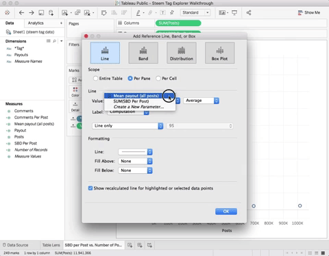
Next, format the reference line to shift its label to the right:
Window_Sum is a table calculation, which means we can control how the computation is done across the marks on the graph. We want the window sum to sum across the data for all of the tags, so we need to tell Tableau to do this by editing Mean payout (all posts) 's Tableau Calculation:
Now the reference line shows the correct value. Understanding Table Calculations is essential for using Tableau. You can read about them in the Tableau documentaiton on Table Calculation Functions
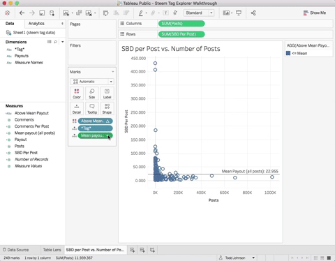
Add Color Coding
The scatterplot uses color coding to indicate tags that are above and below the Mean Payout. First, define the calculated field Above Mean Payout as:
IF SUM([SBD Per Post]) > [Mean payout (all posts)]
    THEN "> Mean"
    ELSE "<= Mean"
END
Next, drag Above Mean Payout to Color:
Enhance Tooltips
At this point, the tooltips look like this:
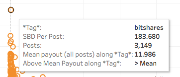
That's not very nice from a graphic design or usability standpoint, so lets change the tooltips to look like this:
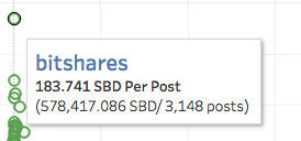
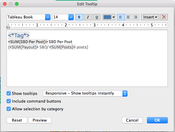
If you look at the current tooltip, it already has the fields for *Tag*, SBD Per Post, and Posts, but there is no field for the payout for the tag (that's the 578,417,086 SBD in the nicer looking tooltip). To add this just drag Payout to Tooltip, then click on Tooltip and edit it to look like this:
Format the Title
In the Steem Tag Explorer, the title is bold and blue. Just double click the title and change it:
Create the Logarithmic Version
Now duplicate this graph and create the logarithmic version. If you need help, refer to the instructions in the previous post for creating the logarithmic axis on the Table Lens. Your graph should look something like this:
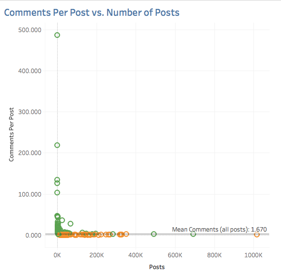
Create the Comments Per Post vs. Number of Posts Scatterplots
Now create the linear and logarithm versions of the following scatterplot by adapting the steps above. You can even just duplicate those charts and modify them. You will have to add some new calculated fields as above, but for comments. I'm not giving you step-by-step instructions here, because you will learn more by actively transferring the above steps to the new graphs.
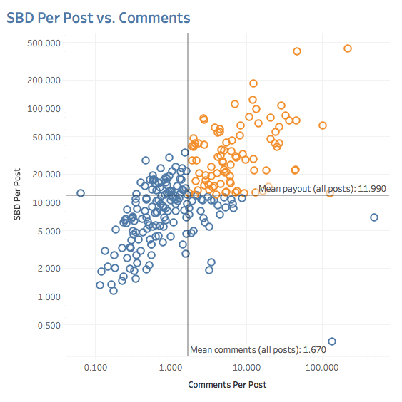
Create the SBD Per Post vs. Comments Scatterplot
Once again, adapt the steps above to create this chart, but this time only as a logarithmic version:
Conclusion and Next Steps
You should now have all of the graphs needed to build a version of the Steem Tag Explorer. In the next post, I'll show you how to put it all together into a dashboard and build the cross-graph interactivity.
Todd
Congratulations! This post has been upvoted from the communal account, @minnowsupport, by toddrjohnson from the Minnow Support Project. It's a witness project run by aggroed, ausbitbank, teamsteem, theprophet0, someguy123, neoxian, followbtcnews, and netuoso. The goal is to help Steemit grow by supporting Minnows. Please find us at the Peace, Abundance, and Liberty Network (PALnet) Discord Channel. It's a completely public and open space to all members of the Steemit community who voluntarily choose to be there.
If you would like to delegate to the Minnow Support Project you can do so by clicking on the following links: 50SP, 100SP, 250SP, 500SP, 1000SP, 5000SP.
Be sure to leave at least 50SP undelegated on your account.
informative thanks i follow u
Get your post resteemed to 72,000 followers. Go here https://steemit.com/@a-a-a