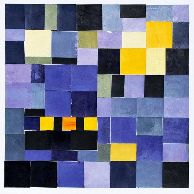
Color composition

In the perception of space, the consciousness, the abstract thinking of the experience of life takes part. As a synthetic art, cinema and other screen appearances use the rich experience of fine arts but rethink it on their own. As a first example, we can accept the golden section when establishing the classical frameset dimensions. Screen arts can not be viewed without their kinetic nature. Here, the composition is mostly flexible and movable, its separate elements mutating, moving and disappearing to reveal new details, new configurations from there and new visual accents. Each frame with very rare exceptions is only part of the single composition of the episode or sequence. Therefore, it is very important to have a colorful and light unity of the episode, respectively unity of time and space. Care must be taken with the bright spots on the background. They distract attention. The eye slowly adapts and the stain prevents the color and tone of the next frame.
Another very important thing is to achieve the coincidence of the plot, optical, tonal and colorful center. According to Kandinsky, only the form as an image of the object can exist on its own. But the color can not. The inevitable interaction between color and shape directs us to the observation of the effects that form exerts on color. One triangle colored yellow, one circle - blue, one square - green, one triangle - green, circle - yellow, square - blue, and so on. These are quite different and differently acting forms. It is easy to notice that a certain shape emphasizes the value of a color while another is muffling it. As an example, sharp Colors enhance this sound in a sharpened shape (for example, yellow in the triangle). The effects of blossoming colors are enhanced by rounded shapes (for example, blue in a circle). On the other hand, of course, it is clear that the non-fitting of the form to, the color can not be regarded as something nonharmonious but, on the contrary, as a new possibility, and therefore also harmony. The color composition also requires a rhythmic arrangement of the color spots. One way is by arranging the blobs that form mid-spacing between them. Thus, for example, red spots can be orange, raspberry or violet, and in green, yellow-green, emerald green.
The spacing can be not only dependent on color tone, but also on lightness and saturation. For example, classic painting can be used. In Rafael's Madonna in Green, we see five basic color zones. Red and blue is the garment, the vegetation is green, the yellow - the color of the body and the gray - the sky. We have a clearly perceptible composition. A contrasted type of composition is in the landscape of K. Coro of the Seine. In it, the main color zones do not contrast strongly and the average intervals are few. With such a colorful composition, the saturation of the air is very good.
Go here https://steemit.com/@a-a-a to get your post resteemed to over 72,000 followers.
Good story & creative
I really like it
Thank you :)