World Popular Brand Logos with their meaning
We see this famous brands everywhere and almost everyday but never consider what their logo meaning exactly. Most of them are design to indicate something much more than just a logo.
Curious to know, will read this article and you will know these famous logos meaning.
1 HYUNDAI
![]()
Many people think that the logo of the South Korean Company Huyndai is simply the first letter of its name. In fact the letter “H” symbolizes two people, a client, and a representative of the company, shaking hands! That’s very thoughtful!
2 ADIDAS
The name of “Adidas” is derived from its founder, Adolf Dassler. The company logo has changed over time, but it has always included three stripes.
The current logo has three stripes at an angle, which together form a triangle.
This symbolizes a mountain which, in turn represent the challenges that all sportsmen have to over come day after day.
3 APPLE
![]()
Rob Danoff, the designer who came up with the world-famous Apple company logo explained his idea in one of his interviews. He bought a bag of apples, placed them in a bowl, and spent time drawing the for a week, trying to break the image down into something simple. Taking a bite out of an apple was a part of experiment.
.png)
Completely by coincidence, he realize that “bite” that bite sounded exactly the same as the computer term “byte”
isn’t this guy top of his field ?
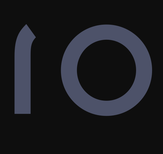
4 VAIO
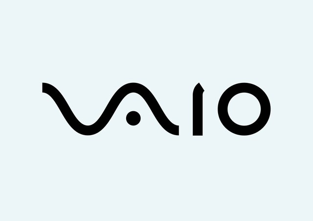
The first two letters of the “Vaio” logo symbolize an analog wave.

The last two are similar to the number 1 and 0, that is, symbols of a digital signal.
5 AMAZON
At first glance, Amazon’s logo appears to be nothing special.
![]()
However, it was designed with the company philosophy in mind. The orange arrow is similar to a smile, because the company want its customers to be satisfied. The arrow is also stretched between the letter A and Z, in hint that the company sells absolutely every product you can imagine.
6 BASKIN ROBBINS (Ice cream company)
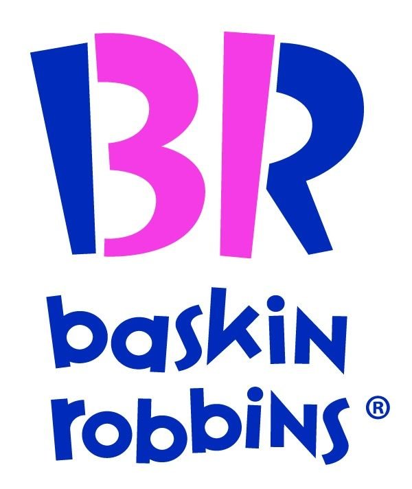
The pink colored parts of the B R section make up the number 31 which is how many ice cream flavors Baskin Robins used to famously sell. Have you tried them all?
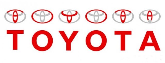
7 TOYOTA (Car manufacturer company )
![]()
Many people compare the logo of this Japanese car producer to an image of a cowboy wearing a hat. In fact, it represents a stylized image of a needle eye with a thread passing through it.
![]()
This is a hint at the company’s past. They used to produce weaving machines.
However, the individual parts of the logo also spell out the letters of the company’s name.
![timthumb.jpg]
( )
)
8 CONTINENTAL

Continental, a famous tire producer, has a logo in which of the first two letters depict a car wheel.
Yeah, everything genial is simple.
If you like this article leave a comment down for part two.
Thanks.
Congratulations @abxaib! You received a personal award!
Click here to view your Board of Honor