03.03 - Hierarchy - The Foundations of Typography
Chapter 03 - Arrangement
Lesson 03 - Hierarchy
A typographic hierarchy expresses an organizational system for content in order to indicate levels of importance. Hierarchy can help readers scan a text and quickly know where to enter and exit and how to pick and choose what they want to read. By creating an established hierarchy in your work, you are doing the heavy lifting for your reader, making it much easier for them to find the right spot to begin and enable them to dive in and out of your text with ease.
In writing and coding, it is common practice to avoid redundancy. In typography, however, it is acceptable and sometimes recommended. For example a subtitle can be marked bold and all caps. This allows the designer to create a system of hierarchy where, maybe a sub-subtitle could be just in all caps. If you are trying to simply create emphasis to a word in particular, I recommend using only one cue and when developing a system, trying using only 3 max.
Hierarchical Cues (unlimited variations are possible)
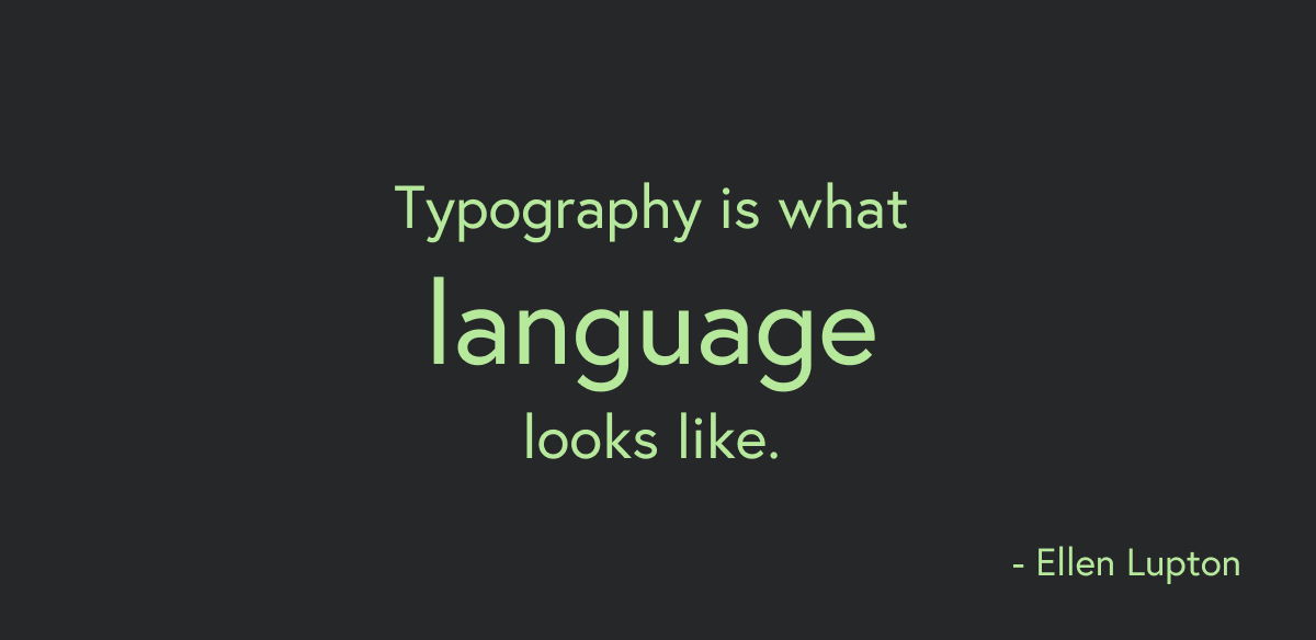
Size
- Larger is more prominent
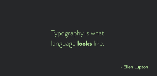
Weight
- Bolder more prominent
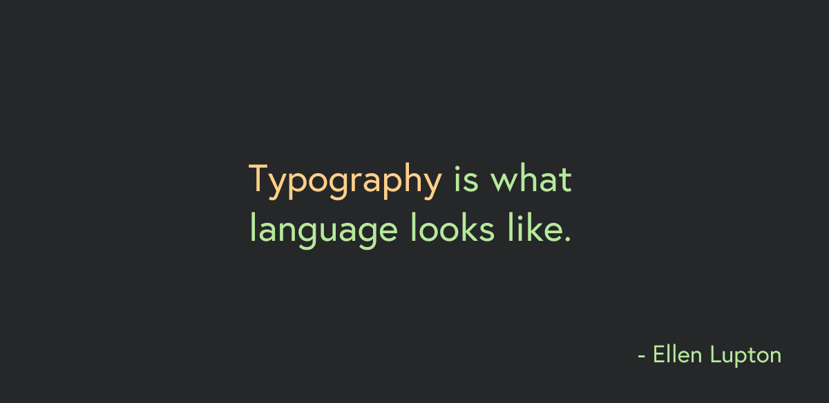
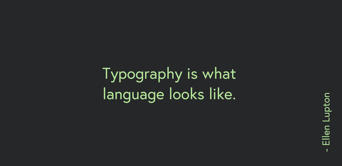
Color
- Contrasting background more prominent
- "Cool colors" like blue tend to sit more in the background
- "Warm colors" like red sit more comfortably in the foreground.
- A nice tip is to set your text in about a 90-95% tint of black or white, and when you want to bold something, you can pump it up to 100% and it will really stand out!
Order
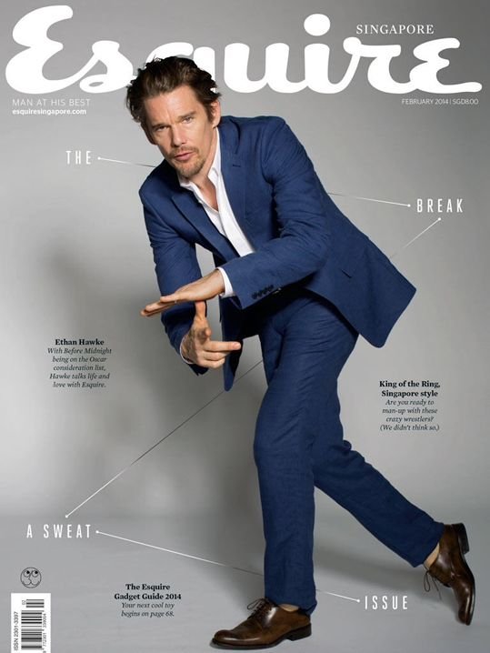
- Top/Front is more prominent
- Notice how the title is very light in weight and color, yet still draws your immediately due to it's size and order (over the woman's face)

- IL64 Cover. Type by Jessica Hische
Orientation
- Vertical type usually stands out more than horizontal
Adjacency
- Type that’s adjacent to other important hierarchical objects also share some of it’s hierarchy depending on it’s proximity. (Note the emphasis on the date near masthead on magazine)
Spacing
- By increasing the space around the type, you are giving that body of type more integrity and prominence.
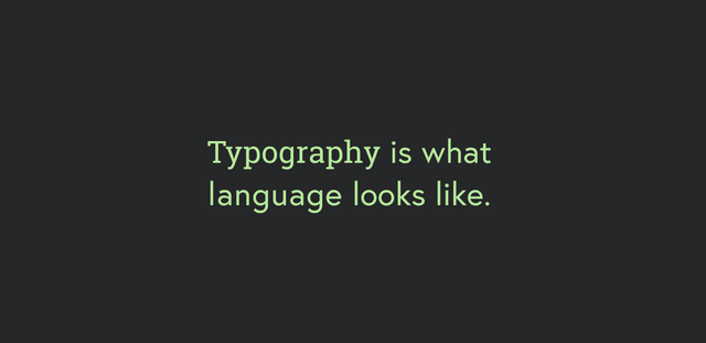
Differentiation
- Pairing sans and serifs is a ubiquitous principle of typography. This is because the complex, interesting, and often elegant serifs mesh well with the simple, clear sans serifs, creating effortless hierarchy without causing tension.
- If you choose typefaces that can be used as text type and display type, you can alternate their hierarchies throughout a publication or website, to organize and distinguish content as another theme or topic.
Some of these hierarchical cues are more subtle than others, but they can be used in a number of a different ways, and an infinite number of different combinations. To reiterate, this is not a complete list of hierarchical cues.
Can you think of any other hierarchical cues you can use for type?