04.02 - Balance - The Foundations of Typography
Chapter 04 - Layout & Composition
Lesson 02 - Balance
One of the principles of design, balance places elements on the page so that elements are evenly distributed. In a balanced layout the page doesn't seem to tilt to one side or the other.
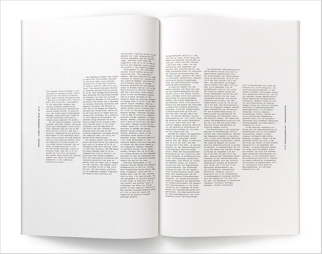
Symmetrical Balance
Symmetrical balance maintains equal “weight” on equal sides of a centrally placed fulcrum. Symmetrical balance tends to communicates formality, elegance and a conservative tone. Using symmetrical balance works well in small doses, but it does get rather dull and constrained, so be sure to play around with other kinds of balances as well.
Bilateral or (linear) symmetry is when type is arranged equally on either side of a central axis. Radial symmetry is symmetry around a central point. Approximate symmetry when equivalent but not identical forms are arranged around fulcrum line.
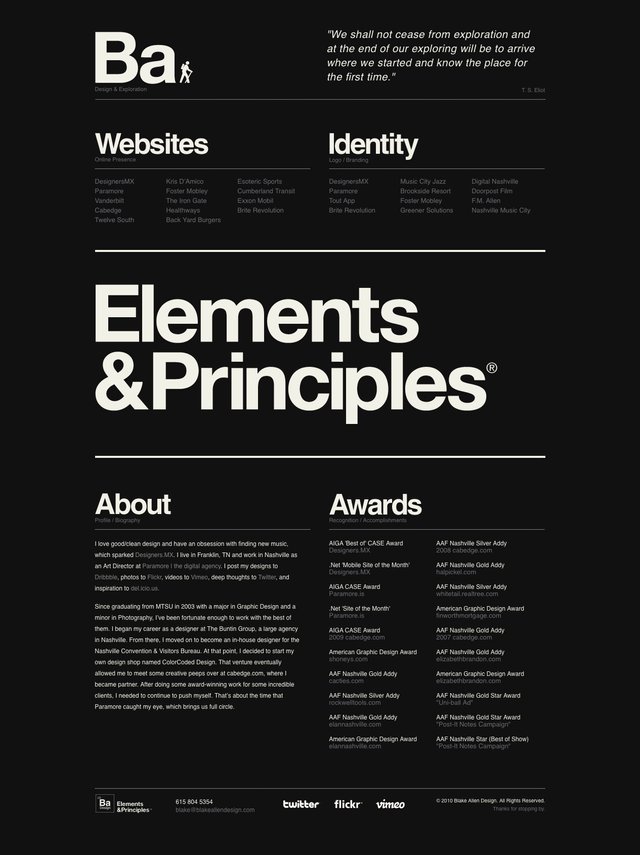
Here are some examples of symmetrical typographic balance.

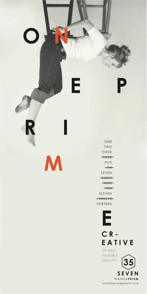
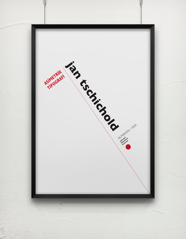
Asymmetrical Balance
Asymmetrical typographic balance is placement of type in a way that will allow objects of varying visual weight to balance one another around a fulcrum point.
(ex: cluster of small text balanced by a large headline)
Unequal weights can be balanced by shifting proximity to fulcrum point on imaginary scale.
Check out some of these excellent examples of asymmetric type at work!