Type Talk Interview with Paul Rand [1989]

Type Talk Interview with Paul Rand
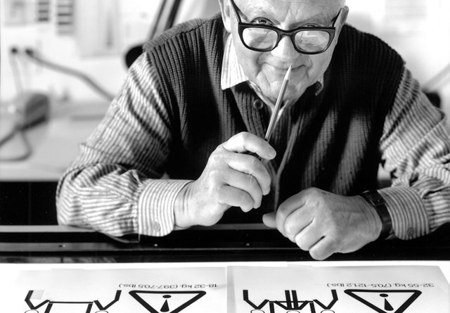
Paul Rand was an American art director and graphic designer, best known for his corporate logo designs and branding, including the logos for IBM, UPS, Enron, Morningstar, Inc., Westinghouse, ABC, and NeXT. He was one of the first American commercial artists to embrace and practice the Swiss Style of graphic design. This Type Talk interview took place in the fall of 1989 (7 years before Paul's passing).

MARIO RAMPONE: How do you feel about the “new” typefaces that are inundating the marketplace today?
PAUL RAND: The announcement of anything new is bound to call attention to itself. When one considers the wonderful old faces that have passed through the sieve of time, one wonders, why new faces! Unless they’re really new, there seems to be no reason to add to an already overloaded stockpile. A new typeface is ideal for the neophyte who is intent on one-upmanship, and who equates the latest with the greatest. “There are as many different varieties of letters as there are different kinds of tools,” commented Eric Gill, a long time ago.
MR: How do you regard “freedom of expression” — about the person inspired to design a new typeface?
PR: One must accept the good with the bad, the fanciful with the freakish. Out of a hundred designs, there may be one that’s really new. Who knows!
MR: IBM has recently adopted Berthold Bodoni as its house style, without altering its design. Does that make more sense than creating a new typeface?
PR: Yes, unless it can be improved. Increasing the x-height and shortening ascenders and descenders might be useful. Berthold Bodoni is based on the original design. Incidentally, it is similar to Didot or Walbaum. They are the same modern type family that the old typographic fraternity frowned upon.
MR: Why?
PR: Because the contrast between thicks and thins was enormously exaggerated. The serifs were square and uninteresting. They were, apparently, too mechanical, some would say too cold or too geometric. “Swelteringly hideous” is how William Morris is said to have described it. A speech by Talbot Baines Reed in 1890 in Ars Typographica, edited by Goudy in 1920, dealt with these very same problems. The need for anything to be designed has nothing to do merely with wanting to do it.
MR: Some people are going to love that comment.
PR: But it’s true. It’s an ego trip or a ploy to attract new business. Once Univers was done, for example, there was no apparent reason to have a new sans-serif typeface.
MR: Univers is a beautiful typeface and it made as big a splash as Helvetica did. And it is still the most popular sans serif.
PR: Well, Univers is better in some respects; it fits better. In my view, the very bold is far superior to Helvetica. In some instances, one can’t use the very bold; the counters ate much too small.
MR: That can be rectified.
PR: In typography things get revived. Now there is a revival of Futura, a typeface that was designed in 1925.
MR: But it’s one of the classics.
PR: Yes, but it’s not exactly the most legible face; it has certain characteristics lacking in other sans-serif faces. Compass and ruler are quite in evidence. It is, nevertheless, unique. Still, one must understand how to use it. Appropriateness, not timeless, is the guiding principle.
MR: It seems that designers often go out of their way to attract attention.
PR: That’s an understatement. There are essentially two kinds of typography: The familiar kind for reading, and the other, simply for viewing, like a painting. Some say that readability is most important. There are really two important things about typography: readability and beauty; both are equally important. However, many readable typefaces are visually offensive. The design of a typeface, ugly or not, is only one aspect of the problem of readability. How a typeface is used is equally, if not more, important. The trick is to choose a readable and beautiful face like Baskerville, or Caslon, or Garamond. Tschichold’s favorite typeface, incidentally, was Janson, which is similar to Caslon.
MR: Does a typeface have to be new to attract attention?
PR: Although newness has its place, good design is not merely a question of novelty. The typographer is more important than the type he uses. You can’t blame the type if the typography is poor. It’s like putting the burden on the music when the musician is at fault.
MR: Do you believe that the proliferation of computers in design schools is a good thing?
PR: It depends on how the computer is built into the curriculum. To the extent that the machine replaces the hand and prevents the student from practicing the manual skills, it is wrong. To the extent that computer theory replaces and is confused with design theory, it is equally wrong. Of course, there’s a time and place for everything. Once a student feels at home with design—and this takes a very long time—he is free to choose his tools. A student once said, “I came here to learn how to design, not how to use a computer.” Design schools take heed. After all, for every competent designer, there are at least a thousand competent computer operators—and we haven’t even begun to deal with the products of computer-generated design, nor with the competence of those who teach design. The computer is surely one of the most astonishing machines of our time. However, the language of the computer is not the language of art/design. It is the language of machine—of production. It enters the world of creativity only as an adjunct, as a tool—a time-saving device, as a mean of investigating, retrieving, and executing tedious jobs—but not as the principal player. In education this art/production relationship is inescapable. The moment the balance is disturbed, it becomes a hindrance to invention and a barrier to the link between hand and tool. Of course, the computer is capable of producing visual effects not possible by other means. In the hands of a thoughtful designer, this may be useful. It may even help in the creative process—the realm of ideas—by suggesting visual possibilities undreamed of with other techniques, or by helping to solve problems specifically designed for the computer’s capabilities. But these very means may also be the source of exploitation, merely for the sake of effects but not of essence. The expression “garbage in, garbage out” is more than a quip. Unless the computer is used properly, it will only encourage the kind of trendiness so profuse today—worse, in a way, than that stemming from more conventional means. The abundance of visual possibilities the computer makes available is its virtue: at the same time, it may be a source of confusion and baffling complexity. When to use it is certainly more important than how to use it. In the school environment it should be only a part of the curriculum but not the curriculum. I sometimes wonder if the fuss about computers in design schools isn’t simply a decoy to show that the school is au courant. Or does it indicate some other problem! The tangibles of computer technology are obviously easier to cope with than the intangibles of design.
MR: Do you believe design by computer will be as enduring as more conventional systems?
PR: Enduringness has little to do with technique.
MR: The computer is nor the ideal tool to learn design fundamentals, is this what you’re saying?
PR: As a production tool for a seasoned designer the computer is ideal. As a tool for the beginning student it is a distraction. It produces more than the student needs, or is capable of absorbing. I don’t use a computer myself. My supplier is better equipped to satisfy all my typographic needs, as he was in the Linotype days. I have never set type. I just look and “feel” if it’s right or wrong. I don’t think one has to set type in order to be aware of its intricacies. It’s a bit like expecting a doctor to experience the same illness as his patient, in order to validate his prescriptions.
MR: Do you feel this technology can satisfy the requirements for good typography?
PR: Computer-generated typesetting lacks the built-in discipline so essential to proper spacing. The limitations of metal typesetting provided the restrains for finer word spacing. On the other hand, the unlimited, variable spacing possibilities of the computer are the source of endless problems, unless the designer is a pro.
MR: Metal typesetting required greater skill because type was set “wrong reading.” Today, the computer operator sees his “proof’ on the screen as he is keyboarding.
PR: Computer composition, nevertheless, presents its own peculiar problems, especially for students, who are only potential specialists.
MR: With the arrival of desktop publishing, a typographer’s skills are being put to test. Companies are installing Macs, memos are beginning to look like ransom notes. This prompted a large corporation to rid most of the typefaces from its laser printers. How do you think this will affect the quality of typography?
PR: That kind of publishing is bad for the art of typography. It may sound fascinating to produce your own printed piece, but it will probably result in the accumulation of a Matterhorn of rubbish. Wishful thinking never took the place of experience or talent. Here’s an example why one must be discriminating in choosing the right typeface: Some students send me letters set in type so impersonal as to be indistinguishable from direct mail advertising. The old Egyptian square-serif typewriter face has a certain charm about it, and it looks like a letter, not like a printed piece.
MR: Alphabets for computer programs are unitized the same as metal type was. The programs provide kern tables to cut the sidewalls off in order to bring the characters closer together. Today, unitizing provided with each font is not accurate enough for critical spacing. To correct this problem, custom kern tables are necessary. PostScript devices have exacerbated the problem. Do you believe that good typography is possible with this technology?
PR: Yes, of course. The principal problem is spacing. It depends on people who are sensitive to the kind of typography that was possible when metal setting was available.
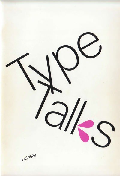
- Published in “Type Talks”, Fall 1989.

Congratulations @spencec6! You have completed some achievement on Steemit and have been rewarded with new badge(s) :
Click on any badge to view your own Board of Honor on SteemitBoard.
For more information about SteemitBoard, click here
If you no longer want to receive notifications, reply to this comment with the word
STOPi like your post my friend
Congratulations @spencec6! You have completed some achievement on Steemit and have been rewarded with new badge(s) :
Click on any badge to view your own Board of Honor on SteemitBoard.
For more information about SteemitBoard, click here
If you no longer want to receive notifications, reply to this comment with the word
STOP