You are viewing a single comment's thread from:
RE: My Contribution To Common Useful Python
Hey @davidmind ,
Thank you for the contribution.
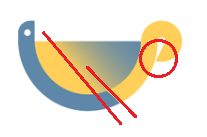
Empty space which I mentioned with circle looks to small, need to breathe more.
Alignment of the gradient transition and connection part of blue and yellow can be on same direction. I also not sure about the gradient level. Looks unbalanced without any reason.

Also, for mockup, your logo design seems like it stretched. You need to export it according to dimension which project owner will use.

Your contribution has been evaluated according to Utopian policies and guidelines, as well as a predefined set of questions pertaining to the category.
To view those questions and the relevant answers related to your post, click here.
Need help? Chat with us on Discord.
The project owner just pick up one of the PNG file, without using the exported file. That is not on me. As for the gradient making it appear on a single side will ruin the beauty of the design. You should have test it to see the outcome.
Thank you for your review, @baranpirincal! Keep up the good work!