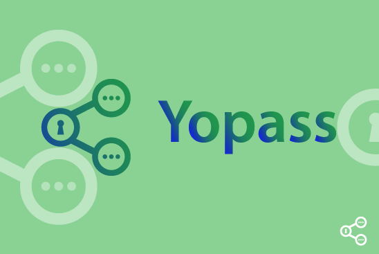
RE: My logo contribution to yopass
Hey @davidmind ,
Thank you for the contribution.
In my opinion, it looks you put so many ideas on logo design and because of that design looks complex. I think the main function of the project is 'secret messages', so we can eliminate the share idea.

Please avoid to give gradient color to all letters separately. I think it's not a good choice. Also, the color contrast between the light green,dark green and dark blue is looks weak, and it reduces visibility of the design.
You can look here when you decide the color palette which you'll use.
In addition, you gave wrong link for project repository. here is the correct link. It can be better if you fix it. Have a nice day!
Your contribution has been evaluated according to Utopian policies and guidelines, as well as a predefined set of questions pertaining to the category.
To view those questions and the relevant answers related to your post, click here.
Need help? Chat with us on Discord.
@baranpirincipal First of all thanks for your review.
But your decision about removing the share idea from your own view may seems right as a designer. But honestly the view of the project owner and what other people think also need to be considered.
Thank you for your review, @baranpirincal! Keep up the good work!