Hey @michaelizer ,
Firstly, welcome back :)
Thank you for the contribution, I really appreciated your work and effort.
Gap between the Icon and text is not enough. You should need to expand that part. Also, in my opinion thicknesses of the typeface can be thinner.
Generally I think that the logo design need breath.
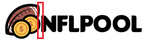
It is good that you prepared a lot of color variation. I liked the idea behind the design and angle of the football ball.
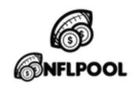
Some points on single color version (especially on small sizes) are not understandable but it seems that project owner satisfied with it and started to use your logo design. Well done!
Your contribution has been evaluated according to Utopian policies and guidelines, as well as a predefined set of questions pertaining to the category.
To view those questions and the relevant answers related to your post, click here.
Need help? Chat with us on Discord.
Thank you for your review, @baranpirincal! Keep up the good work!
Thanks a lot, @baranpirincal, for the welcoming and the review. All corrections have been noted and will be implemented for future contributions.