Hey @munadikiehl ,
Thank you for the contribution, the final logo design looks excellent.
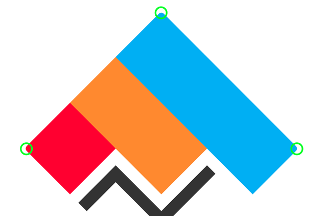
I liked the color palette. Relation between the icon and typeface is really strong. Except the typos, presentation looks good.
In single color version, I think it would be better if invisible lines follow each other. Because if they not follow each other, you back down about your design decisions you made. Shortly, it is not same with the colored version.
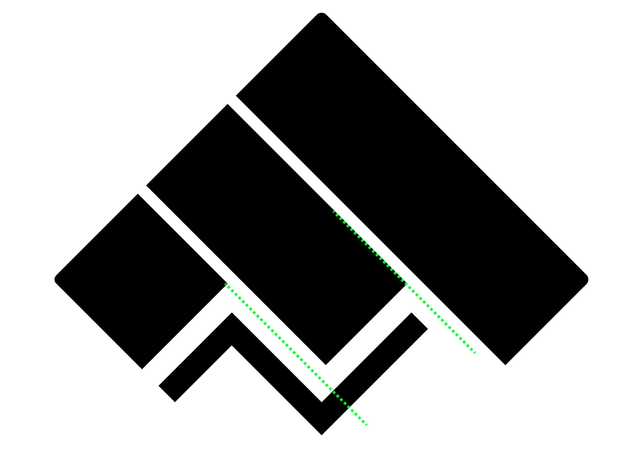
In addition, as a suggestion, I think these corners can be sharp. Because all other corners except those corners are sharp.
Your contribution has been evaluated according to Utopian policies and guidelines, as well as a predefined set of questions pertaining to the category.
To view those questions and the relevant answers related to your post, click here.
Need help? Chat with us on Discord.
Thank you for your review, @baranpirincal! Keep up the good work!