Part 7: Build a CSS-in-JS React App with Styled Components and Priceline Design System
Repository
Tutorial Repo
What Will I Learn?
You will learn how to build a feature that progressively displays author information upon interaction. In the course of building this feature, we will learn about and use these techniques below to achieve our goal.
- Component composition of Priceline Design System components
- Stream rate limiting using
debounceandlodash. - Using cache memoization to avoid memory leaks and improve performance.
- Progressive reveal techniques and optimizations for React apps.
Difficulty
- Advanced
Requirements
- Node.js 8.0 or greater.
- NPM 3.0 or greater.
- Yarn package manager
- Git
- FireLiners Github Repository Code
- An intermediate level of ReactJS knowledge.
- Keen interest and patience.
Introduction.
Performance can be what makes the difference between a good app and a great one. In production settings the aphorism, "to lag is to lose users" usually holds true. Fluid and swift apps can be achieved by avoiding or minimizing resource intensive operations.
In certain use cases, we have to handle a stream (or flood, as the case may be) of events that need to be handled in some way and improper handling of these events may cause some lags in our application.
Performance aside, having a great user interface that is simple and intuitive is a big plus for users of our apps and while the Priceline Design System does a great job at providing simple components to get us started building user interfaces, we may have our own use cases that are just not covered by it. When this happens, we need to create our own components. As smart developers, we understand that composition is better than creation, and we are better off extending a preexisting component rather than creating a new one so we'll simply create new components that inherit from previously created components.
With all said, last time we explored skeletal content placeholder screens as a technique for improving perceived app response times and action notifications as an effective feedback mechanism. This time, we'll examine more performance techniques. We'll learn about concepts such as cache memoization, request rate limiting and component composition off vendor components.
Disclaimer:
This tutorial may be pretty challenging for a first time reader of this series. I sincerely recommend that visitors get at least a cursory gaze at the previous articles in this series for easier comprehension. Links to the previous articles are available at the bottom of the this tutorial.
Briefing.
In the overview above, we briefly described our problem space and we also clearly outlined the techniques we hope to use to address said problems. Let's address the first technique.
Progressive Reveal Techniques in User Interfaces.
What is Progressive Revealing?
Progressive revealing is a user experience design technique that stresses the importance of only absolutely essential elements being displayed to the user. Any content or elements deemed to be of a lower priority nature are not visible to the user until a required interaction has occurred.
There exist multiple examples of progressive revealing as a pattern in most mainstream production apps as it helps to reduce the cognitive load on the user. The most common interactions that are leveraged for progressive revealing are the mouse over, key press, tap/click and scrolling interactions.
Why are optimizations necessary for progressive revealing?
Optimizations are of the essence when carrying out progressive revealing because we all want a smoother experience. Jaunty animations and layouts distorting due to elements being revealed are best avoided as these can mar something beautiful.
Adding Author Cards to Our FireLiners app.
Today, we'll be adding a new feature to our app. In the course of adding this feature, we will use every single technique we are to learn in this tutorial. The feature we'll be adding displays additional information about an author when a user mouses over the author's avatar.
We'll do a recap of our structure. As you can see below, we have a really extensive structure for our app.
fire-liners/
- config/...
- node_modules/...
- public/...
- scripts/...
- src/
- assets/
- data/
- authors.json
- liners.json
- img/...
- data/
- components/
- Header/
- index.js
- Feed/
- index.js
- Form/
- index.js
- Transitions/
- index.js
- Header/
- containers/
- App/
- App.test.js
- index.js
- constants.js
- reducer.js
- saga.js
- App/
- redux/
- reducerInjector.js
- reducers.js
- sagas.js
- store.js
- screens/
- AddLine /
- index.js
- actions.js
- Author/
- index.js
- constants.js
- actions.js
- saga.js
- reducer.js
- Home /
- index.js
- constants.js
- actions.js
- saga.js
- reducer.js
- Loading /
- index.js
- AddLine /
- services/
- DataService/
- index.js
- DataService/
- index.js
- registerServiceWorker.js
- assets/
- package.json
Setting the Stage.
We'll need to carry out these steps to get our author cards displaying:
Design the card component for displaying author information and then create the
<AuthorCard/>component. This is hidden by default pending interaction.Listen for an interaction by our user and then display or hide the
<AuthorCard/>as the case may be.
While these are seemingly easy steps, we have to keep performance at the forefront of our priorities. We will proceed with our first task.
Designing and Building the <AuthorCard/> component.
Our AuthorCard component has three primary aims:
Display the government names of our authors. This is an extraneous detail, and it is better suited to being progressively revealed to avoid clutter.
Display a much more prominent call to action button that allows our users see all liners belonging to an author.
Collate and display the total number of liners belonging to each author.
With this in mind, we proceed to creating our AuthorCard component. Let's create a directory called AuthorCard at src/components. We'll be adding all styled components that have to do with our AuthorCard here. We'll then create an index.js file at the newly created directory and get straight to work.
We start off by importing styled-component's styled function that allows us to extend or build off another styled component (in this case, the Card component which we also import).
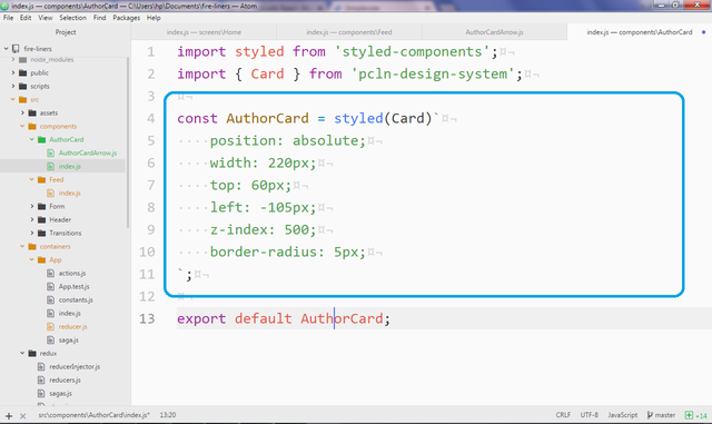
Next, we add some light CSS within the tagged template literal of the AuthorCard constant. We are simply doing some absolute positioning here to make sure it is some distance away from the avatar and then we make it wide. It's interesting to see that we have less CSS to write thanks to styled component composition as we simply inherit from the <Card/> component.
import styled from 'styled-components';
import { Card } from 'pcln-design-system';

const AuthorCard = styled(Card)`
    position: absolute;
    width: 220px;
    top: 60px;
    left: -105px;
    z-index: 500;
    border-radius: 5px;
`;
export default AuthorCard;
Great, let's see if we're ready to use it. We'll use it within the Feed component. At the moment our Feed component is a monolithic mess. Let's break it down into a series of smaller components. Our Feed component is now much more easy to understand as we simply define a new component FeedItem. We'll pass the index, liner and other provided variables as props.
export const Feed = (props) => {
    return props.liners.length > 0 ?
            props
            .liners
            .sort()
            .map((liner, index) => <FeedItem key={index} liner={liner} index={index} {...props} />) :
            <div>Nothing found</div>
}
We also define some prop types for our Feed component. The props accepted by our Feed component:
liners: This is the array of liners to be displayed.linersSetIndex: The index of the liner set.authors: The authors of the quotes.isLoading: Tracks the state of the data.onAuthorMouseOver: A handler method that handles the mouse over event on theAuthorCard.onAuthorMouseLeave: A handler method that handles the mouse leave event on theAuthorCard.
We also set some default values.
Feed.propTypes = {
    liners: PropTypes.array,
    linersSetIndex: PropTypes.number,
    authors: PropTypes.array,
    isLoading: PropTypes.bool,
    onAuthorMouseOver: PropTypes.func,
    onAuthorMouseLeave: PropTypes.func
}

Feed.defaultProps = {
    liners: [],
    linersSetIndex: 0,
    authors: [],
    isLoading: false,
    onAuthorMouseOver: function () {},
    onAuthorMouseLeave: function () {},
}
We also define the FeedItem component. It's also really small as the bulk of its code is contained within the FeedItemContent and FeedItemAvatar components.
const FeedItem = (props) => (
<Box>
    <Flex
      bg={props.index === (props.linersSetIndex * 5) ? 'lightBlue' : "lightGray"}
      style={{borderRadius: '4px'}}
      p={3}
      mb={3}>
        <FeedItemAvatar {...props}/>
        <FeedItemContent {...props} />
    </Flex>

</Box>
)
Within our FeedItemAvatar, we'll simply be displaying our avatar as previously seen on this series but we are making two changes: we are adding event handlers to the Circle component. We have:
onMouseOver: Here we check for users hovering their cursors over our avatar. Within the handler's method, we callprops.onAuthorMouseOverpassing it theprops.index. Thisprops.onAuthorMouseOvermethod is supplied by a parent component.
The reason this method must be supplied by a parent component is simple: our Feed component is dumb (or stateless, if your prefer) and it can only work with any methods or values supplied to it from another component.
const FeedItemAvatar = (props) => (
    <Flex style={{ position: "relative" }} width={[0.5, 0.7, 0.3]}>
        <Circle
            bg="#d5d5d5"
            mr={5}
            flexDirection="column"
            justify="center"
            onMouseOver={e => props.onAuthorMouseOver(props.index)}
            onMouseLeave={e => props.onAuthorMouseLeave()}
            >
          {!props.isLoading && (props.liners.length >= props.index) && (
              getLinerAuthor(props.liner, props.authors).photo &&
                <Image src={require(`../../assets/img/${getLinerAuthor(props.liner, props.authors).photo}`)} style={{ borderRadius: '50%', width: '60px' }}/>
            )
          }
        </Circle>
    </Flex>
)
Last of all, we finish refactoring by defining the FeedItemContent.
const FeedItemContent = (props) => (
    <Flex flexDirection="column" width={[0.5, 0.7, 0.7]}>
        <Text mb={3} width={1} italic fontSize={[1, 2, 3]}>
            {!props.isLoading && ((props.liners.length) >= props.index) ? props.liner.body : <Skeleton count={3}/>}
        </Text>
        {
            !props.isLoading && (props.liners.length) >= props.index ? (
                <Link href={'/authors/' + getLinerAuthor(props.liner, props.authors).slug}>
                    <Text fontSize={1} mb={3} color="gray" align="right" bold>{props.liner.author}</Text>
                </Link>
            ) : (
                <Flex flexDirection="row-reverse">
                    <Skeleton width={100}/>
                </Flex>
            )
        }
    </Flex>
)
Great! Instead of one giant component, we have three smaller components. Proceeding with our AuthorCard component, we'll use it within the <FeedItemAvatar/> component.
We try to make sure our AuthorCard is only visible when we hover over the corresponding author. Now, we have to be subtle about this or we could risk displaying multiple author cards instead of just one. We make sure we are looking at the right author card by making sure that two values are equal:
props.activeAuthorCard: This contains the index of the current item we are moving our mouse over. It must be passed from the parent.props.index: This is the index of the current item in the iteration.
All we are saying is, "If the current item being iterated on is the one we've got our mouse over, please show it.".
Next, we'd like a bit of shadow to simulate depth so we set boxShadowSize to lg. We also set up the same handlers for the author card as previously seen. This is to make sure our card does not get hidden when we move our mouse off the authors photo and on to the card.
Next, within the AuthorCard, we start fleshing out some content. We display the author's name alongside his/her government name. We then display the author's liners count to the right with the call to action centrally displayed.
import AuthorCard from '../../components/AuthorCard';

const FeedItemAvatar = (props) => (
    <Flex style={{ position: "relative" }} width={[0.5, 0.7, 0.3]}>
        {/* Previous code exists here */}
        <AuthorCard
            style={{
                opacity: props.activeAuthorCard === props.index ? 1 : 0
            }}
            boxShadowSize="lg"
            onMouseOver={e => props.onAuthorMouseOver(props.index)}
            onMouseLeave={e => props.onAuthorMouseLeave()}
            px={3}
            py={2}
            bg="white">
            <Flex mb={2}>
                <Flex style={{ flex: 4 }} flexDirection="column">
                    <Text bold fontSize={0}>{ props.liner.author }</Text>
                    <Text fontSize={0} color="gray">{ getLinerAuthor(props.liner, props.authors).government_name }</Text>
                </Flex>
                <Flex flexDirection="column">
                    <Text color="darkGray" fontSize={4}>32</Text>
                </Flex>
            </Flex>
            <Flex flexDirection="column" align="center">
                <OutlineButton size="small" py={0} px={2} style={{ height: '35px' }}>
                    <Text fontSize={0}>All 32 quotes</Text>
                </OutlineButton>
            </Flex>
        </AuthorCard>
    </Flex>
)
We'll now need to head back to our Home screen at src/screens/Home/index.js and rewrite it a little.
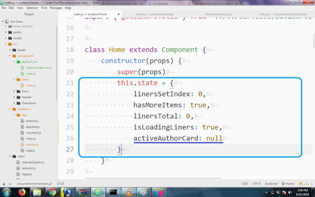
First of all, we need to find a way to keep the index of the author card of interest for the short term. The Home component's state is perfect for this job. We'll define the activeAuthorCard state property and set it to null by default.
class Home extends Component {
    constructor(props) {
        super(props)
        this.state = {
            // Previous code here
            activeAuthorCard: null
        }
    }
}
We also update our <Feed/> component call to reflect the recent changes made. We set the activeAuthorCard prop to this.state.activeAuthorCard. We also call this.setActiveAuthorCard within the onAuthorMouseOver handler method passing the received index value as an argument. We also do the same in the onAuthorMouseLeave handler but we pass null this time as we want to revert back to default state when we move the mouse away.
    <Feed
        liners={this.props.liners}
        linersSetIndex={this.state.linersSetIndex}
        authors={this.props.authors}
        isLoading={this.state.isLoadingLiners}
        activeAuthorCard={this.state.activeAuthorCard}
        onAuthorMouseOver={index => this.setActiveAuthorCard(index)}
        onAuthorMouseLeave={index => this.setActiveAuthorCard(null)}
    />
We'll define the setActiveAuthorCard method next. It is a one-liner method that simply sets the value of the state.activeAuthorCard value.
    setActiveAuthorCard = index => this.setState({
        activeAuthorCard: index
    })
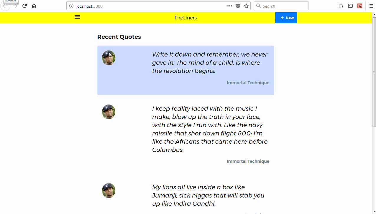
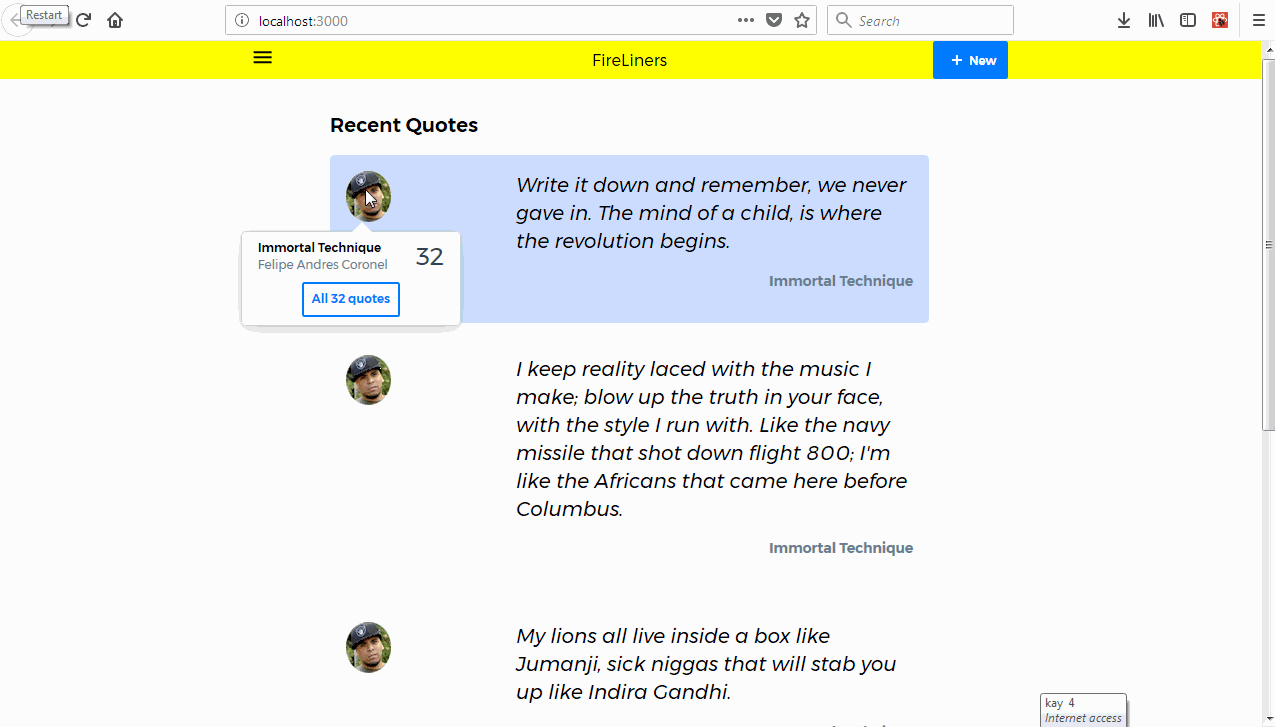
We'll fire up our server with npm start and have a look at the result below.
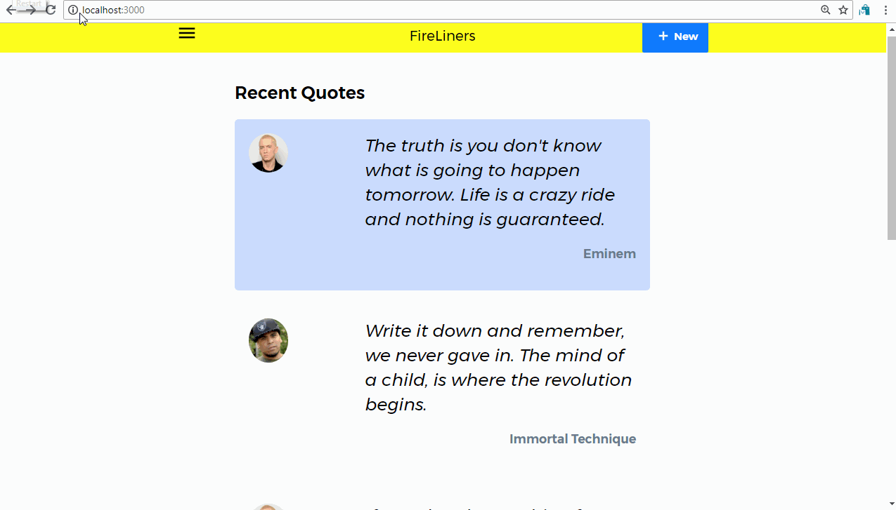
Our author card shows up as expected, but multiple mouseover events causes it to flicker. This could create a really frustrating user experience for our users so we need to find a solution. If only there is a way to only show the card once and ignore other events that are fired at least for some time. Turns out there is a way. That way is debounce.
What is debounce?
Debounce is a technique with which we delay the invocation of a function until after a period of time (expressed in milliseconds) have elapsed since the last time the debounced function was invoked.
Thanks to lodash, the utility library, we can use the debounce function to solve our problem. The best part of all these, to me, is the fact that you don't need to npm install lodash as it is a React dependency itself.
We will make sure we call a debounced function every time we move our mouse to prevent flickering. We will also use cache memoization (which is the assignment of a memory instance that could be created multiple to a memory address to speed up performance)
To get started, we import the debounce function from lodash. Next up, we will make sure any time the this.setActiveAuthorCard method is called, only the "debounced" version of this method is called, we will make sure this method can only be called once in 200 milliseconds so we supply 200 as the second argument to the debounce function.
import { debounce } from 'lodash';

class Home extends Component {
    constructor(props) {
        // previous code...
        this.setActiveAuthorCard = debounce(this.setActiveAuthorCard, 200)
    }
}
We save and we head back to the browser. Great! As you can see below, there is no flickering even when we have multiple mouse over events which is pretty awesome.
While everything works as expected, the motion of the Author Card is a little to abrupt and not natural at all. We can leverage the power of CSS-in-JS to make it a little more fluid.
We'll edit the AuthorCard component CSS and add a transition for the opacity and transform CSS properties that we'll use to make our Author Card appear gracefully.
const AuthorCard = styled(Card)`
    position: absolute;
    width: 220px;
    top: 60px;
    left: -105px;
    z-index: 500;
    border-radius: 5px;
    transition: opacity 0.5s ease,
                transform 0.3s ease-in-out;
`;
We'll now proceed to carry out a transform depending on whether the card is visible or not. If it is not visible, we'll keep it 30 pixels away from the top, if it is visible, we'll bring it back to the top with a pleasant fading-translating transition.
<AuthorCard
   style={{
      opacity: props.activeAuthorCard === props.index ? 1 : 0,
       transform: props.activeAuthorCard === props.index ? 'translateY(0)' : 'translateY(30px)'
   }}
/>
        {/* other code here */}
</AuthorCard>
Ain't that sweet? It's looking real pretty. We just need to do one thing and that is add a little wedge pointing to the authors photo. We'll create a component called AuthorCardArrow at src/components/AuthorCard/AuthorCardArrow.js and get to work.
We are extending the Box Priceline component (just displays a div) and then we're using some absolute positioning and CSS triangle techniques to generate the white wedge.
import styled from 'styled-components';
import { Box } from 'pcln-design-system';

const AuthorCardArrow = styled(Box)`
    position: absolute;
    top: -10px;
    left: 105px;
    width: 0;
    height: 0;
    border-left: 15px solid transparent;
    border-right: 15px solid transparent;

    border-bottom: 15px solid white;
`;

export default AuthorCardArrow;
Next, we head over to src/Components/Feed and add it to the AuthorCard component instantiation.
import AuthorCardArrow from '../../components/AuthorCard/AuthorCardArrow';

        <AuthorCard
            {/* props here */}
        />
        <AuthorCardArrow/>
        {/* other code here */}
</AuthorCard>
After our hard work, we get this cool author card.
Conclusion
In this tutorial, we covered multiple concepts. We learned more about the importance of performance for our applications. We also added progressive revealing features to the FireLiners application. We used the debounce function from lodash to successfully rate-limit event handler invocations.
In our next tutorial, we'll explore more advanced performance techniques. We'll look at interactive lazy-loading as a means of increasing perceived application responsiveness. We'll also look at techniques for searching through fire liners easily.
Curriculum
Part One: Build a CSS-in-JS App With Styled Components and Priceline Design System
Part Two: Build a CSS-in-JS App With Styled Components and Priceline Design System
Part Three: Build a CSS-in-JS App With Styled Components and Priceline Design System
Part Four: Build a CSS-in-JS App With Styled Components and Priceline Design System
Part Five: Build a CSS-in-JS App With Styled Components and Priceline Design System
Part Six: Build a CSS-in-JS App With Styled Components and Priceline Design System
Congratulations @creatrixity! You have completed some achievement on Steemit and have been rewarded with new badge(s) :
Click on the badge to view your Board of Honor.
If you no longer want to receive notifications, reply to this comment with the word
STOPTo support your work, I also upvoted your post!
Do not miss the last post from @steemitboard!
Participate in the SteemitBoard World Cup Contest!
Collect World Cup badges and win free SBD
Support the Gold Sponsors of the contest: @good-karma and @lukestokes
Congratulations @creatrixity! You have completed some achievement on Steemit and have been rewarded with new badge(s) :
Click on the badge to view your Board of Honor.
If you no longer want to receive notifications, reply to this comment with the word
STOPDo not miss the last post from @steemitboard!
Participate in the SteemitBoard World Cup Contest!
Collect World Cup badges and win free SBD
Support the Gold Sponsors of the contest: @good-karma and @lukestokes
Thank you for the beautiful and well-written tutorial.
While the concepts of cards is not something new, yet I enjoyed learning about debounce, never heard of it before.
Could you utilize "Utopian" word and your identity in your tutorials as sample data? I would like to see those in upcoming work. Also please include the date/time in your screenshots/visuals
Your contribution has been evaluated according to Utopian policies and guidelines, as well as a predefined set of questions pertaining to the category.
To view those questions and the relevant answers related to your post, click here.
Need help? Write a ticket on https://support.utopian.io/.
Chat with us on Discord.
[utopian-moderator]
Thanks. Will do that. I'd appreciate resources showing your directives in action please.
Hey @creatrixity
Thanks for contributing on Utopian.
We’re already looking forward to your next contribution!
Contributing on Utopian
Learn how to contribute on our website or by watching this tutorial on Youtube.
Want to chat? Join us on Discord https://discord.gg/h52nFrV.
Vote for Utopian Witness!
Congratulations @creatrixity! You have completed some achievement on Steemit and have been rewarded with new badge(s) :
Click on the badge to view your Board of Honor.
If you no longer want to receive notifications, reply to this comment with the word
STOPDo not miss the last post from @steemitboard!
Participate in the SteemitBoard World Cup Contest!
Collect World Cup badges and win free SBD
Support the Gold Sponsors of the contest: @good-karma and @lukestokes
Congratulations @creatrixity! You have completed the following achievement on Steemit and have been rewarded with new badge(s) :
Click on the badge to view your Board of Honor.
If you no longer want to receive notifications, reply to this comment with the word
STOPDo not miss the last post from @steemitboard:
SteemitBoard World Cup Contest - The results, the winners and the prizes
Congratulations @creatrixity! You have completed the following achievement on Steemit and have been rewarded with new badge(s) :
Click on the badge to view your Board of Honor.
If you no longer want to receive notifications, reply to this comment with the word
STOPHi bro, can we please talk. I am discord surpassinggoogle#1660