RE: My Logo contribution to "Shitter"
Hey there, @tobaloidee.
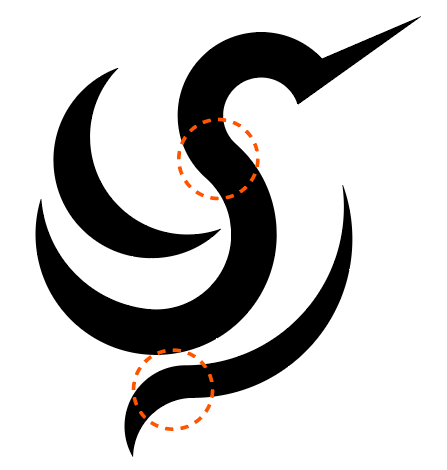
This logo is practically perfect in every way.
The idea and its execution are magnificent. It's understandable at small sizes and the shadow effect used to make the adaptive app icon works great.
The only possible areas of improvement are curve transitions at two points: where the two half-circles meet at the S "neck" of the hummingbird and the downward curve at the bottom. Even that is only visible at the blown-up size and if one is looking verrrry carefully.
Outstanding work. Thanks for continuing to contribute to open source project, and for bringing this amusingly named one to our attention ;-)
--
Your contribution has been evaluated according to Utopian policies and guidelines, as well as a predefined set of questions pertaining to the category.
To view those questions and the relevant answers related to your post, click here.
Need help? Chat with us on Discord.
Thank you @gutenmorganism for this great insight of yours. I didn't notice that curve errors (my bad)😃 will definitely be more careful next time. I commend & appreciate you for giving a very thorough description of every reviews you make. Peace! you got one additional follower here.
Thank you for your review, @gutenmorganism! Keep up the good work!