Performing Visual Analysis of Steemit Post Payout Distribution using a DIY chart
This is my first contribution in this category after several weeks learning how to connect to the Steem database, how to extract, process and analyze data.
During my training I found again and again that the data from Steem use to follow a very peculiar statistical distribution:
The long tail distribution:

In "long-tailed" distributions a high-frequency or high-amplitude population is followed by a low-frequency or low-amplitude population which gradually "tails off" symptotically.
You can read: Long Live Steemit in the Long Tail
I did not know that this distribution already had a name and I named it "the Cobra distribution" (the common name of various snakes) for having a very wide head (or hood) and a long tail with a thin finish.
In particular I found this distribution trying to analyze the Steemit Post Payout Distribution for different categories and sub-communities in Steem.
I wanted to know:
- How payouts are distributed among the posts created under a certain category?
- Are there differences in the distributions for different categories?
- Can be deducted from the analysis of these different distributions something about the behavior or status of the Post Payout Distribution in each category?
Not all cobras are the same!
The results will show that in all the categories the distribution follows a long tail distribution (or Cobra distribution according to my nomenclature) but each of them has particularities that clearly distinguish them.

This is easy to see by calculating Averages values, Ratios and Histograms for each category but the main focus of this contribution is on how to process the data and customize the charts to visually highlight the differences among categories.
Firstly, I show the process using two categories:
#utopian-io and #introduceyourself.
Step 1. Extract the data
I got 2000 recent and consecutive posts for each of the two categories:
Step 2. Process the data to obtain values and averages
I calculated some numerical data for both sets of data separately, which I summarize in this table.
| #Introduceyourself | #utopian-io | |
|---|---|---|
| Num.posts | 2000 | 2000 |
| Num. of Authors | 1707 | 689 |
| Num.comments | 16835 | 6013 |
| Total PAYOUT | $1,260.57 | $21,390.20 |
| Posts per author (AVRG) | 1,17 | 2,90 |
| Cmmnts p. post (AVRG) | 8,42 | 3,01 |
| SBD per author (AVRG) | $0.74 | $31.05 |
| SBD per post (AVRG) | $0.63 | $10.70 |
The first usual and simple way to differentiate the behaviors of this two categories is by comparing their Average Payout per Post ($SBD):
- #utopian-io: $10.70
- #introduceyourself: $0.63
Step 3. Process the data to get a histogram
I procesed the data to show the distributions in a HISTOGRAM with five bins and showing on the Y axis the sum of the payouts of the posts included in each bin.
| HSTGRM | RNG | COUNT | SUM |
|---|---|---|---|
| Bin1 | [$0-$12] | 1979 | $727 |
| Bin2 | ($12-$24] | 11 | $182 |
| Bin3 | ($24-$36] | 6 | $172 |
| Bin4 | ($36-$48] | 3 | $120 |
| Bin5 | ($48-$60] | 1 | $58 |
| TOTAL | [$0-$60] | 2000 | $1259 |
| HSTGRM | RNG | COUNT | SUM |
|---|---|---|---|
| Bin1 | [$0 - $60] | 1861 | $8235 |
| Bin2 | (60 - $120] | 116 | $9580 |
| Bin3 | ($120 - $180] | 18 | $2513 |
| Bin4 | [$180 - 240] | 4 | $779 |
| Bin5 | ($240 - $300] | 1 | $281 |
| TOTAL | [$0-$300] | 2000 | $21388 |
It should be noted that the ranges of each bin are different for each category because they are calculated by taking the maximum payout value divides by the number of bins (5).
Producing these usual columns charts
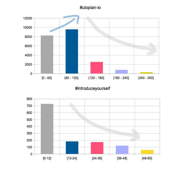
By carefully analyzing the numerical values of the tables and the HISTOGRAMS, can be observed that both categories follow a common pattern but also there are differences in the behavior of the distributions within each category.
But the key question that I ask myself here is...
Can we improve the visualization of these data to appreciate more intuitively the differences between the two groups?
From Data Visualization to Visual Grammar
More and more importance is given to the visualization of the data and to be creative in the design of graphics. Experts suggest that the charts tell a story and easily show the point of view that you want to highlight. It is also suggested that the results of the analyzes be presented not only for Data Scientists but also to people with little or no knowledge of statistics or analysis.
For example, this can be achieved by creating charts that sacrifice part of the accuracy or precision to gain on emotional sensation or connection with the person looking at it.
Step 4. Creating a modified version of histogram
Using the same data, I recalculate the histograms in the following way:
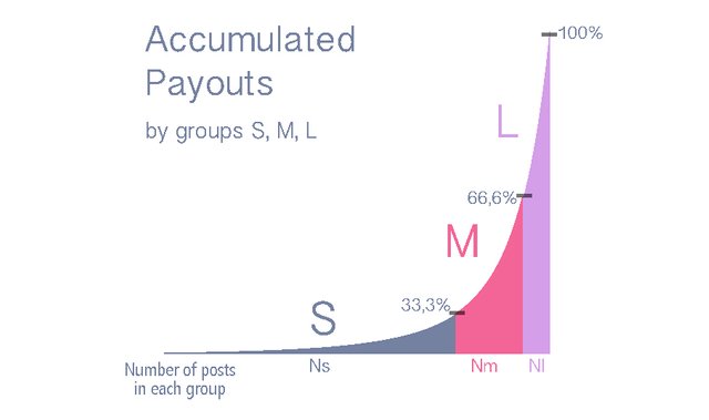
Given a group of M posts with a total payout SDB generated by all of them. I divide it into three parts (1/3) and consider that each part has been made by three groups of posts. (With a pevious sorting of the posts by theirs payouts from zero to the maximum payout value)
The "S" group (Small) gathers the posts that having the lowest payouts (but > 0), the partial sum of their payouts reaches the 33.3% of the totalSBD.
The "M" group (Medium) includes the posts that having medium payouts and the partial sum of their payouts reaches the 66.6% of the totalSBD
The "L" group (Large) has the posts that having the highest payouts and the partial sum of their payouts reaches the 100% of the totalSBD.
I also include the "Z" group (Zero), which includes the posts that have payouts equal to zero, so the partial contribution of this group of posts is also 0 $SBD.
As can be seen, it is like a process of integration (or discrete summation) of the payout of each post
and the value of the summation is used to calculate the corresponding number of posts that have been included in each group.
The following tables are obtained:
| #introduceyourself | Num. posts | % |
|---|---|---|
| Group L | 14 | 0,70% |
| Group M | 53 | 2,65% |
| Group S | 1637 | 81,85% |
| Group Z | 296 | 14,80% |
| #utopian-io | Num. posts | % |
|---|---|---|
| Group L | 58 | 2.90% |
| Group M | 99 | 4,95% |
| Group S | 1651 | 82.55% |
| Group Z | 192 | 9.60% |
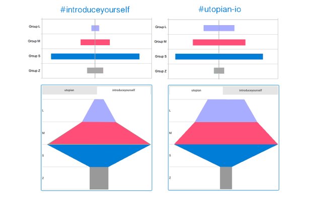
First version for an alternative histogram & chart
In this case I have opted to present the histograms using a centered bar chart and a funnel type chart to highlight the increasing order of payouts of the posts included in each group, from Z(zero) at the bottom to L(large) on the top. I have also applied a logarithmic scale to the x axis to highlight the small values for the goups L and M.
With these type of charts I think that the perception of the differences between the two categories has improved somewhat but I was still not satisfied. I wanted to find a more optimal type of chart. I found many types in data visualization tools and although they have modifiable parameters to adjust their appearance I did not get the kind of chart I wanted.
On this subject it is highly recommended to research on Data-Driven Documents D3, a JavaScript library for manipulating documents based on data.
(

But, what happens when there is not an adequate chart to visualize your data? There is only one option: Create it yourself!
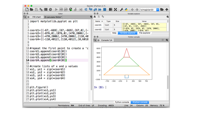
The funnel-type chart inspired me to create my own customized version using a python script that uses the plot function to draw polygons given by their coordinates.
This is a colored explanatory version

Where Nz, Ns, Nm and Nl represented as widths of the segments at the bottom of each polygon are the number of posts that each group includes (Z, S, M and L) respectively.
Note:
The values of Nl and Nm have been magnified x20 to improve the perception of the contributions for groups L and M since otherwise they would not be appreciated enough. As I said before, a bit of accuracy is sacrificed to improve perception since the main objective here is to compare the charts of several categories.
What is the resulting figure looks like?
Is it a tree? What kind of tree? Or does it look more like a house? What kind of house? Maybe is more like a pyramid with different slopes, or even a flying saucer that projects a beam of light?
No matter what it looks like, the interesting thing is that it looks like something.
Much better if it looks more organic and alive (than a set of stacked bars or columns) that inspires adjectives that personalize the perception of it.
Performing Visual Analysis of Steemit Post Payout Distribution using the new chart
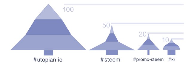
Once the custom chart was designed, I used it to visually analyze a wider group of six relevant categories in Steemit:
[ #introduceyourself, #utopian, #steem, #promo-steem, #kr, #spanish. ]
I calculated the number of posts in each group: Nz, Ns, Nm, Nl for all the categories.
These are the tables including absolute values and percentages.
| Category | N.zero | N.small | N.medium | N.large |
|---|---|---|---|---|
| intrdcyrslf | 296/14,8% | 1637/81,8% | 53/2,6% | 14/0,7% |
| utopian | 192/9,0% | 1651/82,5% | 99/4,9% | 58/2,9% |
| steem | 398/19,9% | 1544/77,2% | 44/2,2% | 14/0,7% |
| prmsteem | 315/5,7% | 1646/82,3% | 32/1,6% | 7/0,3% |
| kr | 573/28,6% | 1280/64% | 113/5,6% | 34/1,7% |
| spanish | 644/32,2% | 1342/67,1% | 13/0,6% | 1/0,05% |
These are the corresponding charts
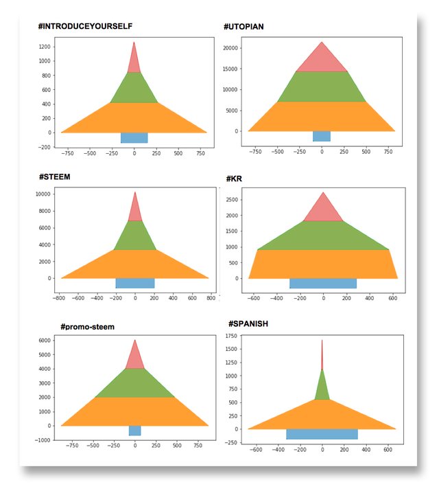
The question that needs to be asked by looking at these graphs is:
Are they good visualizing the internal structure of the distributions for each category and highlighting the differences among the distributions of each category?
Well, I think there has been an improvement because, for example, it would be easy to classify these graphs into families or classes having similar structures.
Analyzing the figure for each category you can also easily see how the contributions are within their structure and can be used to have an idea of whether they are more or less "stable" or another qualifier that you want to define.
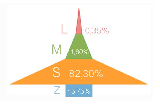 | This graph represents the average global behavior in Steemit that can be taken as reference to compare the following graphs for each category. |
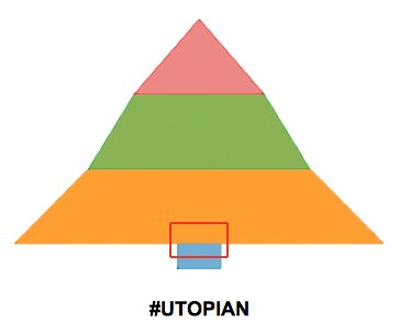 | The case of #utopian-io is far from the average behavior in Steemit. Having the highest proportion of high-value posts (2.9% compared to the average of 0,35% ) and second minimum amount of posts with zero payouts behind the #promo-steem category. |
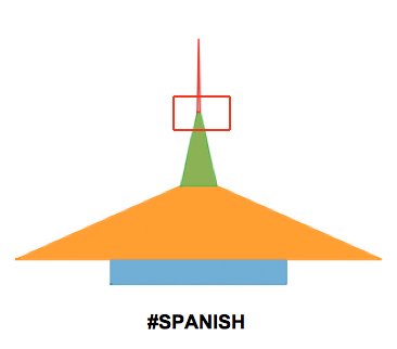 | On the opposite side is the #Spanish category that has the highest percentage of posts with zero payots (32,2%) and the minimun percentage (0,05%) for the group L. |
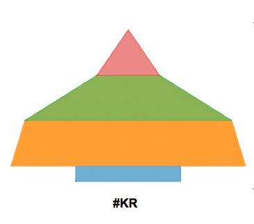 | The #kr case also moves away from the average behavior and highlights the relative size of the M group 5,6% (posts with medium size value payouts) |
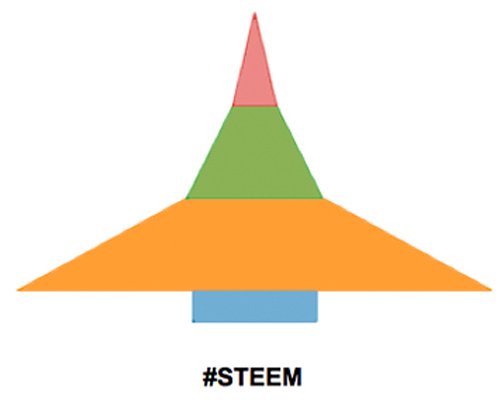 | The structure of the distribution of this category is very similar to the average behavior of all Steemit. |
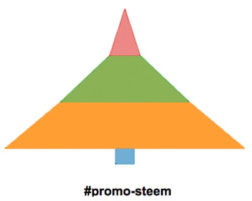 | In this case highlights a larger proportion of small size payouts (82,3%) and a very small amount (5,7%) of posts in group Z (posts with zero payout) |
- They can also be compared by showing the roughly real proportions of their dimensions to appreciate a whole vision.
SUMMARY
In this analysis, I wanted to explore the Steemit Post Payout Distribution for different categories. In a first approximation I have done it in the usual way using average values and standard histograms.
Following the advice of the experts, I focused on the visual part of the analysis and felt the need to create my own type of chart to visualize the processed data and I did it with a simple script using Python.
| With this type of DIY chart I have made an analysis of several important categories in Steemit, giving rise to graphs that allow to intuitively observe the different behavior of the distributions for each category. | .gif) |
SCOPE, TOOLS & CODE
- Date: 24.04.2018
- When I extracted the data from the database, the most recent date was 01.4.2018
- I used STUDIO 3T to get data from the database SteemData in the Public MongoDB Server mongo1.steemdata.com. created by @furion, and Python to process data and create charts.
SQL
SELECT  author, children, created, net_votes, curator_payout_value, total_payout_value, pending_payout_value

FROM Posts

WHERE category in ('selected category')

ORDER BY created DESC

LIMIT 2000
PYTHON
· Drawing a polygon with Python

import matplotlib.pyplot as plt

· DEFINE POLYGON COORDINATES

coord=[[A1,A2],[B1,B2],[C1,C2],[D1,D2]]

· Repeat the first point to create a 'closed loop'

coord.append(coord[0])

· Create lists of x and y values

xs, ys = zip(*coord)

plt.plot(xs,ys)

plt.show()
Posted on Utopian.io - Rewarding Open Source Contributors
Hi @lokomotion, great to see a new contributor in the analysis section, welcome! I have approved your contribution, however with a "first-contributor-bonus" ;)
Here are a few remarks:
You have picked some random tags for your analysis. Please note that in general using a single or a few random tags is not sufficient as an utopian analysis of Steem as a whole open source project. Please try to cover broader aspects for analyses of
steemit/steemfor future contributions.Great work on the visualizations, that must have been quite some effort to set those up! But the analysis of the results is a bit on the short end. Make sure to really draw conclusions from the processing results for future contributions!
You've picked the latest 2000 posts per category from SteemData. In general it is better to use a fixed time range, because then the analysis can be reproduced at any time and is independent of the date the query is executed. Also note that SteemData is being discontinued. The latest entry in the Posts collection is currently from March 30th 2018 and I don't expect more to come in it's last few days of operation.
Need help? Write a ticket on https://support.utopian.io.
Chat with us on Discord.
[utopian-moderator]
Thank you @crokkon for the welcome. I will take into account all your comments and advices that give me perfect guidelines to continue learning and improving.
Love the visualizations. A lot of time went into this post, the gif rocks too. Nice work. Do consider including the tag #blockchainbi when you are looking at steemit or any other blockchain data
thanks @paulag, much of my learning has been studying your contributions!
Hey @lokomotion! Thank you for the great work you've done!
We're already looking forward to your next contribution!
Fully Decentralized Rewards
We hope you will take the time to share your expertise and knowledge by rating contributions made by others on Utopian.io to help us reward the best contributions together.
Utopian Witness!
Vote for Utopian Witness! We are made of developers, system administrators, entrepreneurs, artists, content creators, thinkers. We embrace every nationality, mindset and belief.
Want to chat? Join us on Discord https://discord.me/utopian-io