New Logo for SPK Beasiswa

Repository
https://github.com/rzwibowo/spk-beasiswa
Details
This is a website-based opensource project using PHP. project SPK (Decision support system) This system is used to assist decision making in semi-structured situations and unstructured situations, where no one knows for certain how a decision should be made
the project does not have a logo. the project owner only uses the SPK-BEASISWA sentence in the form of svg to be used as the project logo. and I offer to make an interesting logo for this project and the project owner agrees. After that I sent a pull request. And the project owner has agreed to that. See our conversation about the link below.
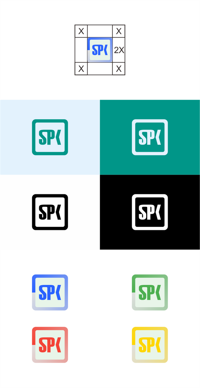
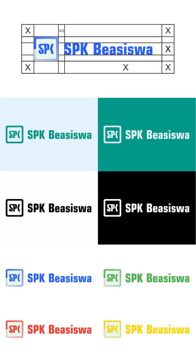
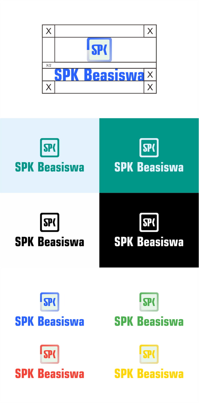
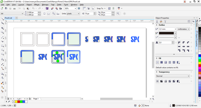
Logomark and Logo Result
Logomark and Logotype Primary Version (horyzontal)
Logomark and Logotype Secondary Version (Vertical)
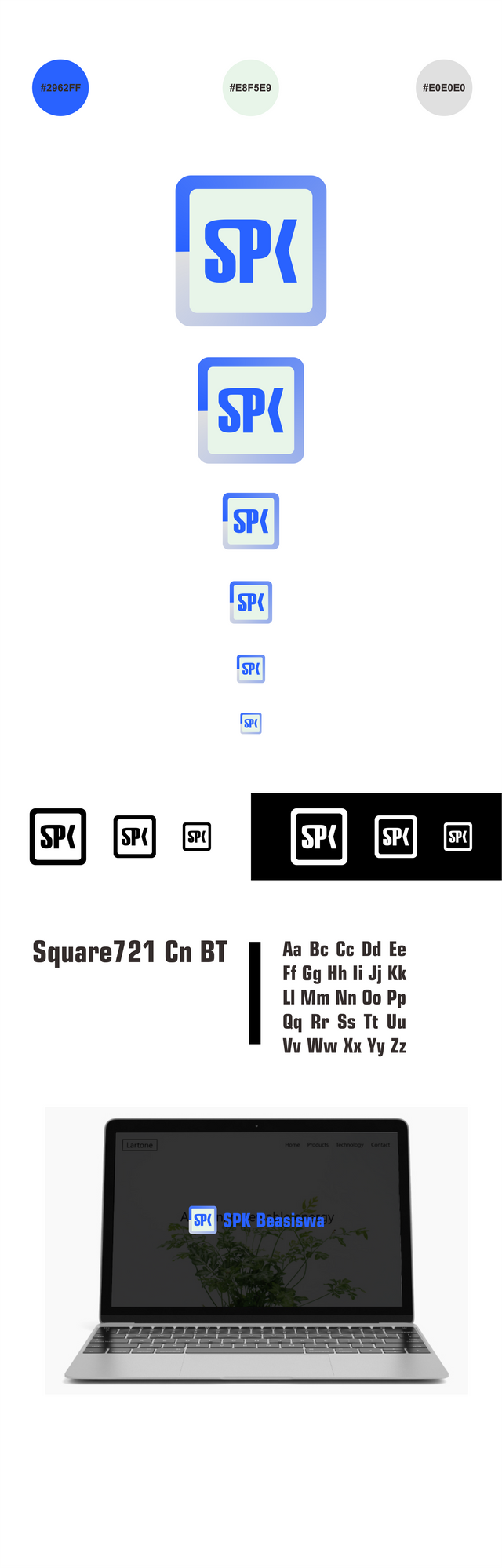
Scheme Colors, Size Variation Icon, Notifications Icon, Typhography, and Mockup
Benefits / Improvements
After reviewing this project. The project does not have a logo. so I offer to create a new logo for the project owner. the new logo looks attractive. in this new design still uses the word SPK because it must show that this is a decision support system project. In the SPK word is slightly modified so that this icon is not the same as other project icons. in this design I use the material color and Font Square721 Cn BT font.
Proof of authorship
Tools
I use CorelDraw Graphics suite X7.
Original files
Drive link Download
Font link Download
Mockup link Download
Proof of Work Done
https://github.com/mansya/spk-beasiswa

This work is licensed under a Creative Commons Attribution 4.0 International License.
Hey @mansyaprime ,
I think something wrong in here:
I did not like connection between 'S' and 'P'. Typeface which you choose has sharp corners but you made connection part rounded. It might be the reason why it comes defective to the eye. Also, the letter 'K' may be more inclined to be understandable.
Here, I used basic 'S' letter and more inclined half part of 'K'. In my opinion it is more clear now.
Your contribution has been evaluated according to Utopian policies and guidelines, as well as a predefined set of questions pertaining to the category.
To view those questions and the relevant answers related to your post, click here.
Need help? Write a ticket on https://support.utopian.io/.
Chat with us on Discord.
[utopian-moderator]
I'm sorry about what's in the red circle. I will be more careful. but about the relationship between s and p I deliberately made it like that so that this logo is interesting and unique. I guess that also seems to be small in size. but this is only my opinion. and I really like your advice. I will try to make the logo as interesting as possible for the next. I really appreciate that. thanks.
Thank you for your review, @baranpirincal!
So far this week you've reviewed 10 contributions. Keep up the good work!
Hi @mansyaprime!
Your post was upvoted by @steem-ua, new Steem dApp, using UserAuthority for algorithmic post curation!
Your post is eligible for our upvote, thanks to our collaboration with @utopian-io!
Feel free to join our @steem-ua Discord server
Hey, @mansyaprime!
Thanks for contributing on Utopian.
We’re already looking forward to your next contribution!
Get higher incentives and support Utopian.io!
Simply set @utopian.pay as a 5% (or higher) payout beneficiary on your contribution post (via SteemPlus or Steeditor).
Want to chat? Join us on Discord https://discord.gg/h52nFrV.
Vote for Utopian Witness!