You are viewing a single comment's thread from:
RE: Task Request - StemQ Logo Design (UPDATED)
Hi sir, here is my submission, hope you'll like it!
Brief Description:
The four colors in the logo symbolize the four subjects. Q is incorporated into the question mark in the shape of magnifying glass, representing searching (for answer).
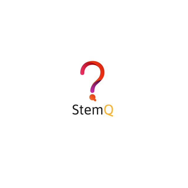
Hi @mecj, thank you for your submission.
I like the fact that the logo has simple shapes and look 'clean'.
On the other hand I think the question mark is too thin and as a result will probably not resize well to a small size.
There may not be enough tonal contrast between the different colours but that problem might be alleviated if the logo is made thicker.
I'm not sure about the question mark idea. Though at first it makes sense since this a Q&A app, it's reminding me a lot about a quizz somehow.
The other thing is that many languages don't use question marks for questions. That would be the case for most Asian languages.
Hopefully this doesn't sound too harsh.
Cheers.
Hi @mecj,
Thanks once again for your proposal.
We selected @naufal's logo proposal in the end.
I hope that's OK with you.
Cheers,
@irelandscape