VueJS Component (Special Edition) - Pokecard, Fancy Card with Pop Animation
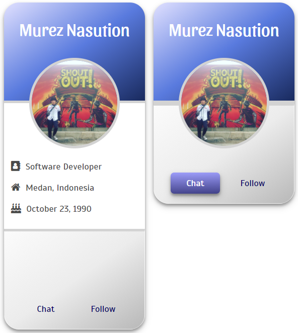
At this moment, I will release my special component that has been built using VueJS. I named it with PokeCard (stands for Pocket Card), which is inspired by the Pokeball in the most popular cartoon of my childhood, Pokemon. Basically, just like any card component that displays profile picture and some attributes. But, by default, pokecard only show short information. However, when popped, then all the secrets will be revealed.
Now, let's go!
Murez Nasution
Attention!
To be able using this template, you need several studies of the components related to perspective of VueJS. You can visit the official website directly here.
And there may be some issues with browser compatibility.
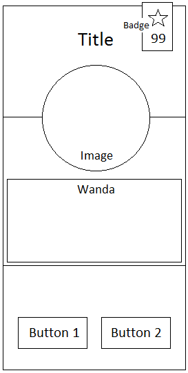
Prototype
- Title, is the main title of current card.
- Badge, located at the most top-right corner of this card. It shows score and a star as rating. By default, it was hidden, But when mouse enters on the profile picture, it will appear.
- Image, as the main picture in the center of this card.
- Wanda, as hidden content distribution. It's shown when this card is unfolded (pop) by clicking on the Image.
- Footer. It consists of two buttons of major actions.
As seen below,
Requirement
As usual, please, make sure to do the following steps:
- Install NodeJS
- Install vue-cli -
npm install -g vue-cli - Install Text Editor (Sublime, or any others)
- Download component in my GitHub.
Rock 'n Roll
Here is a general description of the implementation and the results
Template
All of icon resources is here http://fontawesome.io/icons/.
Code
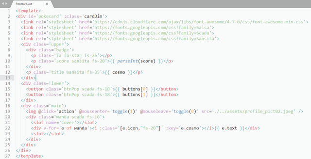
<template>
<div id='pokecard' :class='cardDim'>
    <link rel='stylesheet' href='https://fonts.googleapis.com/css?family=Salsa'>
    <link rel='stylesheet' href='https://cdnjs.cloudflare.com/ajax/libs/font-awesome/4.7.0/css/font-awesome.min.css'>
    <link rel='stylesheet' href='https://fonts.googleapis.com/css?family=Scada'>
    <link rel='stylesheet' href='https://fonts.googleapis.com/css?family=Sansita'>
    <div class='upper'>
        <div class='badge'>
            <p class='fa fa-star fs-25'></p>
            <p class='score sansita fs-20'>{{ parseInt(score) }}</p>
        </div>
        <p class='title sansita fs-35'>{{ cosmo }}</p>
    </div>
    <div class='lower'>
        <button class='btnPop scada fs-18'>{{ buttons[0] }}</button>
        <button class='btnPop scada fs-18'>{{ buttons[1] }}</button>
    </div>
    <div class='main'>
        <img @click='action' @mouseenter='toggle(1)' @mouseleave='toggle(0)' src='./../assets/profile_pict02.jpeg' />
        <div class='wanda scada fs-18'>
            <slot name='cover'></slot>
            <div v-for='e of wanda'><i :class='[e.icon,"fs-20"]' :key='e.cosmo'></i>{{ e.text }}</div>
            <slot></slot>
        </div>
    </div>
</div>
</template>
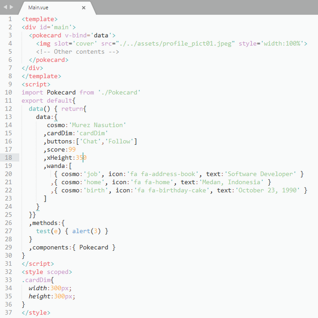
And here is the main container that will implement the component of Pokecard.
Main.vue
<template>
<div id='main'>
    <pokecard v-bind='data'>
        <img slot='cover' src="./../assets/profile_pict01.jpeg" style='width:100%'>
        (html comment removed:  Other contents )
    </pokecard>
</div>
</template>
<script>
import Pokecard from './Pokecard'
export default{
    data() { return{
        data:{
             cosmo:'Murez Nasution'
            ,cardDim:'cardDim'
            ,buttons:['Chat','Follow']
            ,score:99
            ,xHeight:350
            ,wanda:[
                { cosmo:'job', icon:'fa fa-address-book', text:'Software Developer' }
                ,{ cosmo:'home', icon:'fa fa-home', text:'Medan, Indonesia' }
                ,{ cosmo:'birth', icon:'fa fa-birthday-cake', text:'October 23, 1990' }
            ]
        }
    }}
    ,methods:{
        test(e) { alert(3) }
    }
    ,components:{ Pokecard }
}
</script>
<style scoped>
.cardDim{
    width:300px;
    height:300px;
}
</style>
Result
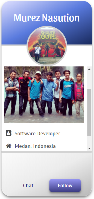
API
- cosmo - Main title.
- type:
String - required:
true
- type:
- score - Number that will be shown on badge.
- type:
Number - required:
true
- type:
- cardDim - The dimension of Pokecard, width and height.
- type:
String - required:
true
- type:
- xHeight - The number in pixel that will be added when Pokecard is unfolded.
- type:
Number - default:
300
- type:
- buttons - Two strings of buttons on the footer.
- type:
Array - default:
[ 'Follow', 'Projects' ]
- type:
- wanda - All properties will be shown on hidden content.
- type:
Array
- type:
Thank you!
Posted on Utopian.io - Rewarding Open Source Contributors
Aprove haha
Belum. :-D
Hey @murez-nst I am @riyo.s94. I have just upvoted you!
Your contribution cannot be approved because it is too generic/simple to qualify for the
Developmentcategory.It's also not recommended to include code examples as screenshots. In your case they are also redundant. In general you shouldn't simply paste entire files into your post. If there are code samples that need to be explained, include only the related part or link directly to GitHub.
You can of course use GitHub to store your tutorial samples ("repository for all my tutorials") but this doesn't make this repository a valid project for Utopian. If you'd start your own open source tutorial platform with lots of features, this would be more appropriate but there are many competitors and you need to have a unique and promising approach. For the moment, I suggest you should stick with the
Tutorialscategory for your next contribution.You can contact us on Discord.
[utopian-moderator]