Making a cool Bitcoin price chart using D3.js and the CryptoCompare API
Repo: https://github.com/d3
In this tutorial I'll show you how to make a Bitcoin price chart using D3.js

D3.js is an open source Javascript library that stands for Data Driven Documents. D3 is one of the best Javascript data visualization libraries out there and is extremely popular. Although the learning curve is a bit steep learning D3 is worth the time due to the tremendous amount of data visualization projects you can create with it. Everything from bar graphs, choropleth maps, force directed graphs, bubble graphs and much more can be made for the web using D3 and HTML/SVG/CSS.
Check out the beautiful projects on the D3 Github page to get an idea of the wide range of projects that can be built with the library.
What you will learn:
- How to set up a D3 project
- Making a request to the CryptoCompareAPI
- Plotting the Bitcoin prices from the last year on a line chart
Requirements:
The project will use the following technologies:
Difficulty:
Intermediate
The project:
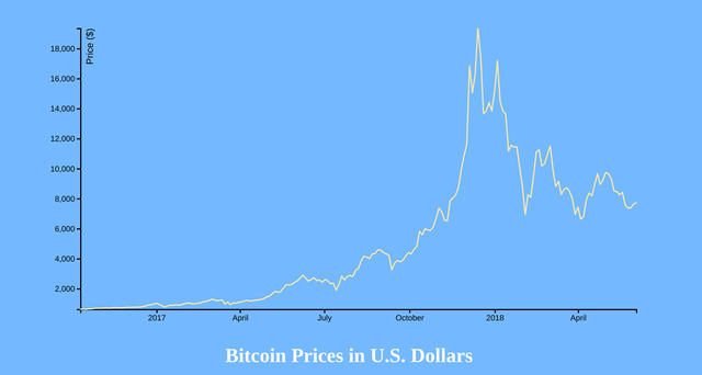
The finished chart
The code in it’s entirety
<!DOCTYPE html>
<html>
  <head>
    <meta charset="utf-8">
    <title></title>

    <script src="https://d3js.org/d3.v4.min.js"></script>
    <svg width="960" height="500"></svg>
  </head>

    <style>

      body {
        text-align: center;
        margin-top: 5em;
        background-color: #74b9ff;
      }

      h1 {
        color: snow;
      }


    </style>


    <body>
    <h1>Bitcoin Prices in U.S. Dollars</h1>
    <script>


  var url = "https://min-api.cryptocompare.com/data/histoday?fsym=BTC&tsym=USD&limit=200&aggregate=3&e=CCCAGG";


  d3.json(url).get(function(error, d) {

    var data = d.Data;
    data.forEach(function(d){ d.time = new Date(d.time * 1000) });

    if (error) throw error;

    var svg = d3.select("svg"),
        margin = {top: 20, right: 20, bottom: 30, left: 50},
        width = +svg.attr("width") - margin.left - margin.right,
        height = +svg.attr("height") - margin.top - margin.bottom,
        g = svg.append("g").attr("transform", "translate(" + margin.left + "," + margin.top + ")");

    var x = d3.scaleTime()
        .range([0, width])

    var y = d3.scaleLinear()
        .range([height, 0]);

    var line = d3.line()
        .x(function(d) { return x(d.time); })
        .y(function(d) { return y(d.close); });

    x.domain(d3.extent(data, function(d) { return d.time; }));
    y.domain(d3.extent(data, function(d) { return d.close; }));

    g.append("g")
        .attr("transform", "translate(0," + height + ")")
        .call(d3.axisBottom(x))
        .attr("stroke-width", 2)
        .attr("fill", "none")
        .style("font-size",".8em");

    g.append("g")
        .call(d3.axisLeft(y))
        .attr("stroke-width", 2)
        .style("font-size",".8em")
      .append("text")
        .attr("fill", "#000")
        .attr("transform", "rotate(-90)")
        .attr("y", 20)
        .attr("text-anchor", "end")
        .attr("font-size", "1.2em")
        .text("Price ($)")


    g.append("path")
        .datum(data)
        .attr("fill", "none")
        .attr("stroke", "#ffeaa7")
        .attr("stroke-linejoin", "round")
        .attr("stroke-linecap", "round")
        .attr("stroke-width", 2)
        .attr("d", line);

  });

    </script>
  </body>
</html>
Now let’s break it down.
The API
In order to get accurate and up to date price information on Bitcoin to use for this project we will be using the CryptoCompare API. This will provide us with, among other things, the current price and historical price of Bitcoin (or practically any other coin we wanted to use). The API offers a lot of other data such as information on exchanges, exchange rates, historical data, information on coins themselves, etc… but for this project we will just be retrieving information on the price of Bitcoin over the last year or so.
In order to use D3 in our project the first thing we need to do is load in the D3 library in the head of our HTML document:
<script src="https://d3js.org/d3.v4.min.js"></script>
Next create an SVG element to hold our chart:
<svg width="960" height="500"></svg>
The API Query
The next step is to save the API endpoint into a variable so we can reference it later in our program.
var url = "https://min-api.cryptocompare.com/data/histoday?fsym=BTC&tsym=USD&limit=200&aggregate=3&e=CCCAGG";
This is the API endpoint that we will be sending our request to. Let’s break down this query:
https://min-api.cryptocompare.com/data/histoday?fsym=BTC
fsym is the parameter for the coin we are searching for, in this case Bitcoin. You could swap out fsym=BTC for fsym=ETH if you wished to search for price data on the Etherium coin or fsym=LTC for Litecoin and so on. There are approximately 1,500 coins you can get information on using this API. Just provide the fsym parameter the proper coin acronym and you’re set.
https://min-api.cryptocompare.com/data/histoday?fsym=BTC&tsym=USD
The currency we provided in the fsym parameter is then converted into whichever currencies we specify in the tsym parameter. We could pass the tysm parameter another cryptocurrency, like Steem for example, or we could pass it fiat currency such as the US dollar or the Euro. For our project we will be passing it the US dollar:
https://min-api.cryptocompare.com/data/histoday?fsym=BTC&tsym=USD&limit=200&aggregate=3&e=CCCAGG
The limit parameter specifies the number of data points to return. In our case it is two. Aggregate tells the API the number of days to aggregate the data over.
The CryptoCompare API works with many different crypto exchanges when retrieving data on coins. The e parameter in our query string tells the API which online exchange we wish to pull our data from when making our request. By default the API uses CryptoCompare’s aggregate average CCCAGG. This takes data from several different exchanges and averages it out before sending it to us.
Sending the request
Now that we have an understanding of the request that we will be sending to the API let’s move on to how D3 sends out a request and retrieves the data for us. We do this using the d3.json method:
d3.json(url).get(function(error, d) {

  });
<br
d3.json takes our API URL as a parameter and then calls the Javascript get method. We pass the get method a callback function with a parameter for what to do in the event there is an error, and a second parameter for the data itself. It is inside this callback function that we will handle everything that pertains to the data from the API and how it will be displayed by D3.
The JSON data we are retrieving looks like this:
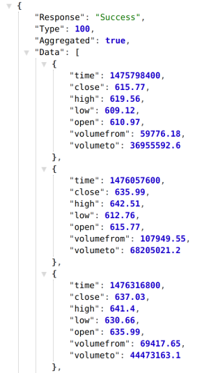
Fixing how the time is displayed
As you can see this time format returned to us in the JSON data is not ideal for our project. We will need to use the Javascript Date object to convert this time into a more human readable form. We will do that like this:
var data = d.Data;
data.forEach(function(d){ d.time = new Date(d.time * 1000) });
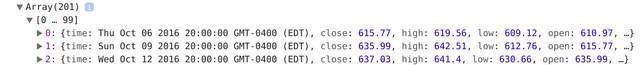
We use the Javascript forEach method to iterate through each element, grab the time via d.time, create a new Date object for each time, and then multiple that by 1000 to format the time in a more readable way. The time is now displayed like this:
Creating the SVG element and dimensions
The next part of the code uses the d3 select method and selects our svg element that we created in the head of our HTML document. We assign this svg element to the variable svg. We then create variables for the margin, width, and height of our element. We can adjust the height and width of our svg element by changing the values stored in the margin object. These values are then assigned to the g variable we have created. Later in the program g will be used to draw/append our x and y axis as well as create the path that will plot the Bitcoin price on our chart.
  var svg = d3.select("svg"),
        margin = {top: 20, right: 20, bottom: 30, left: 50},
        width = +svg.attr("width") - margin.left - margin.right,
        height = +svg.attr("height") - margin.top - margin.bottom,
        g = svg.append("g").attr("transform", "translate(" + margin.left + "," + margin.top + ")");
Creating Scales
Scales are used in D3 to make visual representations of abstract and complex data and map it onto the screen in a way that is proportionate and visually appealing. The most common types of scales in D3 are linear scales.
Linear scales are used to plot continuous quantitative data. The data we are working with is money and time, both of which are linear and continuous. D3 also offers ordinal scales, but because our data is linear we will not be using ordinal scales for this project.
To display the date on the x axis of our chart we will be using the d3.scaleTime method. The range method is used to set the width of the x axis. The range method is passed an array with two parameters. Passing it 0 and the width variable we created earlier sets the x axis’ width to that of the width variable.
  var x = d3.scaleTime()
        .range([0, width]);
The same approach is used to define the y axis. However there are some differences. First, we use d3.scaleLinear for the y axis because we are not dealing with plotting time on this axis like we did on the x axis. Secondly, we use the height variable in this array and the order is reversed:
 var y = d3.scaleLinear()
        .range([height, 0]);
Now that we have the x and y axis drawn we can move on to drawing the chart’s line.
Drawing the chart’s line
We will now use D3’s line function to draw a line on our chart. D3.line takes the time provided by the JSON data (d.time) and the closing price (d.close) and uses this data for the x and y coordinates of the line.
  var line = d3.line()
        .x(function(d) { return x(d.time); })
        .y(function(d) { return y(d.close); });
Working with D3’s domain method
When working with D3 charts you will run into the domain method often. Domain is a way for D3 to determine the size of your dataset and it’s boundaries. For example, consider the following example array:
var myData = [2, 17, 3, 9, 0];
If this myData array was the dataset you were charting the domain would be the smallest number (in this case 0), and the largest number (in this case 17). The domain would be 0-17.
We will handle the x domain for our graph using the following code:
x.domain(d3.extent(data, function(d) { return d.time; }));
In this line of code we are passing the time from our data (d.time) to D3’s extent method. The d3.extent method takes an array and returns the minimum and maximum values. In our code d3.extent passes the minimum and maximum numbers from our time data and passes this to the domain. We have now set our x domain to contain the appropriate times for our x-axis.
We do the same for the y domain, with the only difference being we pass the Bitcoin prices (d.close) to the d3.extent function instead of d.time:
y.domain(d3.extent(data, function(d) { return d.close; }));
The x and y axis now both contain the appropriate domain data.
Drawing the graph’s line
In this next part of the program we will be using the SVG g element to group together multiple SVG elements.
  g.append("g")
        .attr("transform", "translate(0," + height + ")")
        .call(d3.axisBottom(x))
        .attr("stroke-width", 2)
        .attr("fill", "none")
        .style("font-size",".8em");
Using the call method and passing it d3.axisBottom and passing it the x variable we created to store our x axis in appends the x axis line on our chart. Stroke-width and fill make our line thicker, and font-size does exactly what it sounds like, increases the font size of the labels.
Creating the y axis is done the same way, but we use the d3.axisLeft instead:
  g.append("g")
        .call(d3.axisLeft(y))
        .attr("stroke-width", 2)
        .style("font-size",".8em")
      .append("text")
        .attr("fill", "#000")
        .attr("transform", "rotate(-90)")
        .attr("y", 20)
        .attr("text-anchor", "end")
        .attr("font-size", "1.2em")
        .text("Price ($)")
In addition to plotting the y axis itself we will also append text that displays the “Price ($)” label and ticks that display the price range.
The fill attribute determines what color the price label will be. The transform attribute transforms the price label by rotating it so that it displays in a vertical fashion rather than being horizontal like the ticks. Setting the y attribute to 20 puts space between the price label and the actual y axis itself. The text-anchor element is another SVG element that is used to align an element with either the start, middle, or end of another element. In our case we are using text-anchor to align the price label with the end of the y axis.
g.append("path")
        .datum(data)
        .attr("fill", "none")
        .attr("stroke", "#FFB041")
        .attr("stroke-linejoin", "round”)
        .attr("stroke-linecap", "round")
        .attr("stroke-width", 2)
        .attr("d", line);
In order to draw the line of our graph we will need to append an SVG path to our g variable. The data from our JSON is passed to the path via the datum method.
The next few lines set the attributes of our line and allow us to drawn the line how we want it to look. The fill attribute determines whether or not the inside of our path line is filled in, the stroke determines the color of the line, stroke-width determines the width of our line. Stroke-linejoin specifies the shape at the corners of our lines and stroke-linecap specifies the shapes of the end of our lines.
The final line grabs the data from our d3.json request and plots the line using the line variable we created earlier.
The end
This sums up my tutorial on creating a basic D3 line graph that displays Bitcoin prices from JSON data from an API call. I hope this tutorial was informative and concise and that you learned the basics of creating a D3 line graph. The code in it’s entirety can be found here.
Thank you for this walk-through. I can tell this took a long time to put together.
I've never worked with D3, but I've definitely heard about it. It's nice to see an example with data I'm familiar with (trading charts). Now I just need to find some time to play around.
Thanks for sharing!
D3 is tricky to learn. I'm still learning myself. This tutorial helped me solidify my knowledge. I've seen a ton of really awesome D3 projects and I definitely want to get better with D3.
Very Informative tutorial. Thank you for posting this. D3 is one of the hardest JavaScript libraries to learn, but it is worth learning. We can use d3.js to express our creativity with a range of visualization options. We are already looking forward for more tutorials about D3 and various data visualization techniques.
Nice read. I leave an upvote for this article thumbsup
Thanks. Glad you enjoyed it.
Thank you for your contribution.
While I liked the content of your contribution, I would still like to extend one advice for your upcoming contributions:
Looking forward to your upcoming tutorials.
Your contribution has been evaluated according to Utopian policies and guidelines, as well as a predefined set of questions pertaining to the category.
To view those questions and the relevant answers related to your post, click here.
Need help? Write a ticket on https://support.utopian.io/.
Chat with us on Discord.
[utopian-moderator]
Hey @nicknyr
Thanks for contributing on Utopian.
We’re already looking forward to your next contribution!
Contributing on Utopian
Learn how to contribute on our website or by watching this tutorial on Youtube.
Want to chat? Join us on Discord https://discord.gg/h52nFrV.
Vote for Utopian Witness!
The best project for monitoring cryptocurrency status - https://masscoinapp.com
Check the threshold value with comfort!