- The human head is a little bit hard to recognize, maybe you can fix the nose part to make if mor recognizeable as side profile of a human head.
- The logotype will look better if there is more contrast, since it has no space between words 'once' and 'cell'. To achieve good contrast, you can try different weight or different color, or both.
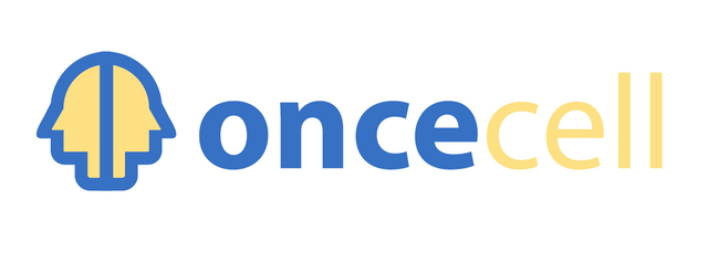
- You should always provide different size variation of the ready to use file (png).
Your contribution has been evaluated according to Utopian policies and guidelines, as well as a predefined set of questions pertaining to the category.
To view those questions and the relevant answers related to your post, click here.
Need help? Write a ticket on https://support.utopian.io/.
Chat with us on Discord.
[utopian-moderator]
Thank you for your review, @nilfanif!
So far this week you've reviewed 4 contributions. Keep up the good work!