RE: My Contribution To BookList Merged & Used
Don't use drop shadow effect on android app icon, it will make the icon not perfectly centered and affect the margin and padding in smartphon display.
most of android launcher will automatically add the shadow when bright background is in use.
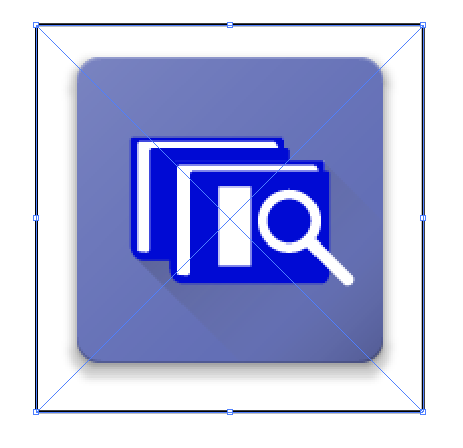
The logotype is too big comapred to the logomark. remember, you are designing a logo not just an icon. always pay attenton to the proportion of logomark and logotype.
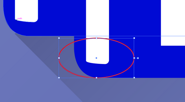
Some shapes is not smooth, you should pay more attention to details.

Your contribution has been evaluated according to Utopian policies and guidelines, as well as a predefined set of questions pertaining to the category.
To view those questions and the relevant answers related to your post, click here.
Need help? Write a ticket on https://support.utopian.io/.
Chat with us on Discord.
[utopian-moderator]
Thanks for your review