Hi @zuur, Thank you for your contribution.
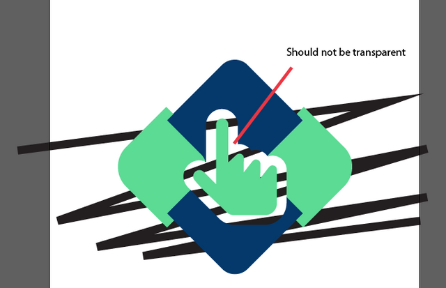
The offset around the hand part should not be transparent, imagin if the Project Owner put the logo on top of green background, the logo would look terrible.
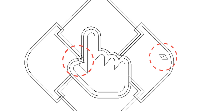
Some part in your logo was not shaped porperly. make sure you pay attention to details.
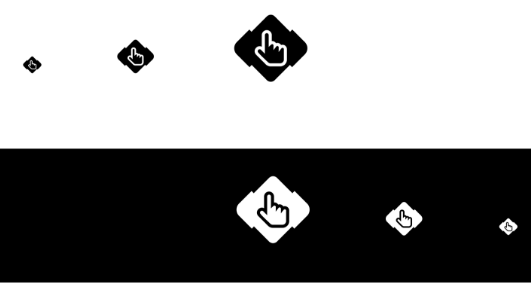
The logomark lost its details in one color variations. you can use offset path feature in Illustrator to show those details.
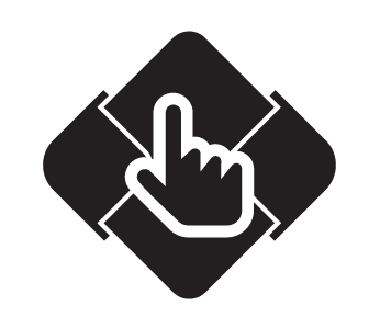
I see you use futura bold condensed for the logotype, i think it will look better if you just use futura bold as the dimension of the logomark is almost a square.
Your contribution has been evaluated according to Utopian policies and guidelines, as well as a predefined set of questions pertaining to the category.
To view those questions and the relevant answers related to your post, click here.
Need help? Write a ticket on https://support.utopian.io/.
Chat with us on Discord.
[utopian-moderator]
Thank you for your review, @nilfanif!
So far this week you've reviewed 2 contributions. Keep up the good work!